A pie chart is a type of chart that is shaped like a circle and uses slices to represent proportions of a whole.
The following step-by-step example shows how to create a pie chart in Google Sheets.
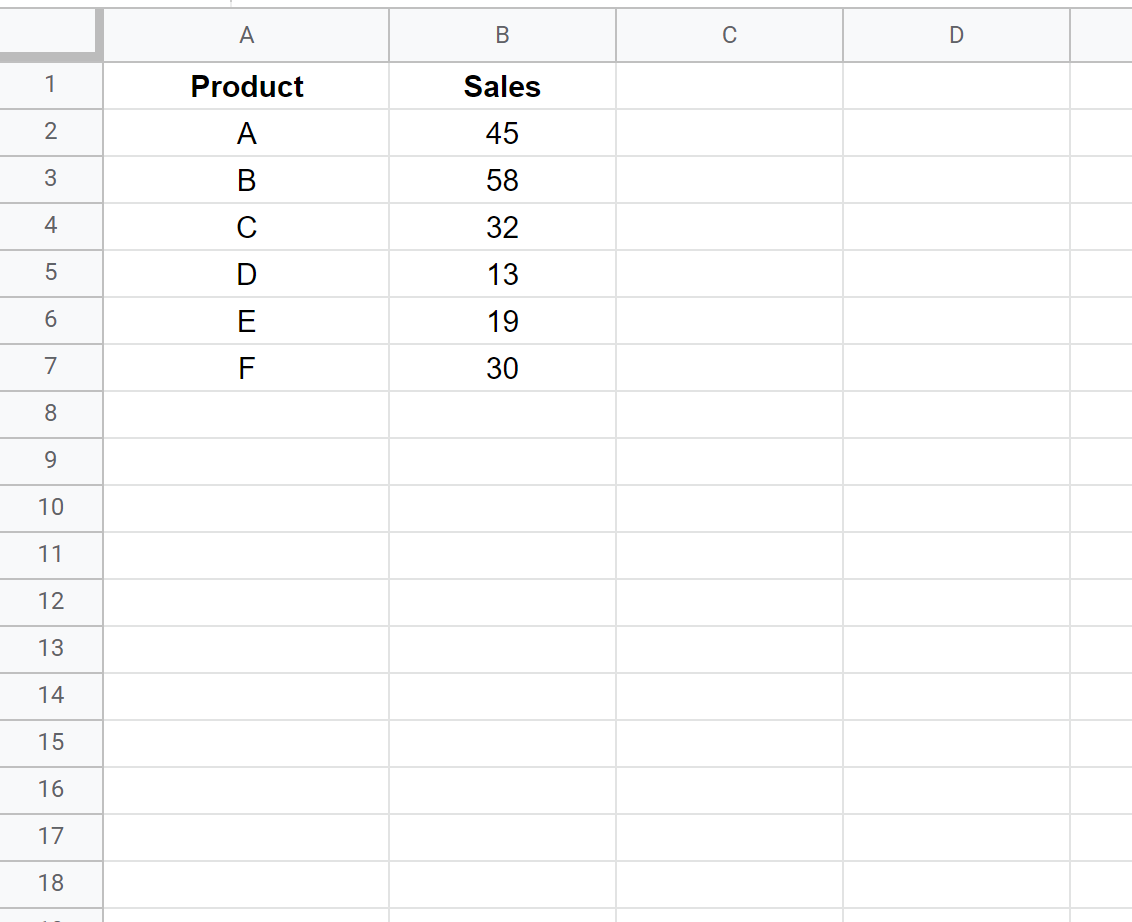
Step 1: Enter the Data
First, let’s enter some data that shows the total sales for 6 different products:
Step 2: Create the Pie Chart
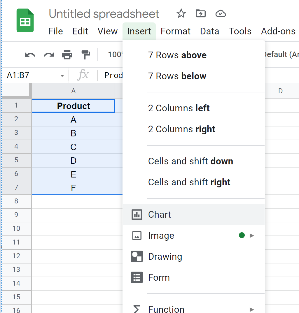
Next, highlight the values in the range A1:B7. Then click the Insert tab and then click Chart:
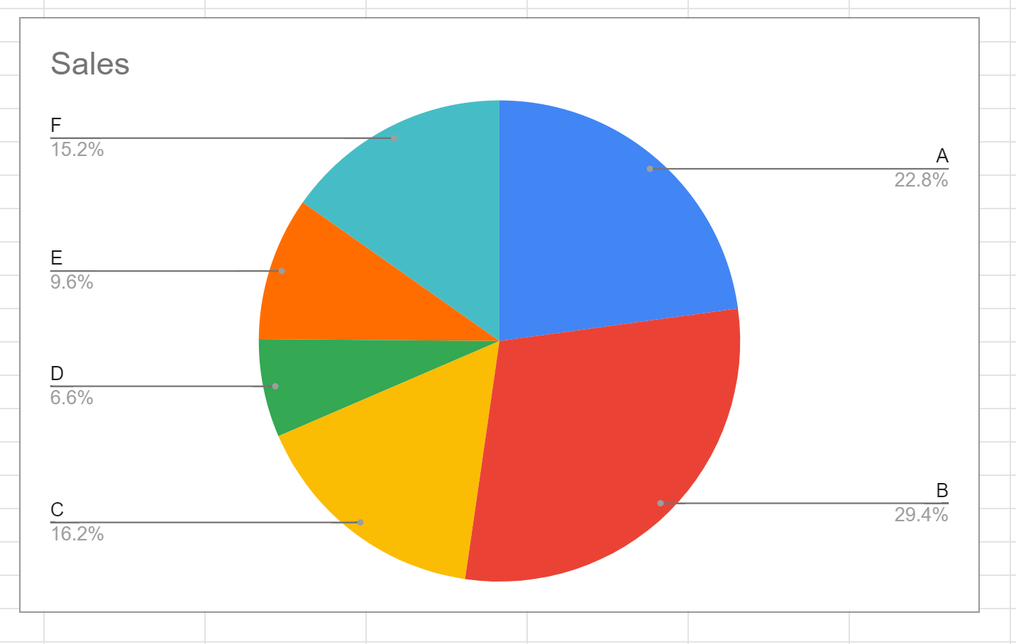
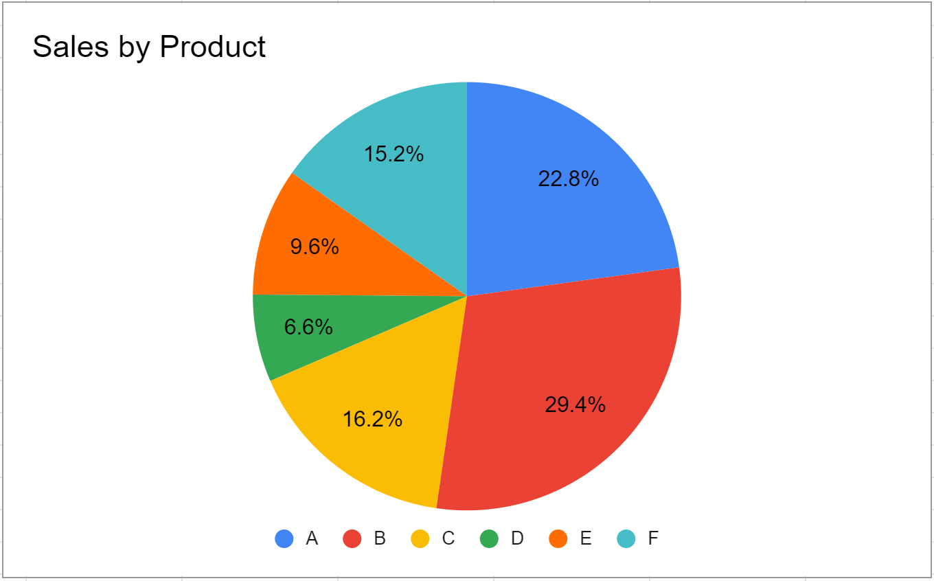
The following pie chart will automatically be inserted:
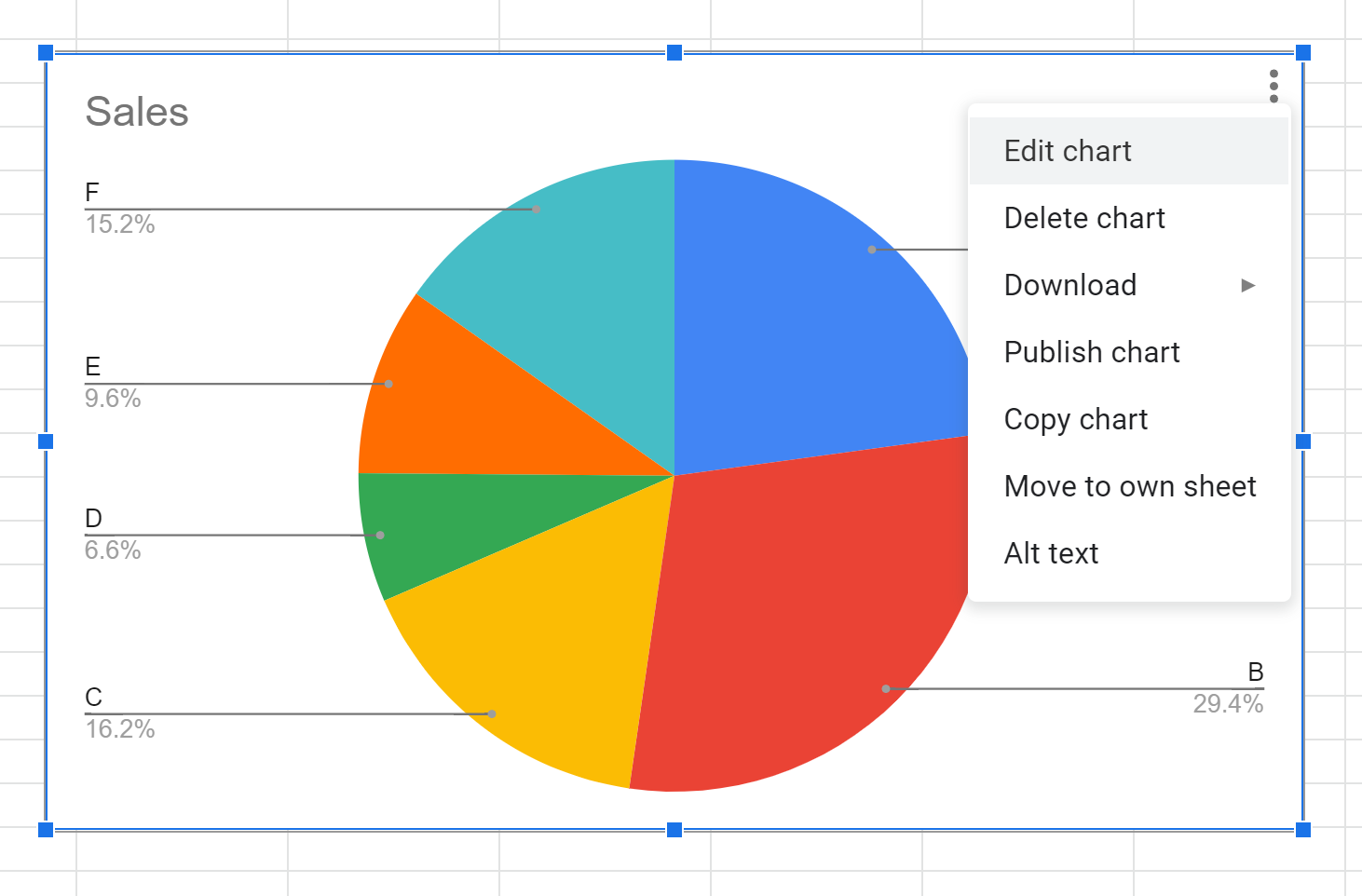
Step 3: Customize the Pie Chart
To customize the pie chart, click anywhere on the chart. Then click the three vertical dots in the top right corner of the chart. Then click Edit chart:
In the Chart editor panel that appears on the right side of the screen, click the Customize tab to see a variety of options for customizing the chart.
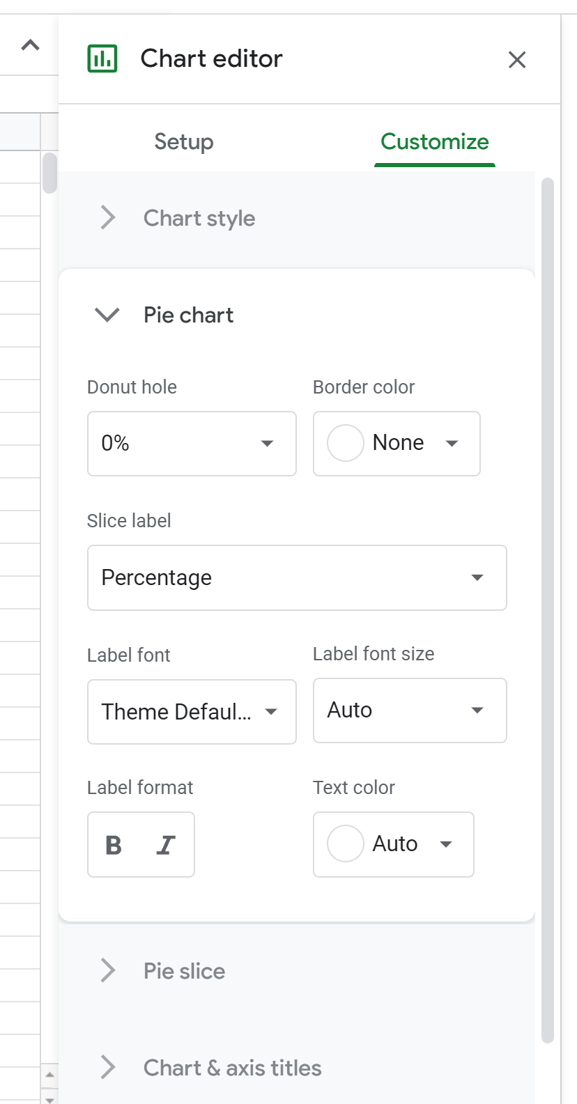
First, we can click Pie chart and change the Slice label to Percentage.
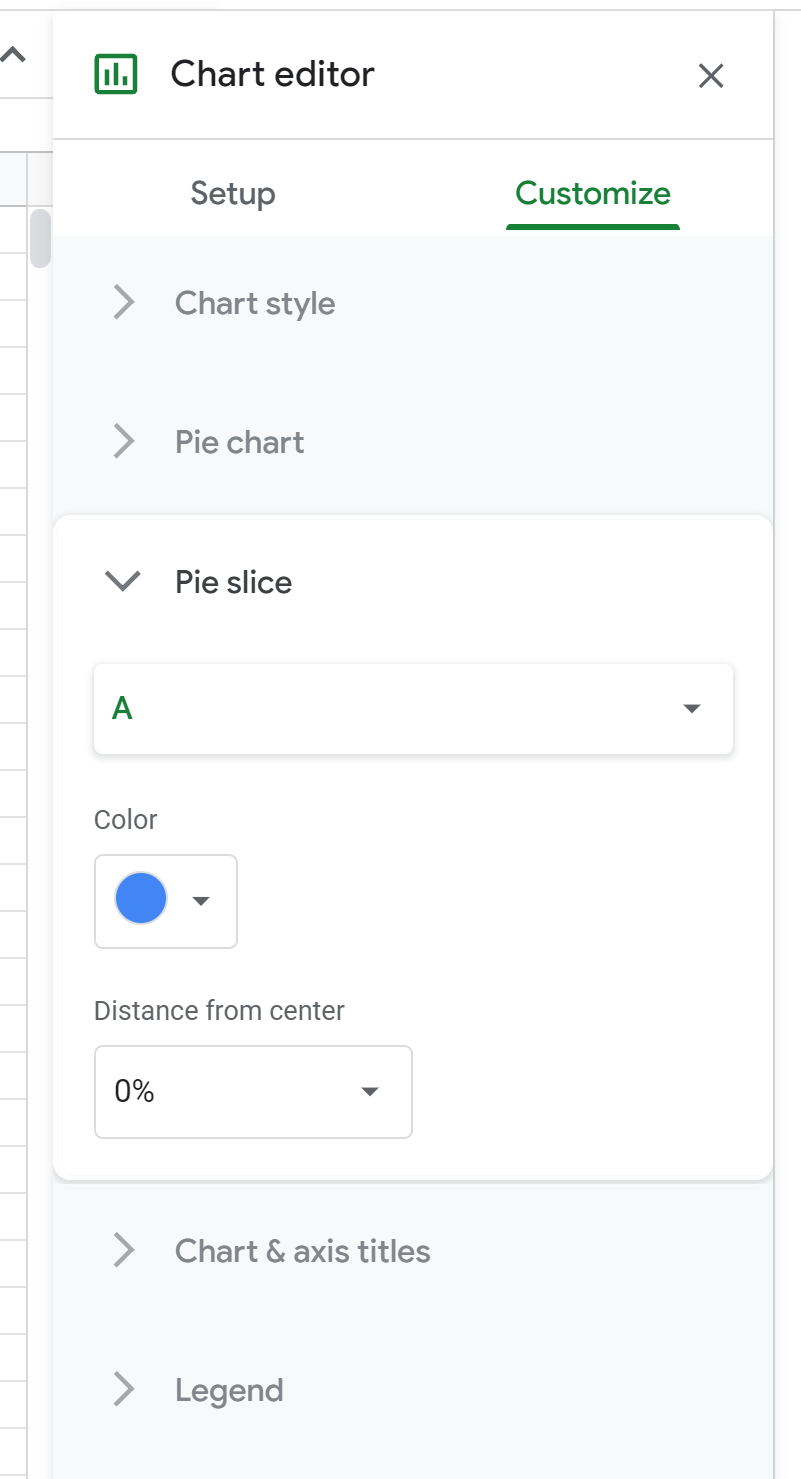
Next, we can click Pie slice and change the individual colors of the slices in the chart if we’d like:
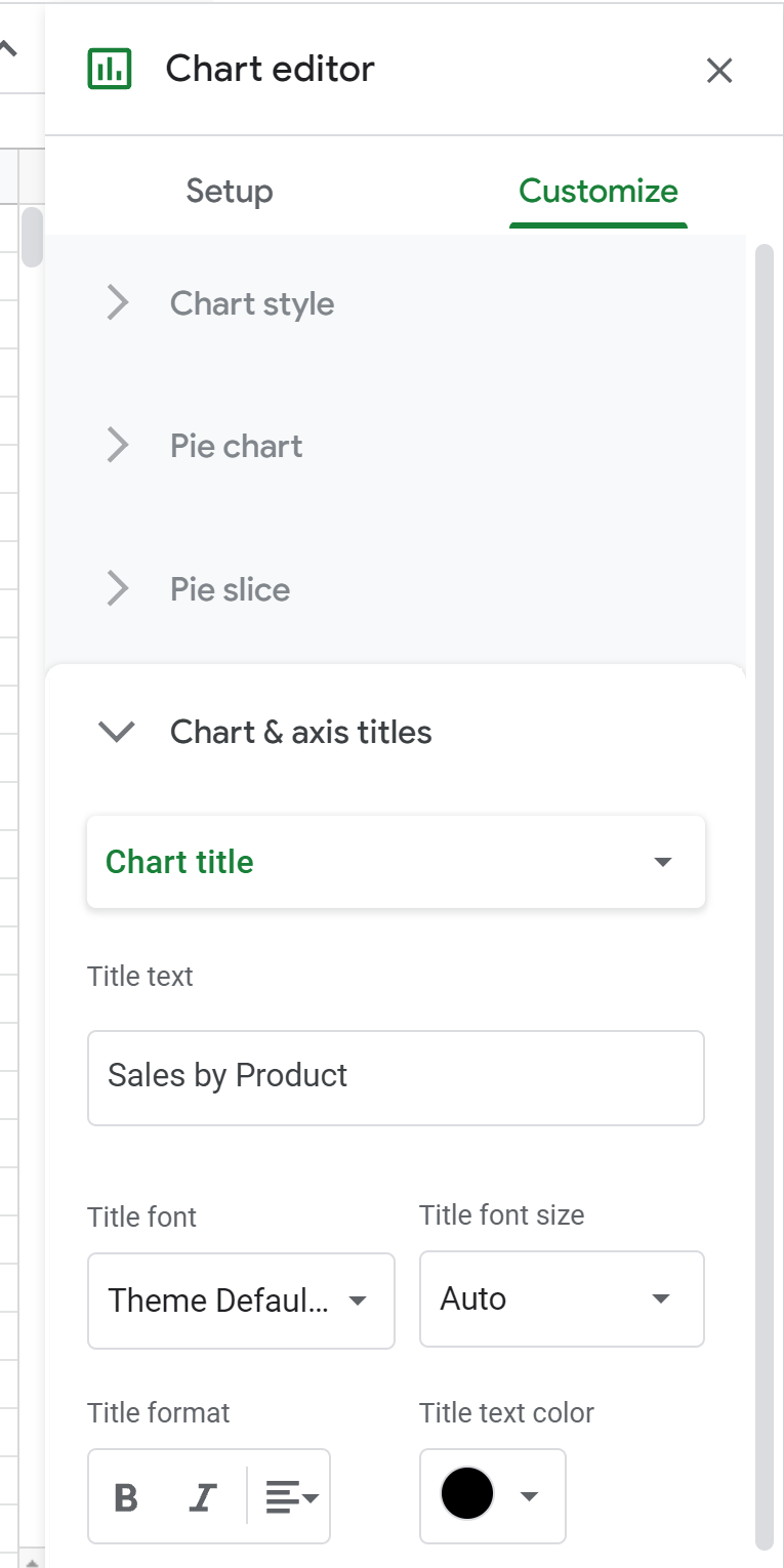
Next, we can click Chart & axis titles and change the Chart title to whatever we’d like:
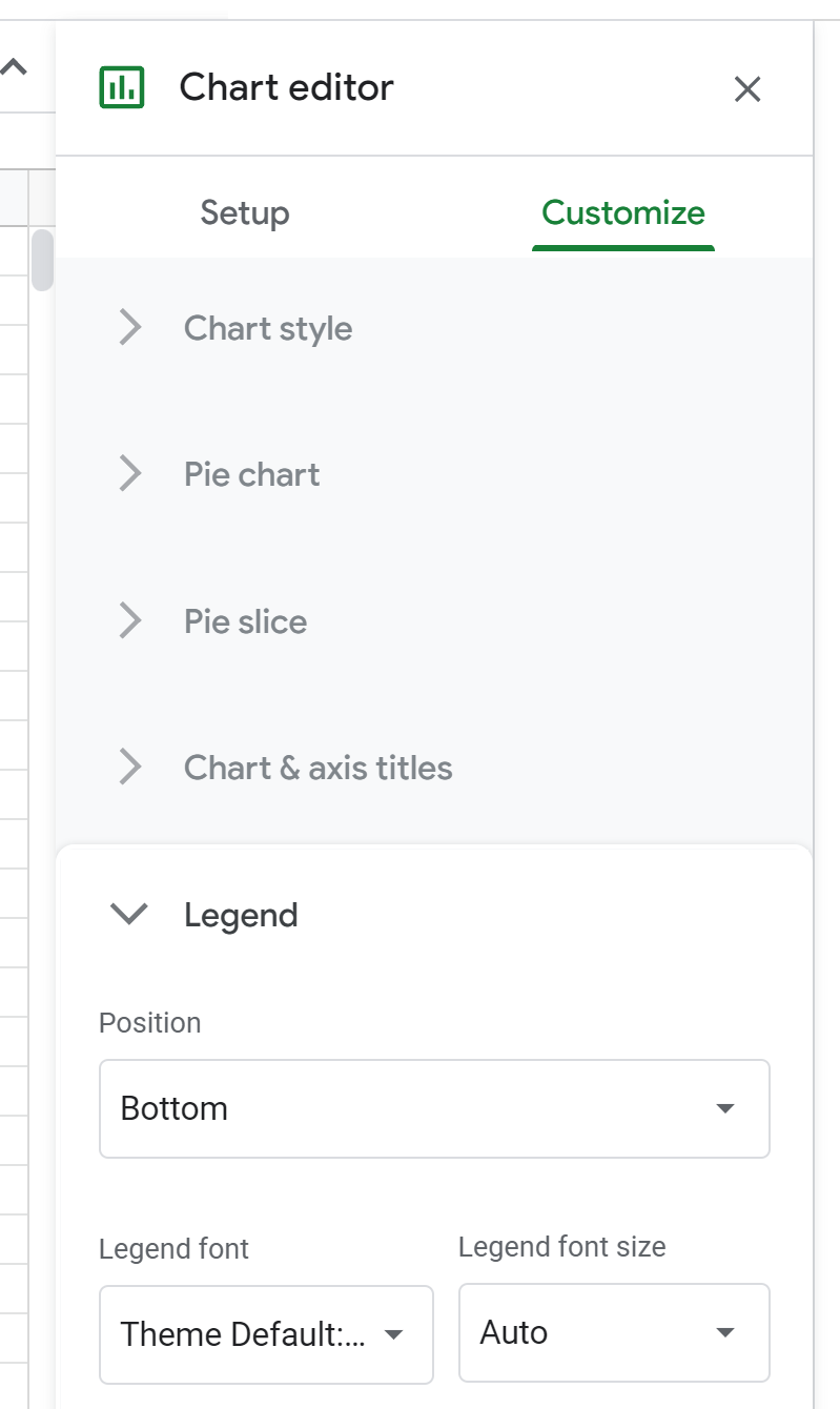
Next, we can click Legend and change the Position to wherever we’d like:
The final pie chart looks like this:
Additional Resources
The following tutorials explain how to create other common charts in Google Sheets:
How to Make a Box Plot in Google Sheets
How to Create a Bubble Chart in Google Sheets
How to Create a Pareto Chart in Google Sheets
How to Create a Candlestick Chart in Google Sheets