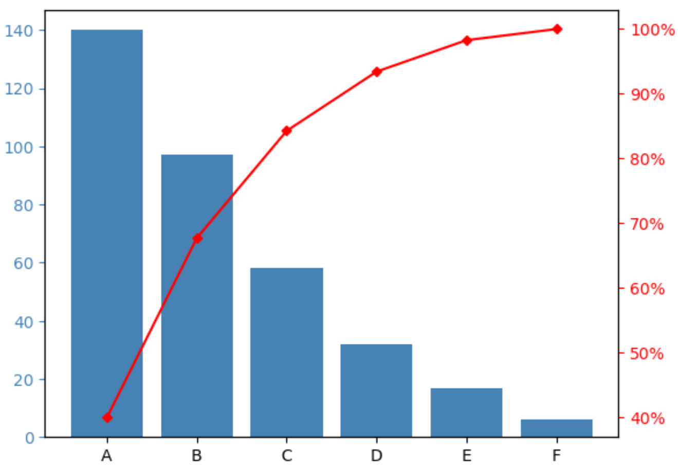
A Pareto chart is a type of chart that displays the ordered frequencies of categories along with the cumulative frequencies of categories.

This tutorial provides a step-by-step example of how to create a Pareto chart in Python.
Step 1: Create the Data
Suppose we conduct a survey in which we ask 350 different people to identify their favorite cereal brand between brands A, B, C, D, and E.
We can create the following pandas DataFrame to hold the results of the survey:
import pandas as pd

#create DataFrame
df = pd.DataFrame({'count': [97, 140, 58, 6, 17, 32]})
df.index = ['B', 'A', 'C', 'F', 'E', 'D']

#sort DataFrame by count descending
df = df.sort_values(by='count', ascending=False)

#add column to display cumulative percentage
df['cumperc'] = df['count'].cumsum()/df['count'].sum()*100

#view DataFrame
df

	count	cumperc
A	140	40.000000
B	97	67.714286
C	58	84.285714
D	32	93.428571
E	17	98.285714
F	6	100.000000
Step 2: Create the Pareto Chart
We can use the following code to create the Pareto chart:
import matplotlib.pyplot as plt
from matplotlib.ticker import PercentFormatter

#define aesthetics for plot
color1 = 'steelblue'
color2 = 'red'
line_size = 4

#create basic bar plot
fig, ax = plt.subplots()
ax.bar(df.index, df['count'], color=color1)

#add cumulative percentage line to plot
ax2 = ax.twinx()
ax2.plot(df.index, df['cumperc'], color=color2, marker="D", ms=line_size)
ax2.yaxis.set_major_formatter(PercentFormatter())

#specify axis colors
ax.tick_params(axis='y', colors=color1)
ax2.tick_params(axis='y', colors=color2)

#display Pareto chart
plt.show()

The x-axis displays the different brands ordered from highest to lowest frequency.
The left-hand y-axis shows the frequency of each brand and the right-hand y-axis shows the cumulative frequency of the brands.
For example, we can see:
- Brand A accounts for about 40% of total survey responses.
- Brands A and B account for about 70% of total survey responses.
- Brands A, B, and C account for about 85% of total survey responses.
And so on.
Step 3: Customize the Pareto Chart (Optional)
You can change the colors of the bars and the size of the cumulative percentage line to make the Pareto chart look however you’d like.
For example, we could change the bars to be pink and change the line to be purple and slightly thicker:
import matplotlib.pyplot as plt
from matplotlib.ticker import PercentFormatter

#define aesthetics for plot
color1 = 'pink'
color2 = 'purple'
line_size = 6

#create basic bar plot
fig, ax = plt.subplots()
ax.bar(df.index, df['count'], color=color1)

#add cumulative percentage line to plot
ax2 = ax.twinx()
ax2.plot(df.index, df['cumperc'], color=color2, marker="D", ms=line_size)
ax2.yaxis.set_major_formatter(PercentFormatter())

#specify axis colors
ax.tick_params(axis='y', colors=color1)
ax2.tick_params(axis='y', colors=color2)

#display Pareto chart
plt.show()

Additional Resources
The following tutorials explain how to create other common visualizations in Python:
How to Make a Bell Curve in Python
How to Create an Ogive Graph in Python
How to Create a Stem-and-Leaf Plot in Python