A Pareto chart is a type of chart that uses bars to display the individual frequencies of categories and a line to display the cumulative frequencies.
This tutorial provides a step-by-step example of how to create a Pareto chart in Google Sheets.
Step 1: Create the Data
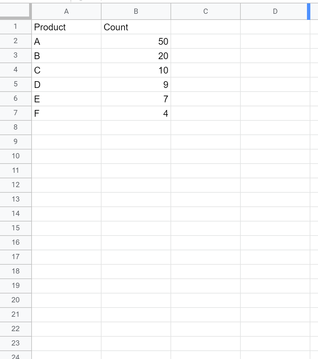
First, let’s create a fake dataset that shows the number of sales by product for some company:
Step 2: Calculate the Cumulative Frequencies
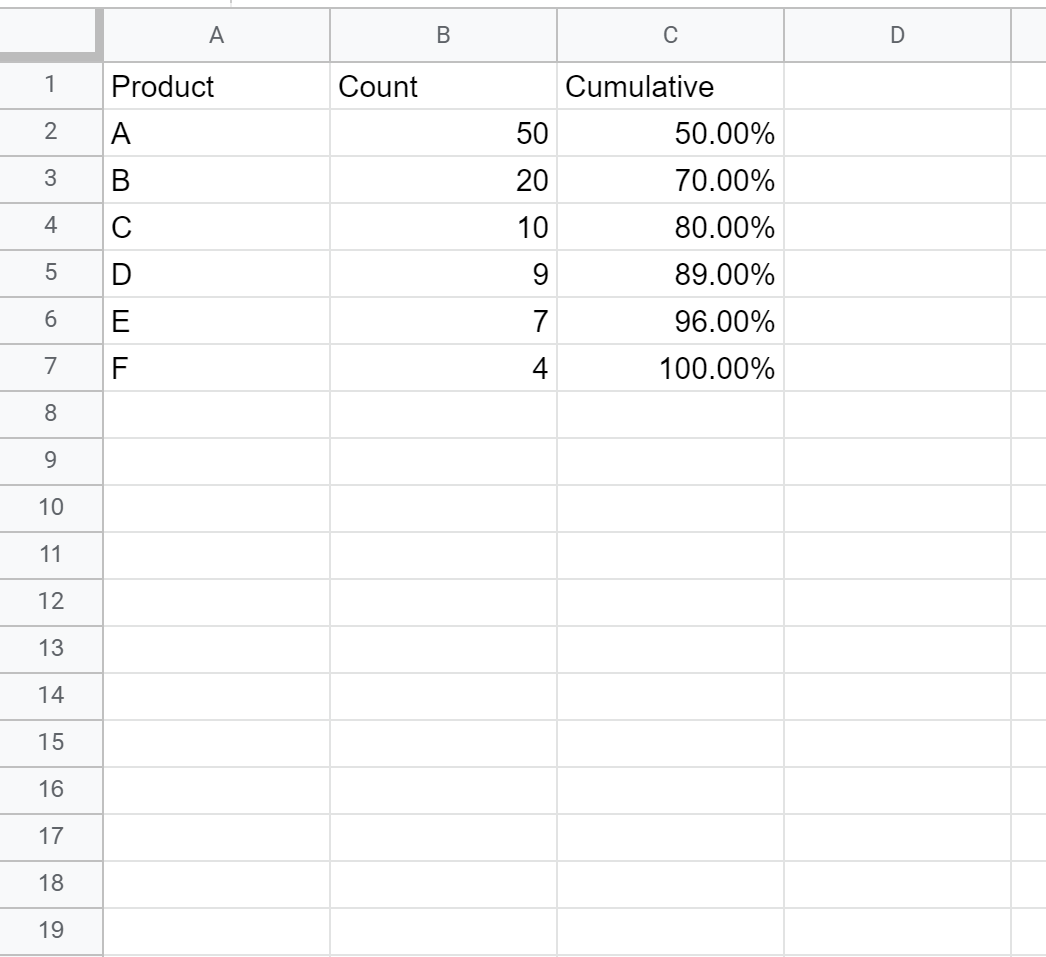
Next, type the following formula into cell C2 to calculate the cumulative frequency:
=SUM($B$2:B2)/SUM($B$2:$B$7)
Copy this formula down to each cell in column C:
Step 3: Insert Combo Chart
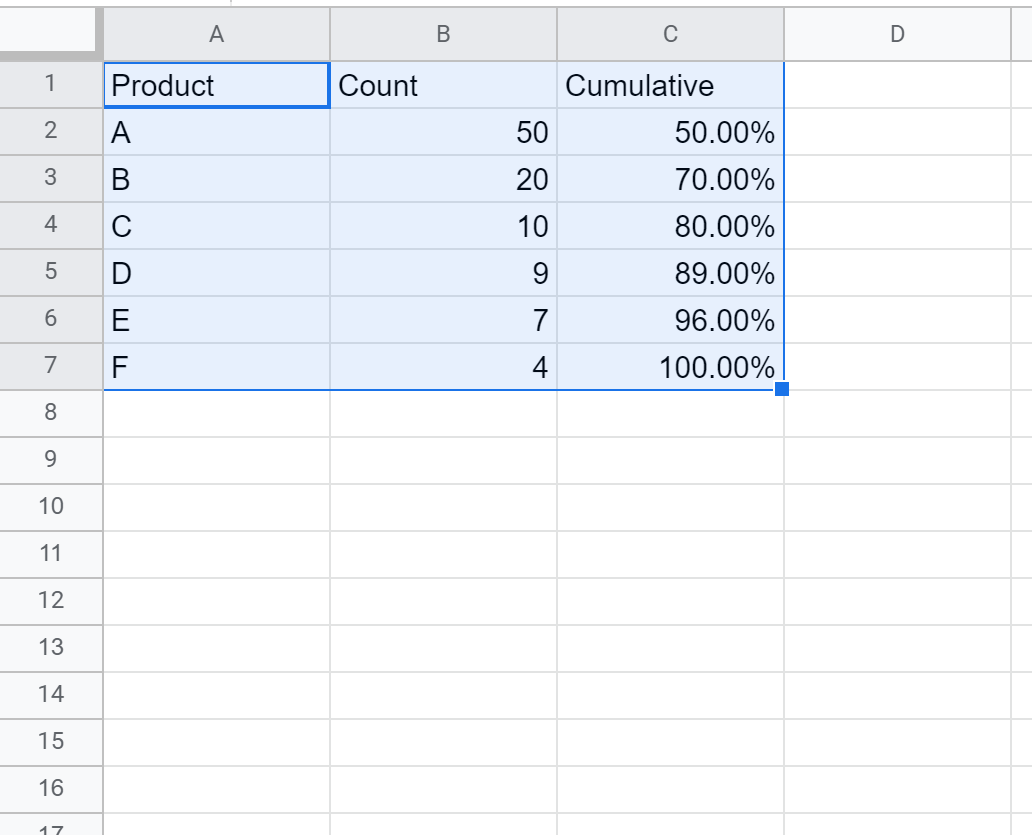
Next, highlight all three columns of data:
Click the Insert tab along the top ribbon, then click Chart in the dropdown options. This will automatically insert the following combo chart:
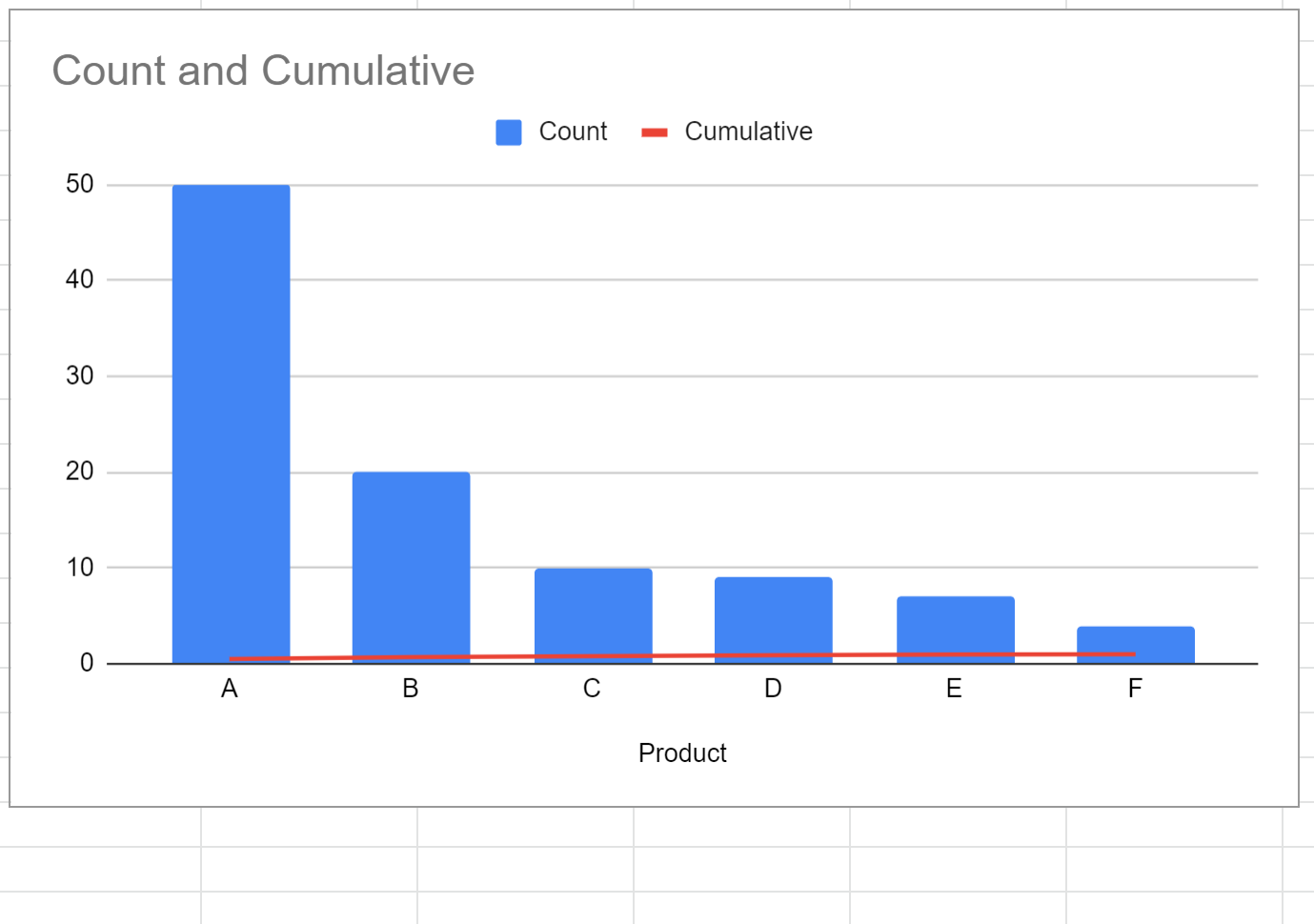
Step 4: Add a Right Y Axis
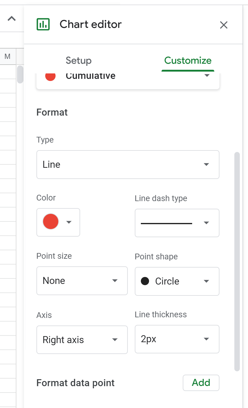
Next, right click on any of the bars in the chart. In the dropdown menu that appears, click Series and then click Cumulative.
In the menu that appears on the right, choose Right Axis under the Axis dropdown:
This will automatically add another y-axis on the right side of the chart:
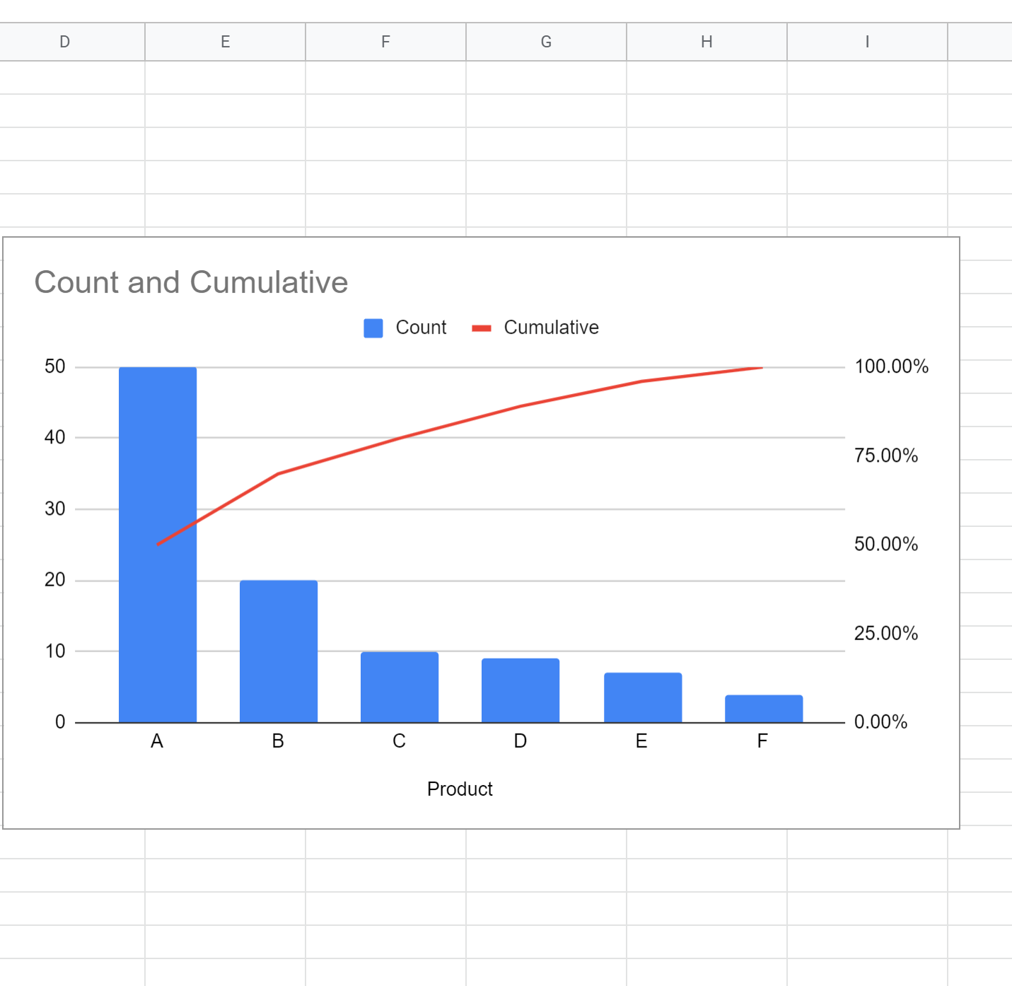
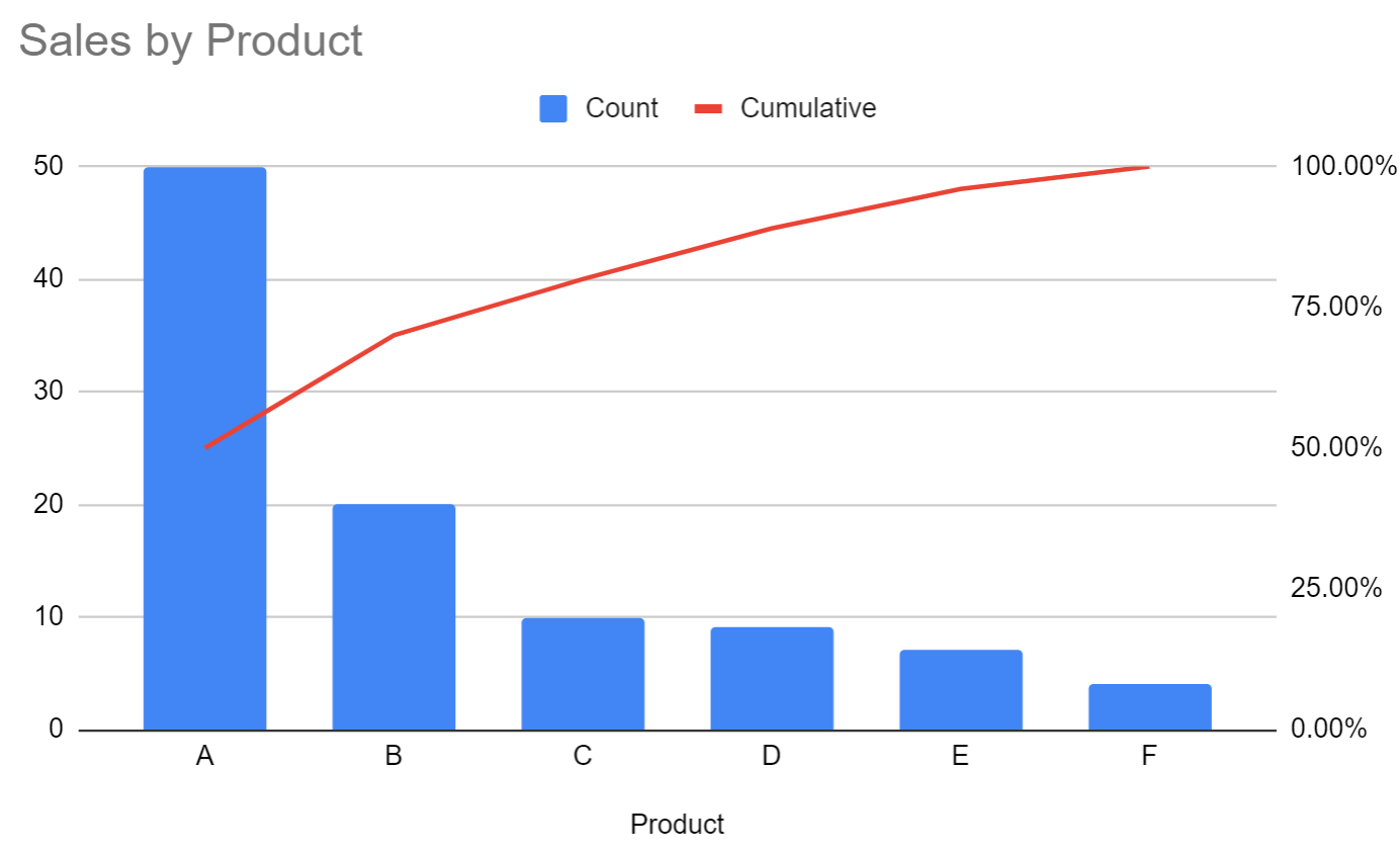
The Pareto chart is now complete. The blue bars display the individual sales of each product and the red line displays the cumulative sales of the products.
Additional Resources
How to Make a Box Plot in Google Sheets
How to Make a Bubble Chart in Google Sheets