You can use the following basic syntax to create a histogram from a pandas Series:
my_series.plot(kind='hist')
The following examples show how to use this syntax in practice.
Note: If you are using an online Python notebook and don’t see any histogram appear after using this syntax, you may need to specify %matplotlib inline first.
Example 1: Create Frequency Histogram
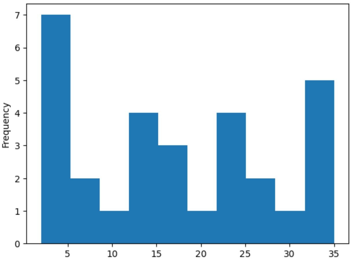
The following code shows how to create a frequency histogram from a pandas Series:
import pandas as pd

#create Series
data = pd.Series([2, 2, 2, 3, 3, 4, 5, 7, 8, 9, 12, 12, 14, 15, 16, 16, 18,
                    19, 22, 22, 22, 25, 26, 27, 30, 33, 33, 33, 34, 35])

#create histogram from Series
data.plot(kind='hist')

The x-axis displays the values for the pandas Series while the y-axis displays the frequency of each value.
Example 2: Create Density Histogram
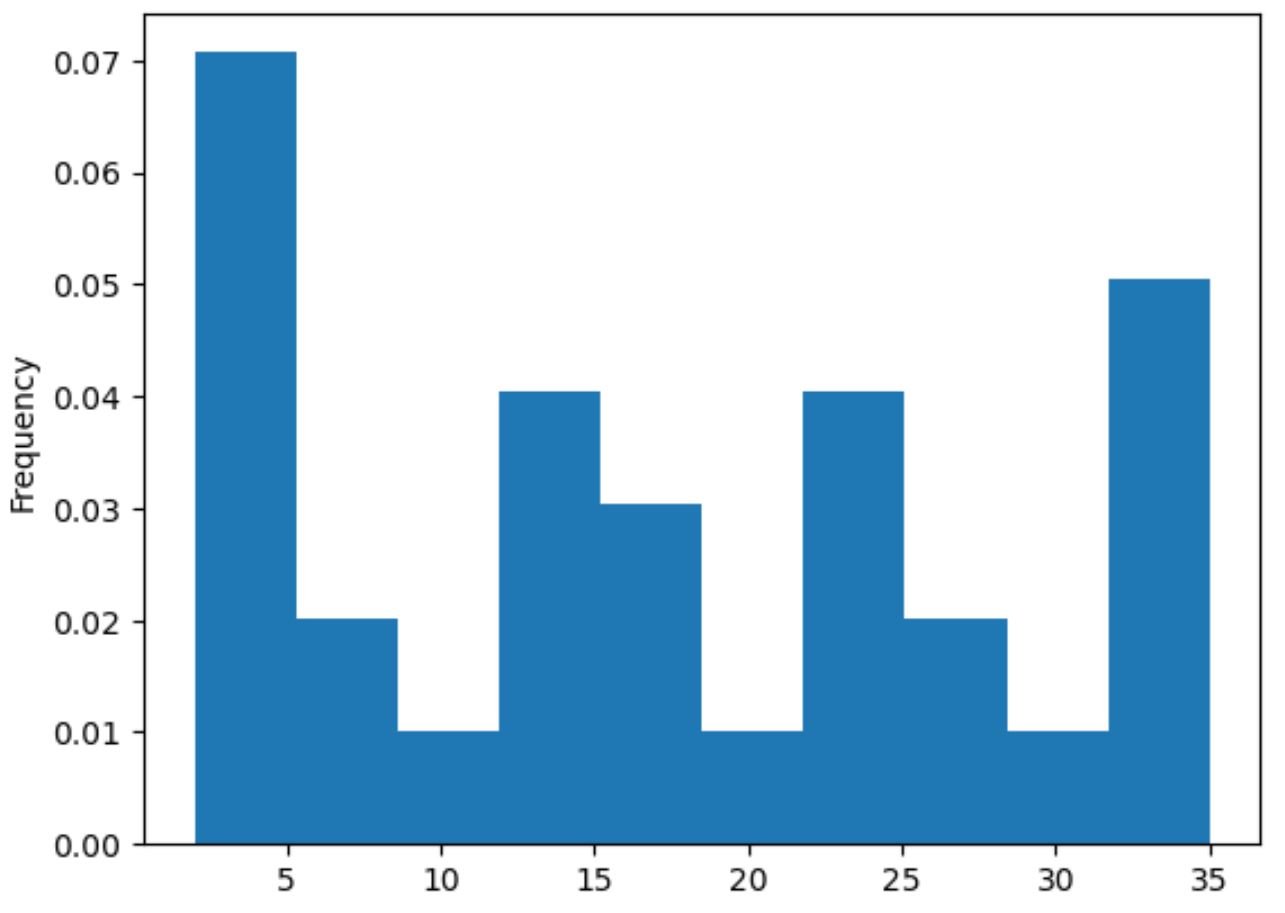
To create a density histogram from a pandas Series, we can specify density=True within the plot() function:
import pandas as pd

#create Series
data = pd.Series([2, 2, 2, 3, 3, 4, 5, 7, 8, 9, 12, 12, 14, 15, 16, 16, 18,
                    19, 22, 22, 22, 25, 26, 27, 30, 33, 33, 33, 34, 35])

#create histogram from Series
data.plot(kind='hist', density=True)

The x-axis displays the values for the pandas Series while the y-axis displays the density.
Example 3: Create Custom Histogram
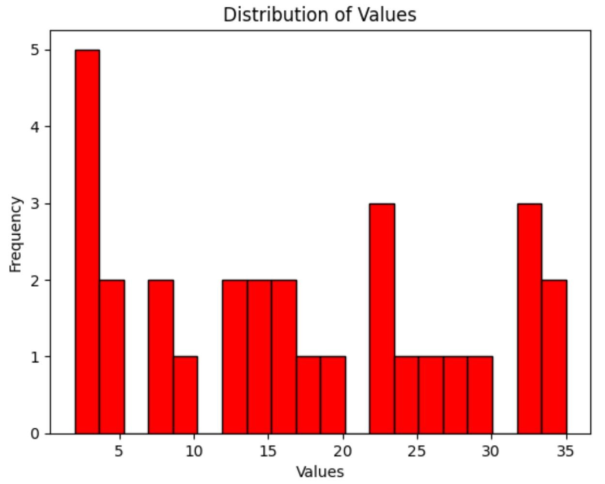
Lastly, we can use the following syntax to customize the color of the bars in the histogram, the number of bins used, the axis labels, and the plot title:
import pandas as pd

#create Series
data = pd.Series([2, 2, 2, 3, 3, 4, 5, 7, 8, 9, 12, 12, 14, 15, 16, 16, 18,
                    19, 22, 22, 22, 25, 26, 27, 30, 33, 33, 33, 34, 35])

#create histogram with custom color, edgecolor, and number of bins
my_hist = data.plot(kind='hist', color='red', edgecolor='black', bins=20)

#add x-axis label
my_hist.set_xlabel('Values')

#add title
my_hist.set_title('Distribution of Values')

Additional Resources
The following tutorials explain how to create other common plots in Python:
How to Plot Multiple Lines in Matplotlib
How to Create Boxplot from Pandas DataFrame
How to Plot Multiple Pandas Columns on Bar Chart