You can use the following basic syntax to impute missing values in a pandas DataFrame:
df['column_name'] = df['column_name'].interpolate()
The following example shows how to use this syntax in practice.
Example: Interpolate Missing Values in Pandas
Suppose we have the following pandas DataFrame that shows the total sales made by a store during 15 consecutive days:
import pandas as pd
import numpy as np

#create DataFrame
df = pd.DataFrame({'day': [1, 2, 3, 4, 5, 6, 7, 8, 9, 10, 11, 12, 13, 14, 15],
                   'sales': [3, 6, 8, 10, 14, 17, 20, np.nan, np.nan, np.nan,
                             np.nan, 35, 39, 44, 49]})

#view DataFrame
print(df)

    day  sales
0     1    3.0
1     2    6.0
2     3    8.0
3     4   10.0
4     5   14.0
5     6   17.0
6     7   20.0
7     8    NaN
8     9    NaN
9    10    NaN
10   11    NaN
11   12   35.0
12   13   39.0
13   14   44.0
14   15   49.0
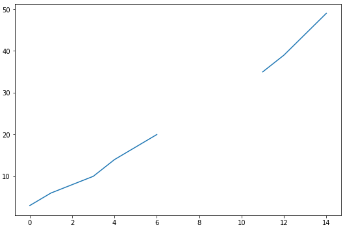
Notice that we’re missing sales numbers for four days in the data frame.
If we create a simple line chart to visualize the sales over time, here’s what it would look like:
#create line chart to visualize sales
df['sales'].plot()

To fill in the missing values, we can use the interpolate() function as follows:
#interpolate missing values in 'sales' column
df['sales'] = df['sales'].interpolate()

#view DataFrame
print(df)

    day  sales
0     1    3.0
1     2    6.0
2     3    8.0
3     4   10.0
4     5   14.0
5     6   17.0
6     7   20.0
7     8   23.0
8     9   26.0
9    10   29.0
10   11   32.0
11   12   35.0
12   13   39.0
13   14   44.0
14   15   49.0
Notice that each of the missing values has been replaced.
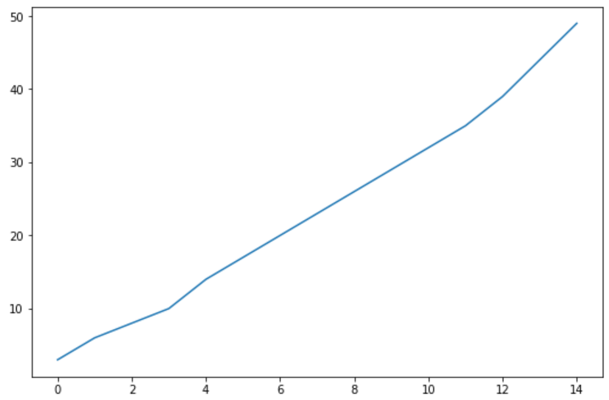
If we create another line chart to visualize the updated data frame, here’s what it would look like:
#create line chart to visualize sales
df['sales'].plot()

Notice that the values chosen by the interpolate() function seem to fit the trend in the data quite well.
Note: You can find the complete documentation for the interpolate() function here.
Additional Resources
The following tutorials provide additional information on how to handle missing values in pandas:
How to Count Missing Values in Pandas
How to Replace NaN Values with String in Pandas
How to Replace NaN Values with Zero in Pandas