You can use the following syntax to create a bar plot from a GroupBy function in pandas:
#calculate sum of values by group
df_groups = df.groupby(['group_var'])['values_var'].sum()

#create bar plot by group
df_groups.plot(kind='bar')
The following example shows how to use this syntax in practice.
Example: Create Bar Plot from GroupBy in Pandas
Suppose we have the following pandas DataFrame that shows the points scored by basketball players on various teams:
import pandas as pd

#create DataFrame
df = pd.DataFrame({'team': ['A', 'A', 'A', 'A', 'A',
                            'B', 'B', 'B', 'B', 'B',
                            'C', 'C', 'C', 'C', 'C'],
                   'points': [12, 29, 34, 14, 10, 11, 7, 36,
                              34, 22, 41, 40, 45, 36, 38]})

#view first five rows of DataFrame
df.head()

	team	points
0	A	12
1	A	29
2	A	34
3	A	14
4	A	10
We can use the following syntax to calculate the sum of points scored by each team and create a bar plot to visualize the sum for each team:
import matplotlib.pyplot as plt

#calculate sum of points for each team
df.groupby('team')['points'].sum()

#create bar plot by group
df_groups.plot(kind='bar')
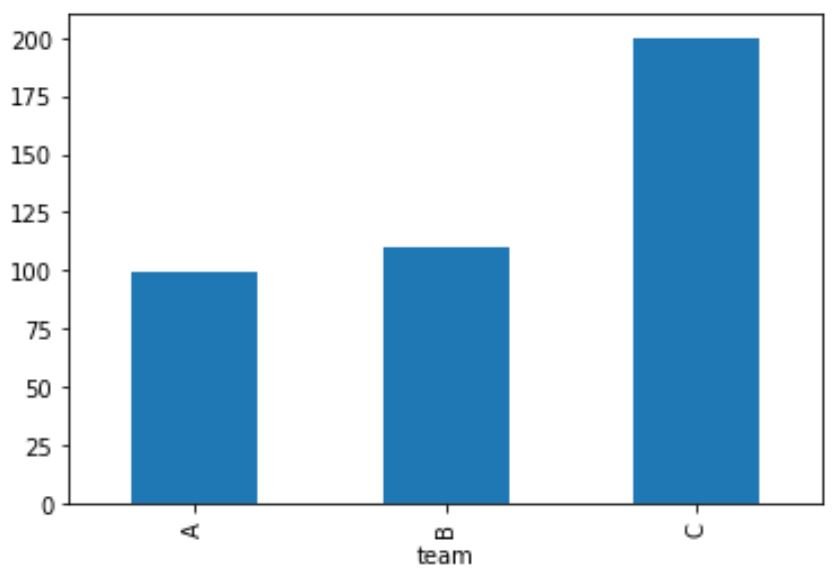
The x-axis shows the name of each team and the y-axis shows the sum of the points scored by each team.
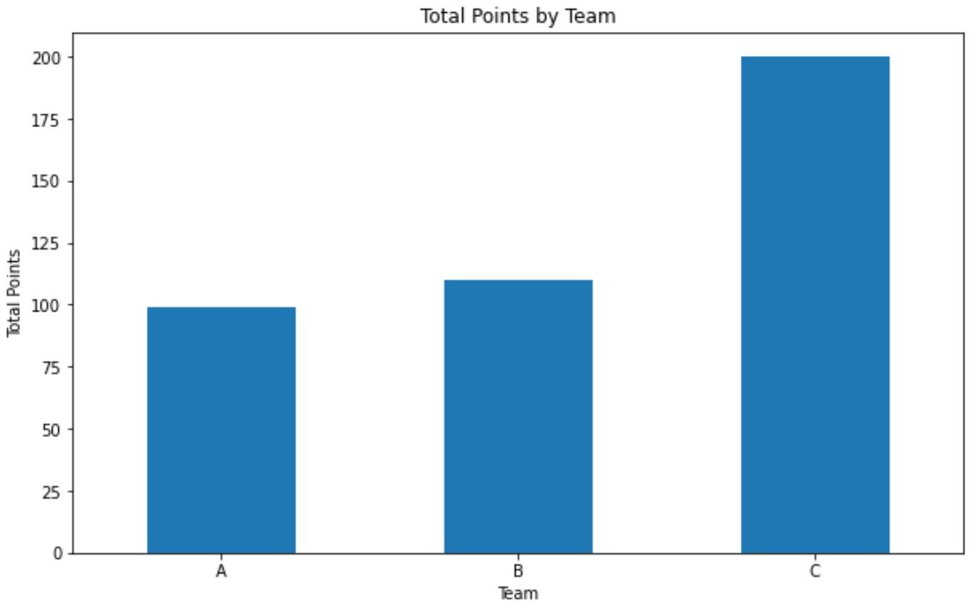
We can also use the following code to make the plot look a bit better:
import matplotlib.pyplot as plt

#calculate sum of points for each team
df_groups = df.groupby(['team'])['points'].sum()

#create bar plot with custom aesthetics
df_groups.plot(kind='bar', title='Total Points by Team',
               ylabel='Total Points', xlabel='Team', figsize=(10, 6))

#rotate x-axis ticks vertically
plt.xticks(rotation=0)
Note: You can find the complete documentation for the GroupBy function here.
Additional Resources
The following tutorials explain how to perform other common operations in pandas:
Pandas: How to Count Unique Values by Group
Pandas: How to Calculate Mode by Group
Pandas: How to Calculate Correlation By Group