In statistics, multidimensional scaling is a way to visualize the similarity of observations in a dataset in an abstract cartesian space (usually a 2-D space).
The easiest way to perform multidimensional scaling in Python is by using the MDS() function from the sklearn.manifold sub-module.
The following example shows how to use this function in practice.
Example: Multidimensional Scaling in Python
Suppose we have the following pandas DataFrame that contains information about various basketball players:
import pandas as pd

#create DataFrane
df = pd.DataFrame({'player': ['A', 'B', 'C', 'D', 'E', 'F', 'G', 'H', 'I', 'J', 'K'],
                   'points': [4, 4, 6, 7, 8, 14, 16, 19, 25, 25, 28],
                   'assists': [3, 2, 2, 5, 4, 8, 7, 6, 8, 10, 11],
                   'blocks': [7, 3, 6, 7, 5, 8, 8, 4, 2, 2, 1],
                   'rebounds': [4, 5, 5, 6, 5, 8, 10, 4, 3, 2, 2]})

#set player column as index column
df = df.set_index('player')

#view Dataframe
print(df)

        points  assists  blocks  rebounds
player
A            4        3       7         4
B            4        2       3         5
C            6        2       6         5
D            7        5       7         6
E            8        4       5         5
F           14        8       8         8
G           16        7       8        10
H           19        6       4         4
I           25        8       2         3
J           25       10       2         2
K           28       11       1         2
We can use the following code to perform multidimensional scaling with the MDS() function from the sklearn.manifold module:
from sklearn.manifold import MDS

#perform multi-dimensional scaling
mds = MDS(random_state=0)
scaled_df = mds.fit_transform(df)

#view results of multi-dimensional scaling
print(scaled_df)

[[  7.43654469   8.10247222]
 [  4.13193821  10.27360901]
 [  5.20534681   7.46919526]
 [  6.22323046   4.45148627]
 [  3.74110999   5.25591459]
 [  3.69073384  -2.88017811]
 [  3.89092087  -5.19100988]
 [ -3.68593169  -3.0821144 ]
 [ -9.13631889  -6.81016012]
 [ -8.97898385  -8.50414387]
 [-12.51859044  -9.08507097]]
Each row from the original DataFrame has been reduced to an (x, y) coordinate.
We can use the following code to visualize these coordinates in a 2-D space:
import matplotlib.pyplot as plt

#create scatterplot
plt.scatter(scaled_df[:,0], scaled_df[:,1])

#add axis labels
plt.xlabel('Coordinate 1')
plt.ylabel('Coordinate 2')

#add lables to each point
for i, txt in enumerate(df.index):
    plt.annotate(txt, (scaled_df[:,0][i]+.3, scaled_df[:,1][i]))

#display scatterplot
plt.show()
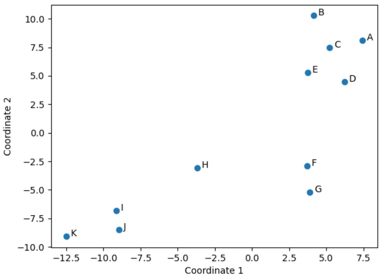
Players from the original DataFrame who have similar values across the original four columns (points, assists, blocks, and rebounds) are located close to each other in the plot.
For example, players F and G are located close to each other. Here are their values from the original DataFrame:
#select rows with index labels 'F' and 'G'
df.loc[['F', 'G']]

        points	assists	blocks	rebounds
player
F	14	8	8	8
G	16	7	8	10
Their values for points, assists, blocks, and rebounds are all fairly similar, which explains why they’re located so close together in the 2-D plot.
By contrast, consider players B and K who are located far apart in the plot.
If we refer to their values in the original DataFrame, we can see that they’re quite different:
#select rows with index labels 'B' and 'K'
df.loc[['B', 'K']]

        points	assists	blocks	rebounds
player
B	4	2	3	5
K	28	11	1	2
Thus, the 2-D plot is a nice way to visualize how similar each players are across all of the variables in the DataFframe.
Players who have similar stats are grouped close together while players who have very different stats are located far apart from each other in the plot.
Additional Resources
The following tutorials explain how to perform other common tasks in Python:
How to Normalize Data in Python
How to Remove Outliers in Python
How to Test for Normality in Python