You can use the following syntax to add a legend to a scatterplot in Matplotlib:
import matplotlib.pyplot as plt
from matplotlib.colors import ListedColormap

#define values, classes, and colors to map
values = [0, 0, 1, 2, 2, 2]
classes = ['A', 'B', 'C']
colors = ListedColormap(['red', 'blue', 'purple'])

#create scatterplot
scatter = plt.scatter(x, y, c=values, cmap=colors)

#add legend
plt.legend(*scatter.legend_elements())
The following examples show how to use this syntax in practice.
Example 1: Scatterplot Legend with Values
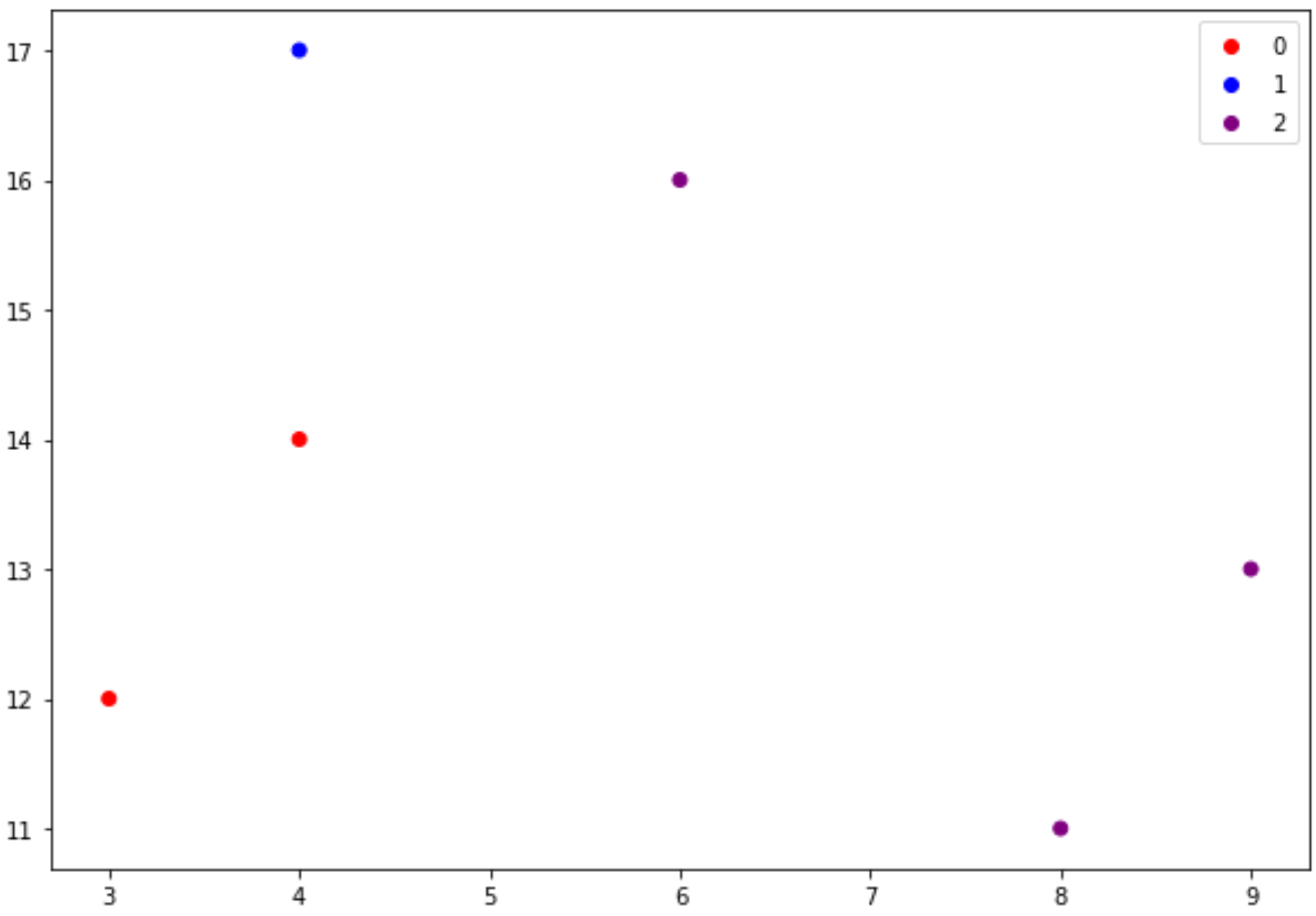
The following example shows how to create a scatterplot where the legend displays values:
import matplotlib.pyplot as plt
from matplotlib.colors import ListedColormap

#define data
x = [3, 4, 4, 6, 8, 9]
y = [12, 14, 17, 16, 11, 13]

#define values, classes, and colors to map
values = [0, 0, 1, 2, 2, 2]
classes = ['A', 'B', 'C']
colors = ListedColormap(['red', 'blue', 'purple'])

#create scatterplot
scatter = plt.scatter(x, y, c=values, cmap=colors)

#add legend with values
plt.legend(*scatter.legend_elements())

Example 2: Scatterplot Legend with Classes
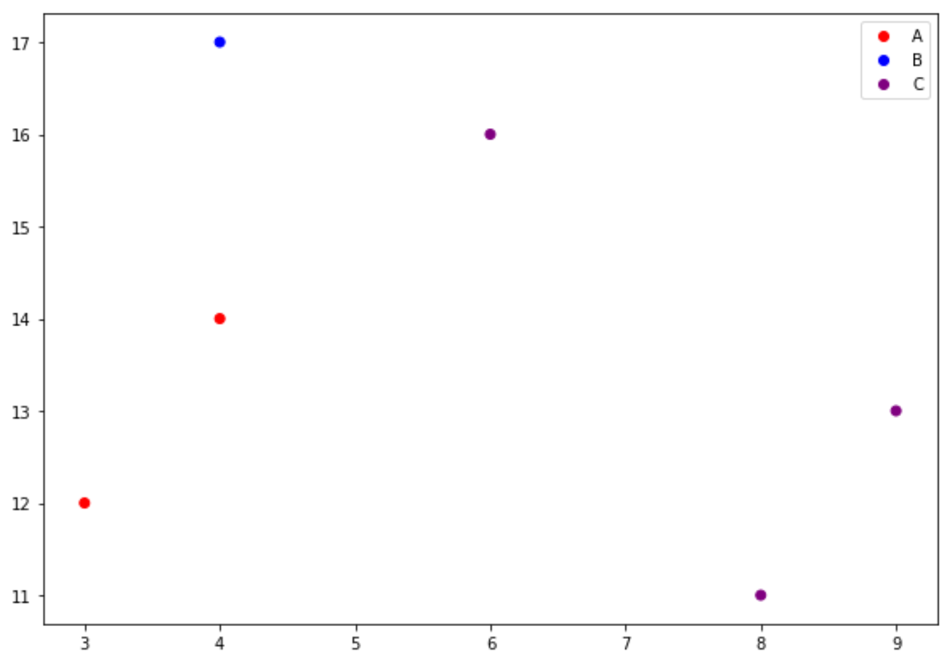
The following example shows how to create a scatterplot where the legend displays class names:
import matplotlib.pyplot as plt
from matplotlib.colors import ListedColormap

#define data
x = [3, 4, 4, 6, 8, 9]
y = [12, 14, 17, 16, 11, 13]

#define values, classes, and colors to map
values = [0, 0, 1, 2, 2, 2]
classes = ['A', 'B', 'C']
colors = ListedColormap(['red', 'blue', 'purple'])

#create scatterplot
scatter = plt.scatter(x, y, c=values, cmap=colors)

#add legend with class names
plt.legend(handles=scatter.legend_elements()[0], labels=classes)

Notice that this legend displays the class names that we specified (A, B, C) as opposed to the values (0, 1, 2) that we specified.
Additional Resources
How to Increase Plot Size in Matplotlib
How to Adjust Title Position in Matplotlib
How to Set Axis Ranges in Matplotlib