Named after American economist Max Lorenz, the Lorenz curve is a way to visualize the income distribution of a population.
This tutorial provides a step-by-step example of how to create the following Lorenz curve in Excel:
Let’s jump in!
Step 1: Enter the Data
First, we must enter values for two columns: the cumulative population and cumulative income of individuals in a certain country:

Here’s how to interpret the values:
- The bottom 20% of individuals in this country account for 10% of the total income.
- The bottom 50% of individuals in this country account for 31% of the total income.
- The bottom 60% of individuals in this country account for 40% of the total income.
- 100% of individuals in this country account for 100% of the total income.
Next, we’ll enter the (x, y) values for the line of equality that we will eventually add to the graph:

Step 2: Create Basic Lorenz Curve
Next, highlight the values in cells A2:B6 and then click the Insert tab along the top ribbon, then click the Scatter with Smooth Lines option in the Charts group:

The following chart will automatically be created:

Next, right click anywhere on the chart and click the option that says Select Data.
In the window that appears, click Add under Legend Entries:

Click the Add button, then enter the following information:

Once you click OK, the diagonal line of equality will automatically be added to the plot:

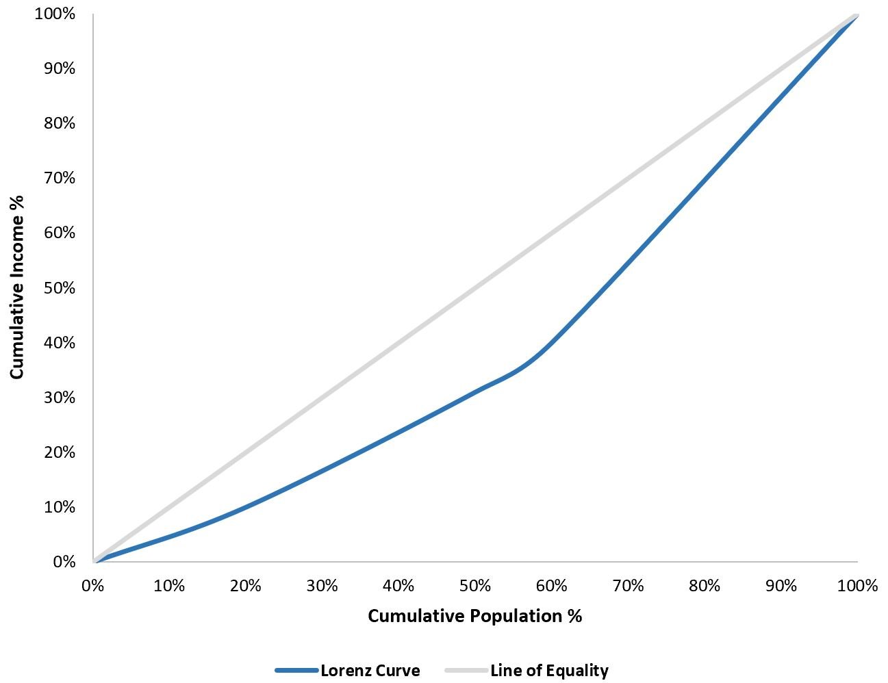
The basic Lorenz curve is complete. The blue line represents the Lorenz curve and the orange line represents the line of equality.
Step 3: Customize Lorenz Curve
Lastly, we can customize the appearance of the chart.
Click on the green plus (+) sign in the top right corner of the chart, then click Legend, then click Bottom:

A legend will be added to the bottom of the chart.
Next, click on the gridlines in the chart and delete them.
Then, click on each individual line and change the color to whatever you’d like.
Then, add an axis title to both the x-axis and y-axis.
The end result will look something like this: