A stacked bar chart is a type of chart that uses bars divided into a number of sub-bars to visualize the values of multiple variables at once.

The following step-by-step example shows how to create a stacked bar chart in Google Sheets.
Step 1: Enter Data
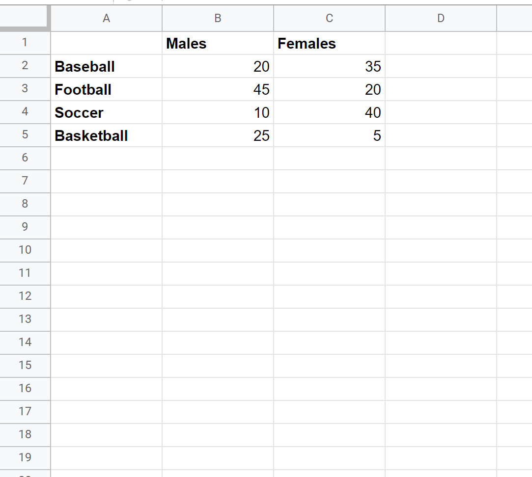
Suppose we send out a survey and ask 100 males and 100 females to choose their favorite sport between baseball, football, soccer, and basketball.
We can first enter the results of the survey in the following format:
Step 2: Create Stacked Bar Chart
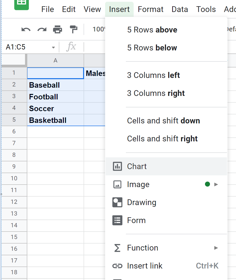
To create a stacked bar chart to visualize this data, we can highlight the cells in the range A1:C5 and then click Insert and then click Chart:
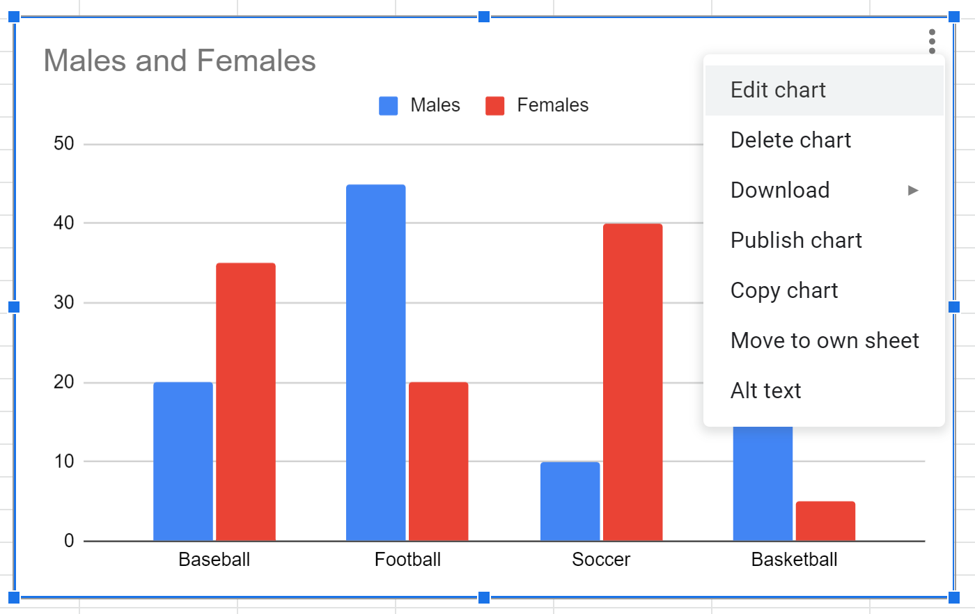
A clustered bar chart will automatically appear.
To turn this into a stacked bar chart, click anywhere on the chart and then click on the three vertical dots in the top right corner, then click Edit:
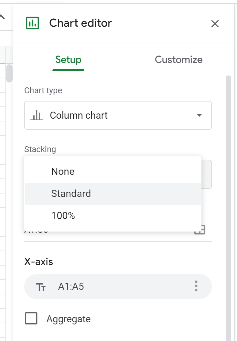
In the Chart editor panel that appears on the right side of the screen, click the Stacking dropdown menu, then click Standard:
The chart will automatically be converted into a stacked bar chart:
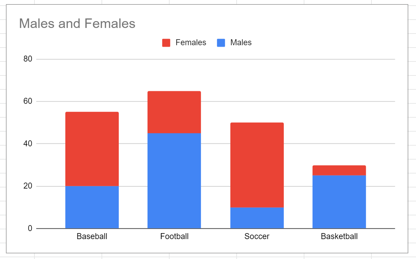
The x-axis displays the sports and the y-axis shows how many males and females chose each sport as their favorite.
Note: If you’d like each bar to add up to 100%, click the option that says 100% in the Stacking dropdown menu instead.
Step 3: Modify the Stacked Bar Chart
Feel free to click on individual elements in the chart to modify their appearance.
For example, we can change the title, the colors of the bars, and the location of the legend:
Additional Resources
The following tutorials explain how to create other common visualizations in Google Sheets:
How to Create a Box Plot in Google Sheets
How to Create a Pie Chart in Google Sheets
How to Create a Bubble Chart in Google Sheets
How to Add Error Bars to Charts in Google Sheets