The following step-by-step tutorial explains how to create the following gauge charts in Google Sheets:
Step 1: Enter the Data
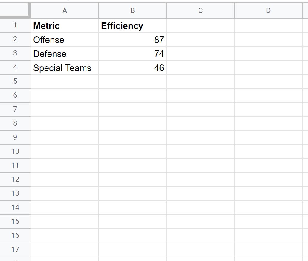
First, let’s enter the following data for three metrics for some football team:
Step 2: Create the Gauge Chart
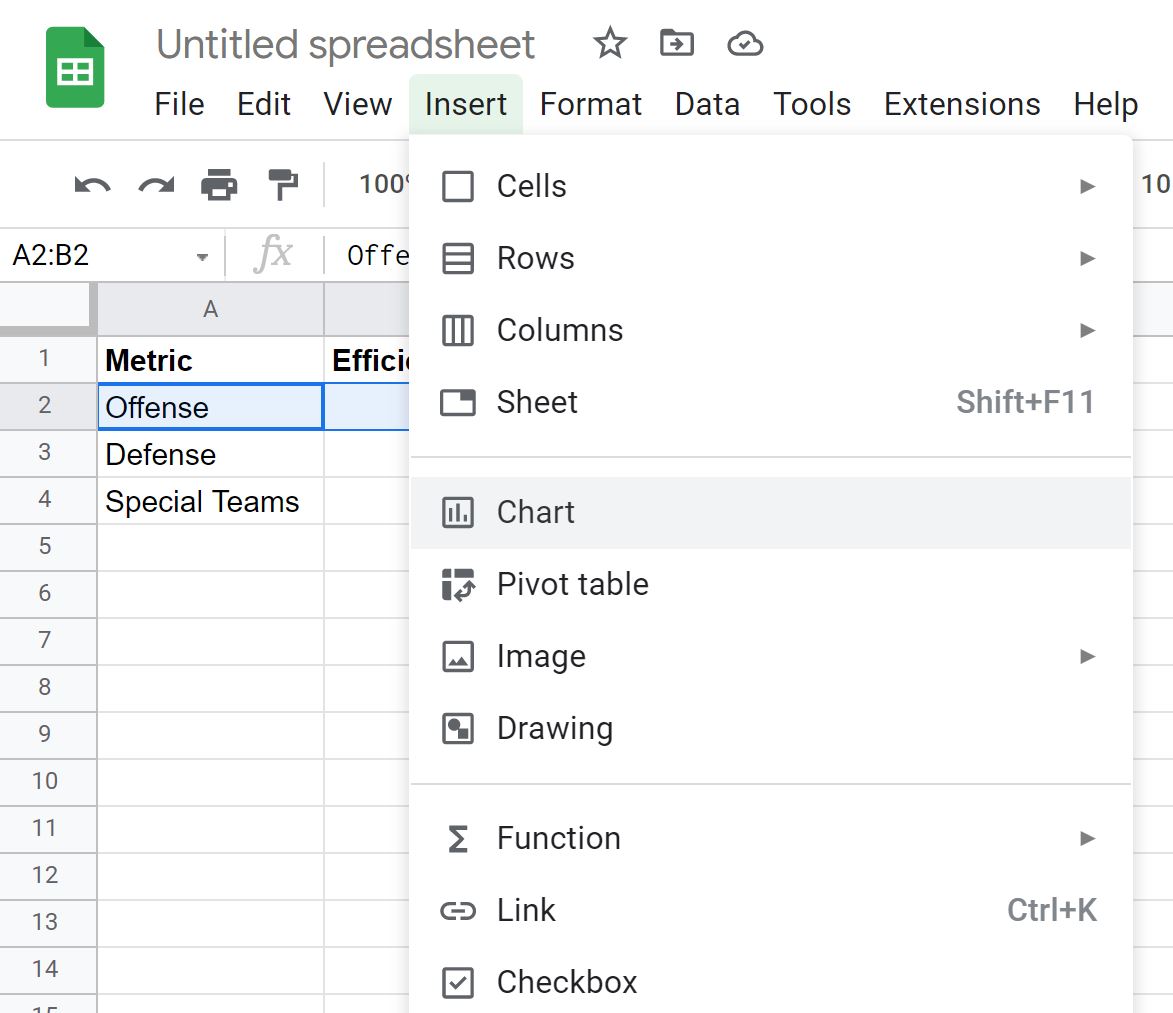
To create a gauge chart for the Offense metric, simply highlight the cell range A2:B2 and then click the Insert tab along the top ribbon and then click Chart:
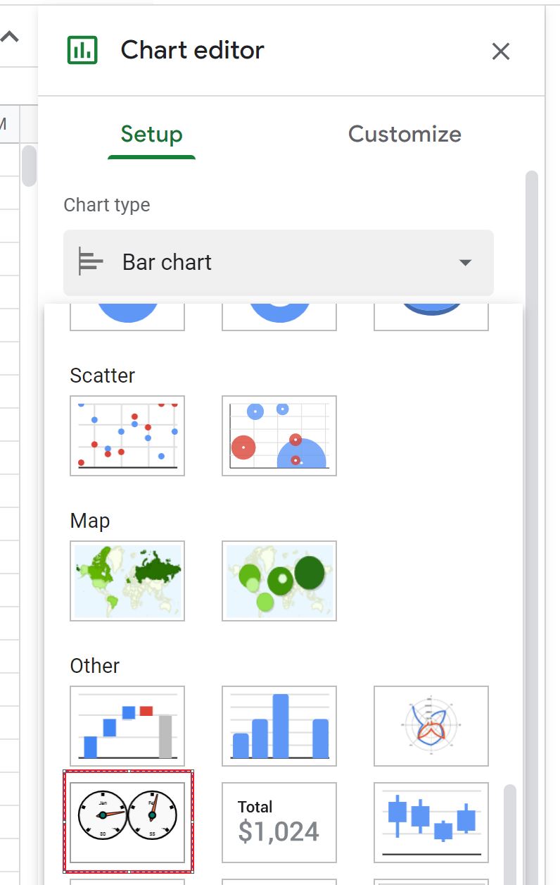
In the Chart editor panel that appears on the right side of the screen, click the dropdown menu for Chart type and click on the option titled Gauge chart:
The following gauge chart will automatically be created:
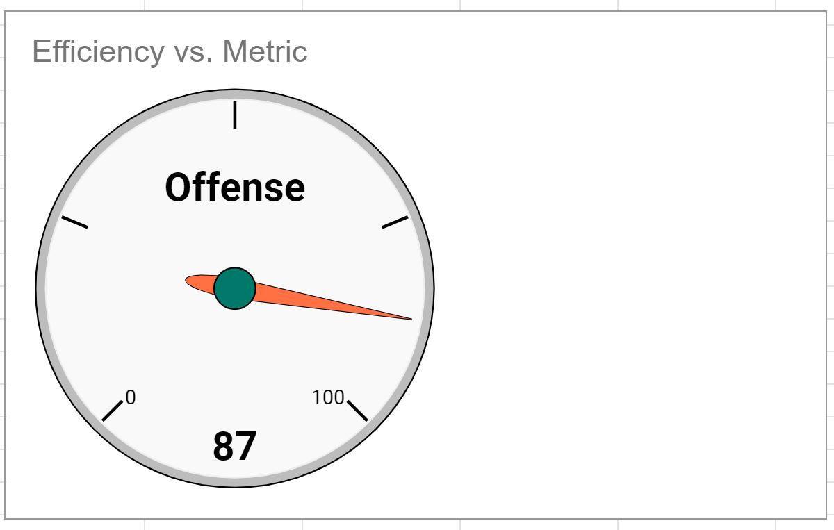
Step 3: Modify the Gauge Chart
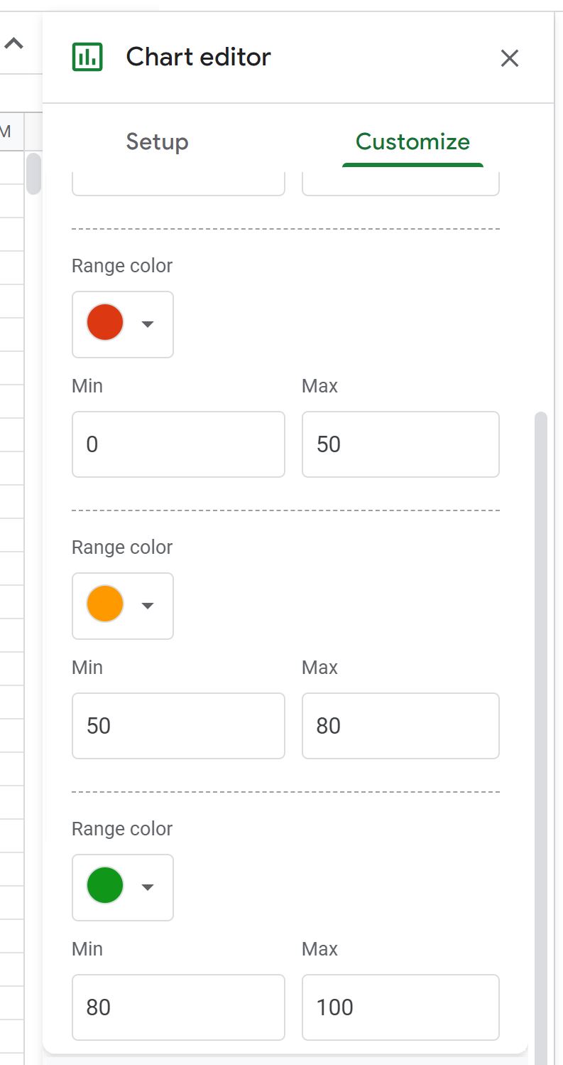
To modify the colors of the gauge chart, click the Customize tab within the Chart editor, then click the dropdown arrow next to Gauge and then specify the colors to use for various maximum and minimum values on the gauge chart:
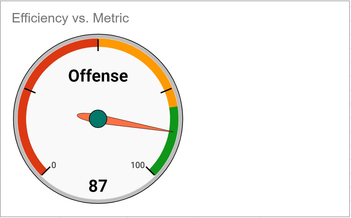
The colors on the gauge chart will automatically be updated:
Step 4: Create Multiple Gauge Charts (Optional)
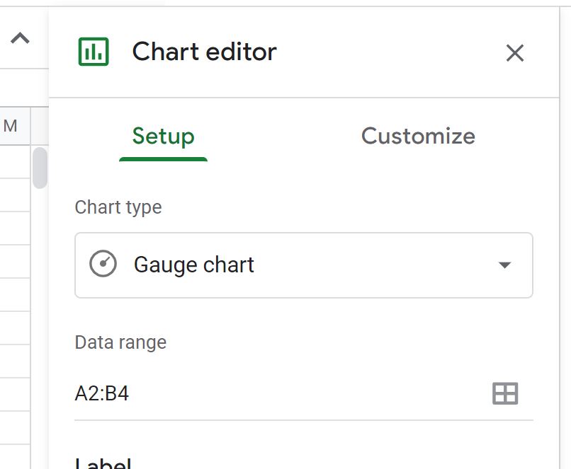
To create multiple gauge charts, simply change the Data range in the Chart editor.
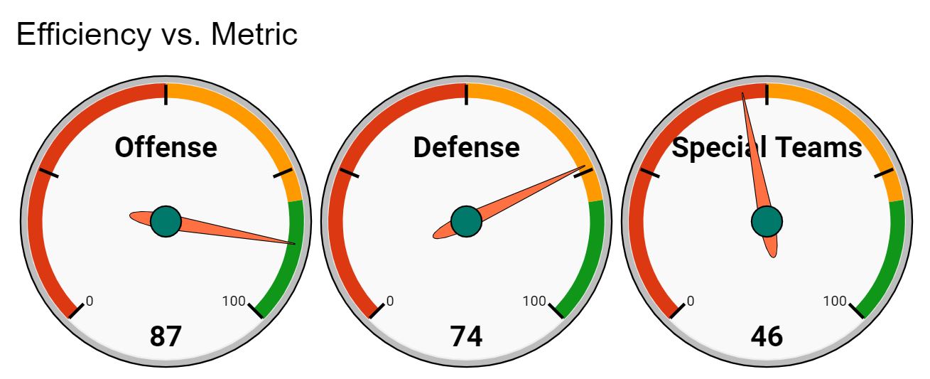
For example, we can change the Data range to A2:B4 to create one gauge chart for each metric:
The following gauge charts will automatically be created:
Additional Resources
The following tutorials explain how to create other common visualizations in Google Sheets:
How to Make a Box Plot in Google Sheets
How to Create a Stacked Bar Chart in Google Sheets
How to Create a Dot Plot in Google Sheets