Often you may want to add custom data labels to charts in Google Sheets.
Fortunately this is easy to do using the Add labels feature in Google Sheets.
The following example shows how to use this function in practice.
Example: Add Custom Data Labels in Google Sheets
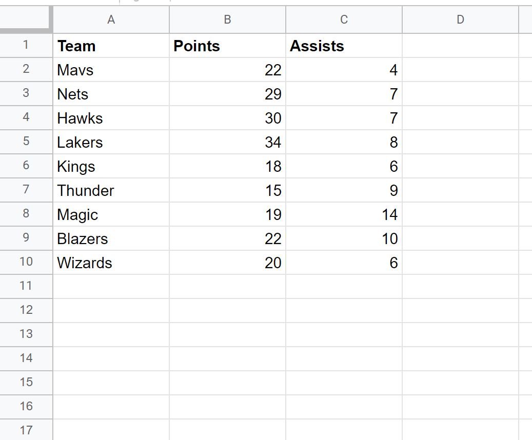
Suppose we have the following dataset that shows the points and assists of basketball players on various teams:
Now suppose we would like to create a scatter plot with custom labels.
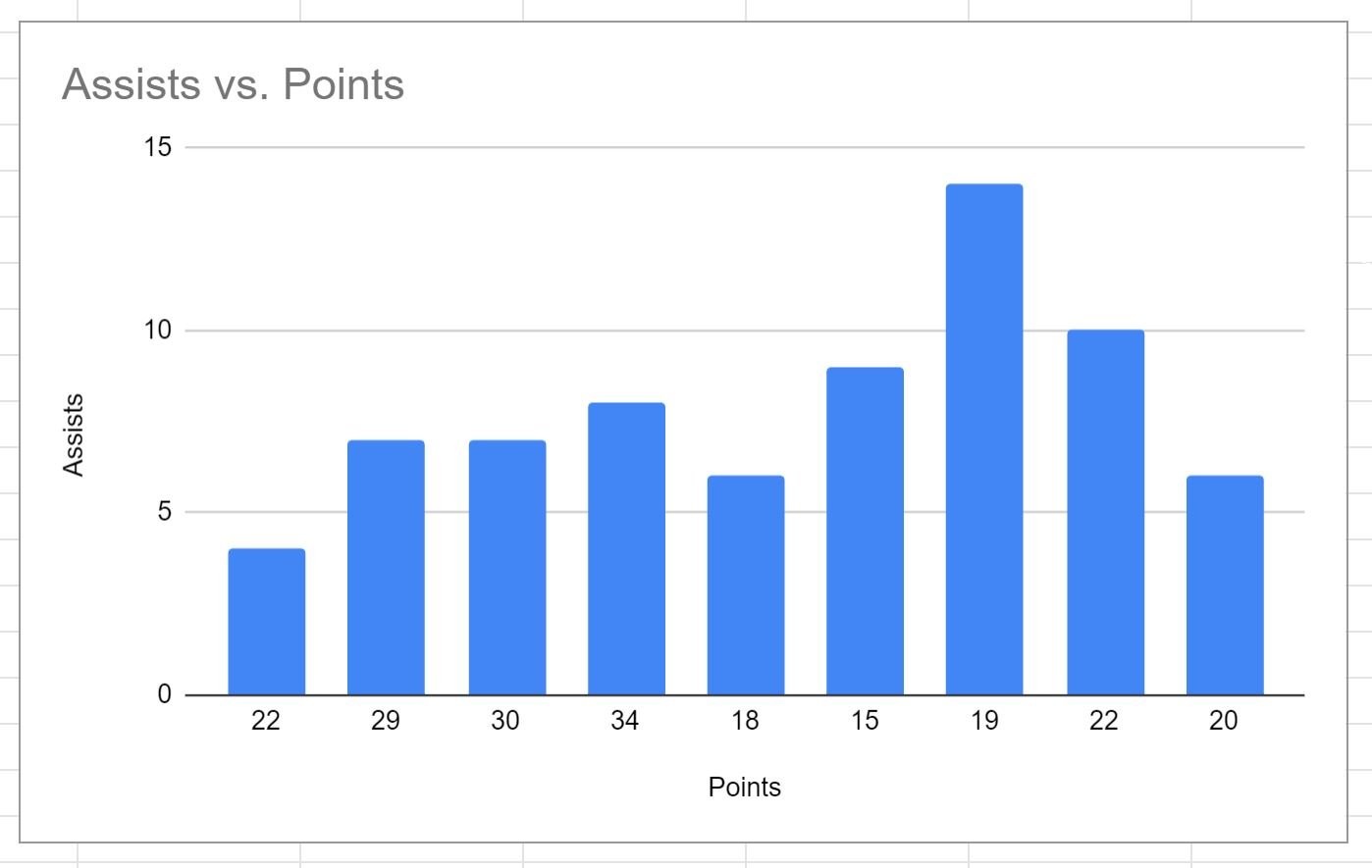
We can highlight the cells in the range B2:C10, then click the Insert tab along the top ribbon, then click Chart
The following bar chart will appear:
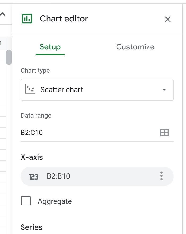
To convert this into a scatter plot, double click anywhere on the chart.
In the Chart editor panel that appears, click the Setup tab, then choose Scatter chart from the dropdown list under Chart type:
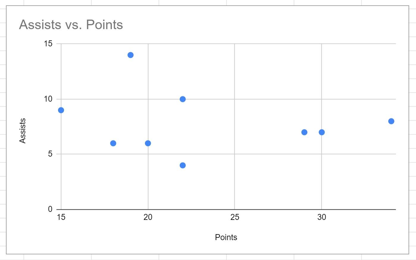
The bar chart will be converted into a scatter plot:
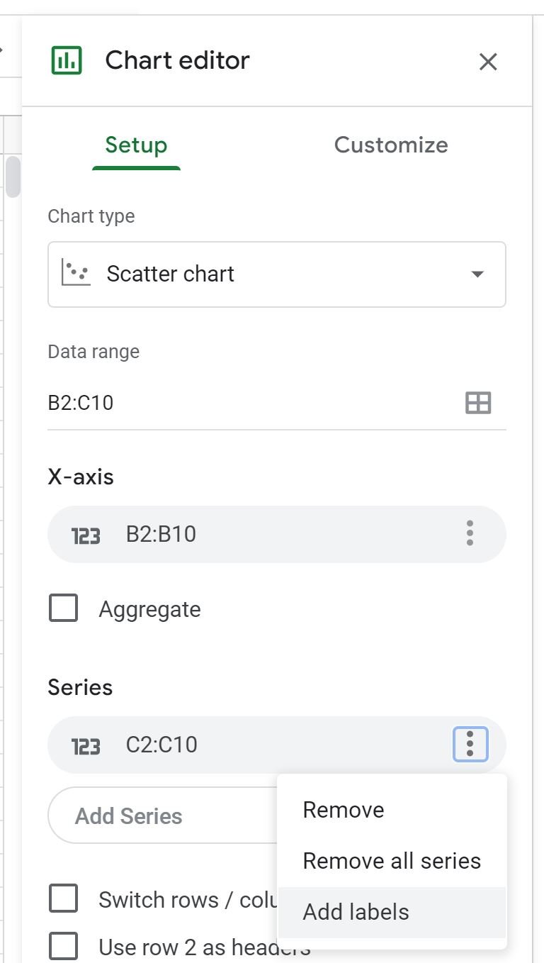
To add custom data labels to each point, click the three vertical dots under Series and then click Add labels from the dropdown menu:
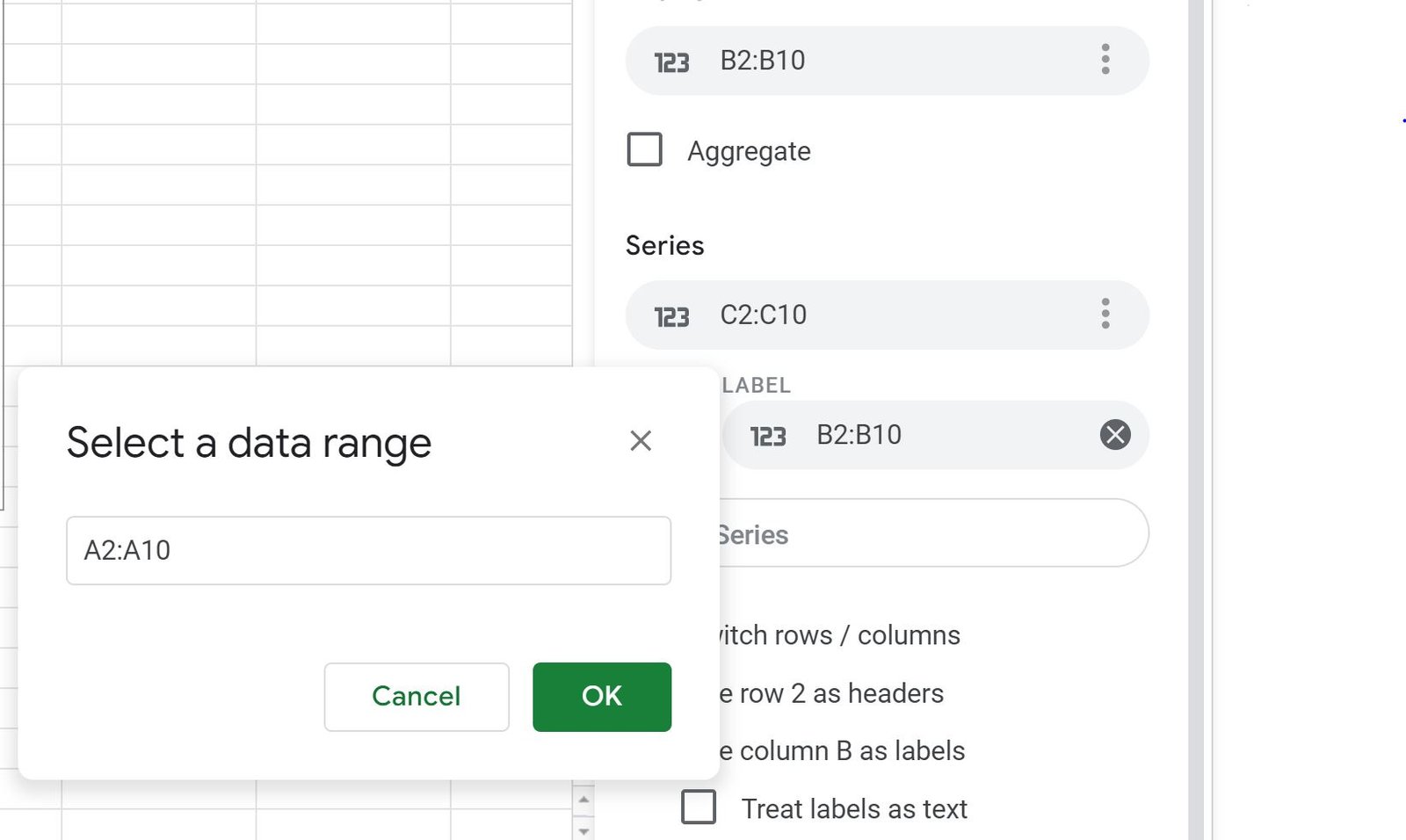
Then click the Label box and then click the tiny icon that says Select a data range, then type A2:A10:
Once you click OK, the team names in the range A2:A10 will be used as data labels for each of the points in the plot:
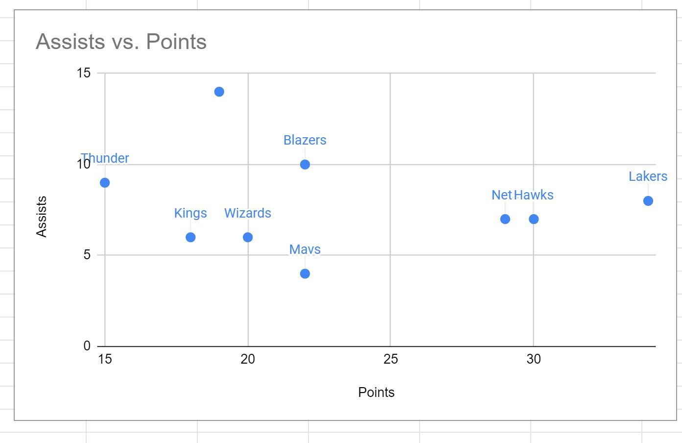
Note that if you change the values in the range A2:A10, the data labels in the plot will automatically change as well.
Additional Resources
The following tutorials explain how to perform other common tasks in Google Sheets:
How to Change Axis Scales in Google Sheets Plots
How to Add Axis Labels in Google Sheets
How to Add a Second Y-Axis in Google Sheets