This tutorial provides a step-by-step example of how to change the axis scales on a plot in Google Sheets.
Step 1: Enter the Data
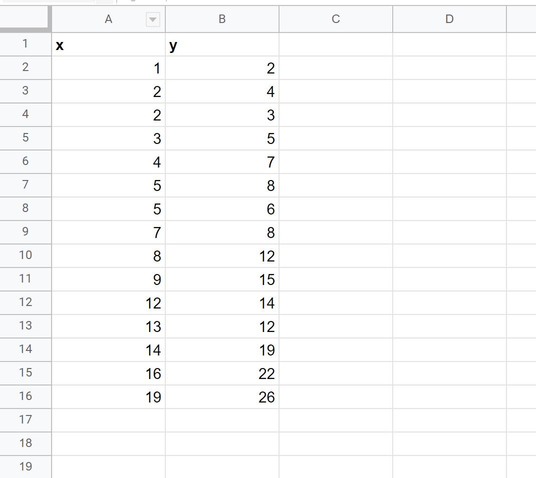
First, let’s enter a simple dataset into Google Sheets:
Step 2: Create Plot
Next, highlight the cells in the range A2:B16. Then click the Insert tab along the top ribbon and then click Chart.
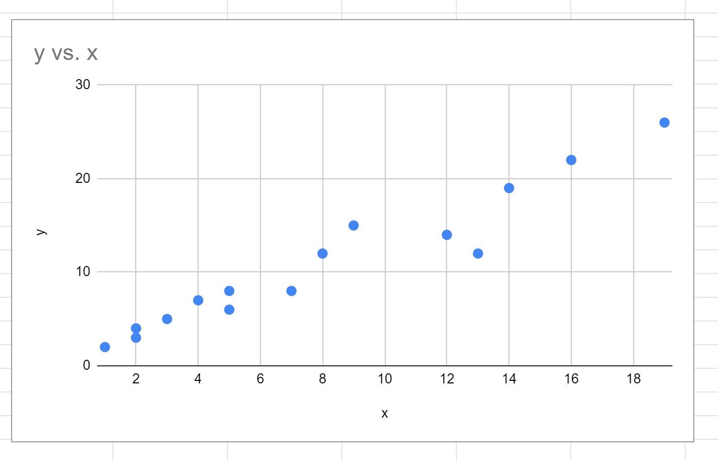
The following scatterplot will be created:
Step 3: Change the Axis Scales
By default, Google Sheets will choose a scale for the x-axis and y-axis that ranges roughly from the minimum to maximum values in each column.
To change the scale of the x-axis, simply double click any value on the x-axis.
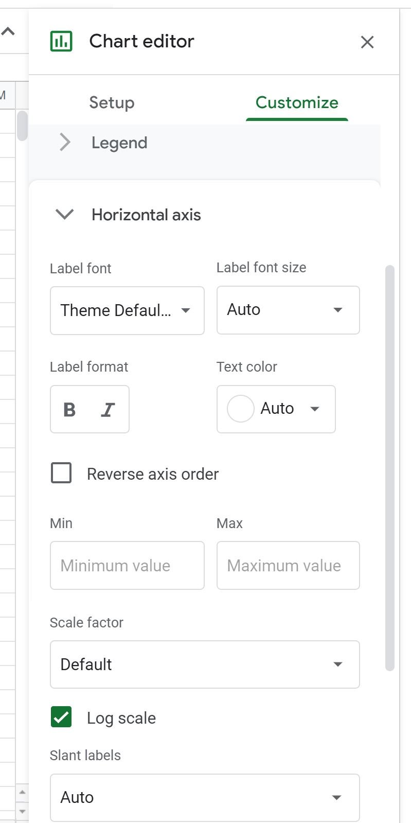
This will bring up the Chart editor panel on the right side of the screen.
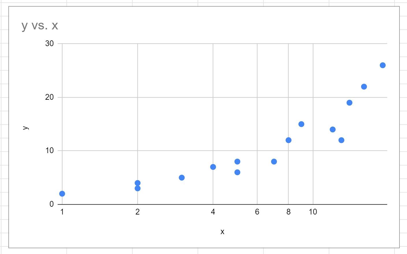
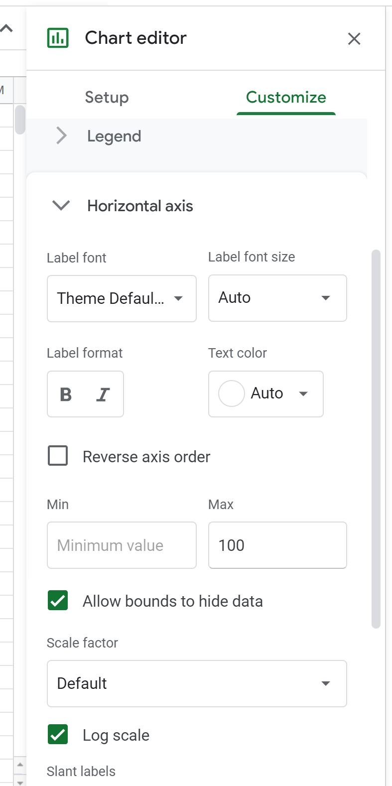
Within this panel you can click the Customize tab, then click the dropdown arrow next to Horizontal axis, then check the box next to Log scale to convert the x-axis to a logarithmic scale:
The x-axis will automatically be converted to a logarithmic scale:
Related: When Should You Use a Log Scale in Charts?
You can also change the range of values for the x-axis.
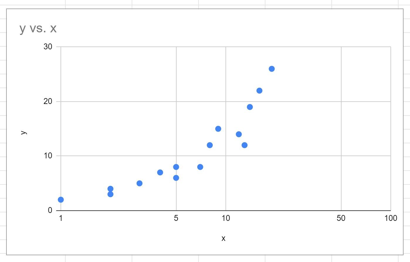
For example, we could choose to make the maximum value on the x-axis equal to 100:
The x-axis on the chart will automatically be updated:
Note that in this example, we chose to change only the x-axis scale.
However, we can just as easily change the y-axis scale by clicking the dropdown arrow next to Vertical axis within the Customize tab of the Chart editor panel and performing the same steps as above.
Additional Resources
The following tutorials explain how to perform other common tasks in Google Sheets:
How to Add Axis Labels in Google Sheets
How to Plot Multiple Lines in Google Sheets
How to Add Labels to Scatterplot Points in Google Sheets