Often you may want to add or modify axis labels on charts in Google Sheets.
Fortunately this is easy to do using the Chart editor panel.
The following step-by-step example shows how to use this panel to add axis labels to a chart in Google Sheets.
Step 1: Enter the Data
First, let’s enter some values for a dataset that shows the total sales by year at some company:

Step 2: Create the Chart
To create a chart to visualize the sales by year, highlight the values in the range A1:B11. Then click the Insert tab and then click Chart:

By default, Google Sheets will insert a line chart:

Notice that Year is used for the x-axis label and Sales is used for the y-axis label.
Step 3: Modify Axis Labels on Chart
To modify the axis labels, click the three vertical dots in the top right corner of the plot, then click Edit chart:

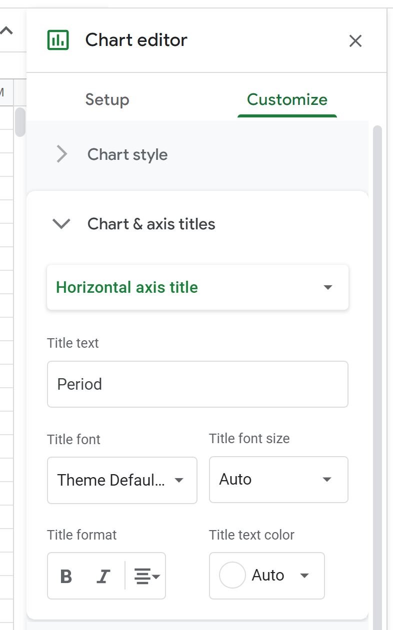
In the Chart editor panel that appears on the right side of the screen, use the following steps to modify the x-axis label:
- Click the Customize tab.
- Then click the Chart & axis titles dropdown.
- Then choose Horizontal axis title.
- Then type whatever you’d like in the Title text box.
For example, we could type “Period” for the title text:
The x-axis will automatically be modified on the chart:

Repeat this process to change the y-axis label, except choose Vertical axis title in the dropdown menu:
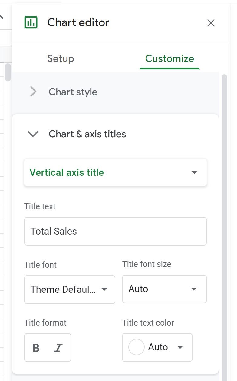
The y-axis label will automatically be modified on the chart:

The x-axis label is now Period and the y-axis label is now Total Sales.
Additional Resources
The following tutorials explain how to perform other common tasks in Google Sheets:
How to Create a Box Plot in Google Sheets
How to Create a Bubble Chart in Google Sheets
How to Create a Pie Chart in Google Sheets
How to Create a Pareto Chart in Google Sheets