You can use the following methods to create a violin plot in ggplot2:
Method 1: Create Violin Plots by Group
ggplot(df, aes(x=group_var, y=values_var, fill=group_var)) +
  geom_violin() +
Method 2: Create Horizontal Violin Plots by Group
ggplot(df, aes(x=group_var, y=values_var, fill=group_var)) +
  geom_violin() +
  coord_flip()
Method 3: Create Violin Plots by Group and Display Median Value
ggplot(df, aes(x=group_var, y=values_var, fill=group_var)) +
  geom_violin() +
  stat_summary(fun=median, geom='point', size=2)
The following examples show how to use each method in practice with the following data frame in R:
#make this example reproducible
set.seed(1)

#create data frame
df frame(team=rep(c('A', 'B', 'C'), each=100),
                 points=c(rnorm(100, mean=10),
                          rnorm(100, mean=15),
                          rnorm(100, mean=20)))

#view head of data frame
head(df)

  team    points
1    A  9.373546
2    A 10.183643
3    A  9.164371
4    A 11.595281
5    A 10.329508
6    A  9.179532
Note: We used the set.seed() function to ensure that this example is reproducible.
Example 1: Create Violin Plots by Group
We can use the following syntax to create violin plots that show the distribution of the points variable, grouped by the team variable:
library(ggplot2)

#create violin plot to visualize distribution of points by team
ggplot(df, aes(x=team, y=points, fill=team)) +
  geom_violin()

The x-axis displays each team and the y-axis displays the distribution of points scored by each team.
Example 2: Create Violin Plots by Group
To create horizontal violin plots that show the distribution of the points variable, grouped by the team variable, simply add the coord_flip() function:
library(ggplot2)

#create horizontal violin plots to visualize distribution of points by team
ggplot(df, aes(x=team, y=points, fill=team)) +
  geom_violin() +
  coord_flip()
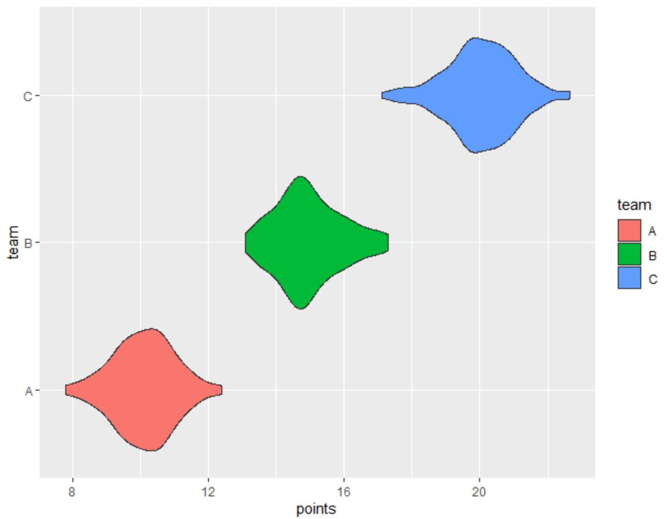
The y-axis displays each team and the x-axis displays the distribution of points scored by each team.
Example 3: Create Violin Plots by Group and Display Median Value
The following code shows how to create violin plots that show the distribution of the points variable, grouped by the team variable, with the median points value represented as a circle:
library(ggplot2)

#create violin plots and display median points value as circle
ggplot(df, aes(x=team, y=points, fill=team)) +
  geom_violin() +
  stat_summary(fun=median, geom='point', size=2)
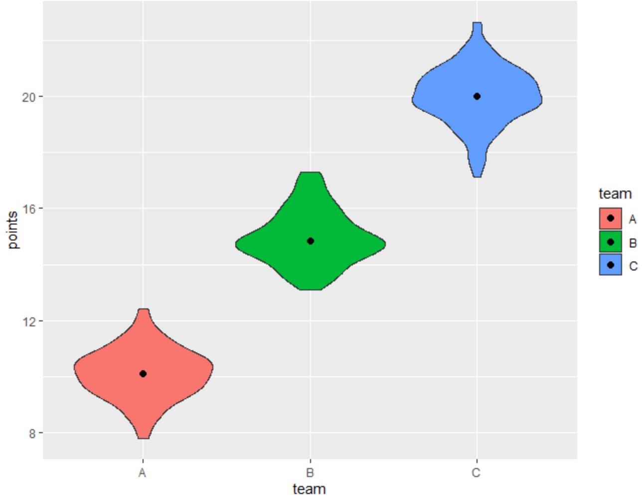
The median points value for each team is represented as a tiny circle inside each violin plot.
Note: To increase the size of the circle, simply increase the value for the size argument within the stat_summary() function.
Additional Resources
The following tutorials explain how to perform other common tasks in ggplot2:
How to Change Font Size in ggplot2
How to Remove a Legend in ggplot2
How to Rotate Axis Labels in ggplot2