Often you may want to add tables to plots made in ggplot2 in R so that readers can view the raw data along with the plot.
Fortunately it’s easy to add tables to plots using the ggpmisc package:
install.packages('ggpmisc')
library(ggpmisc)
The following examples show how to use this package to add a table to a barplot and a scatterplot using the following data frame:
#create data frame
df frame(team=c('A', 'A', 'A', 'A', 'B', 'B', 'B', 'B'),
                 position=c('G', 'G', 'F', 'F', 'G', 'G', 'F', 'F'),
                 points=c(13, 23, 24, 20, 19, 14, 29, 31))

#view data frame
df

  team position points
1    A        G     13
2    A        G     23
3    A        F     24
4    A        F     20
5    B        G     19
6    B        G     14
7    B        F     29
8    B        F     31
Example 1: Add Table to Barplot in ggplot2
We can use the following code to created a grouped barplot in ggplot2 and add a table to the bottom right corner of the plot to shows the actual values from the data frame:
library(ggplo2)
library(ggpmisc)

#create barplot with table
ggplot(df, aes(x=team, y=points, fill=position)) +
    geom_bar(position='dodge', stat='identity') +
    annotate(geom = 'table',
           x=4,
           y=0,
           label=list(df))

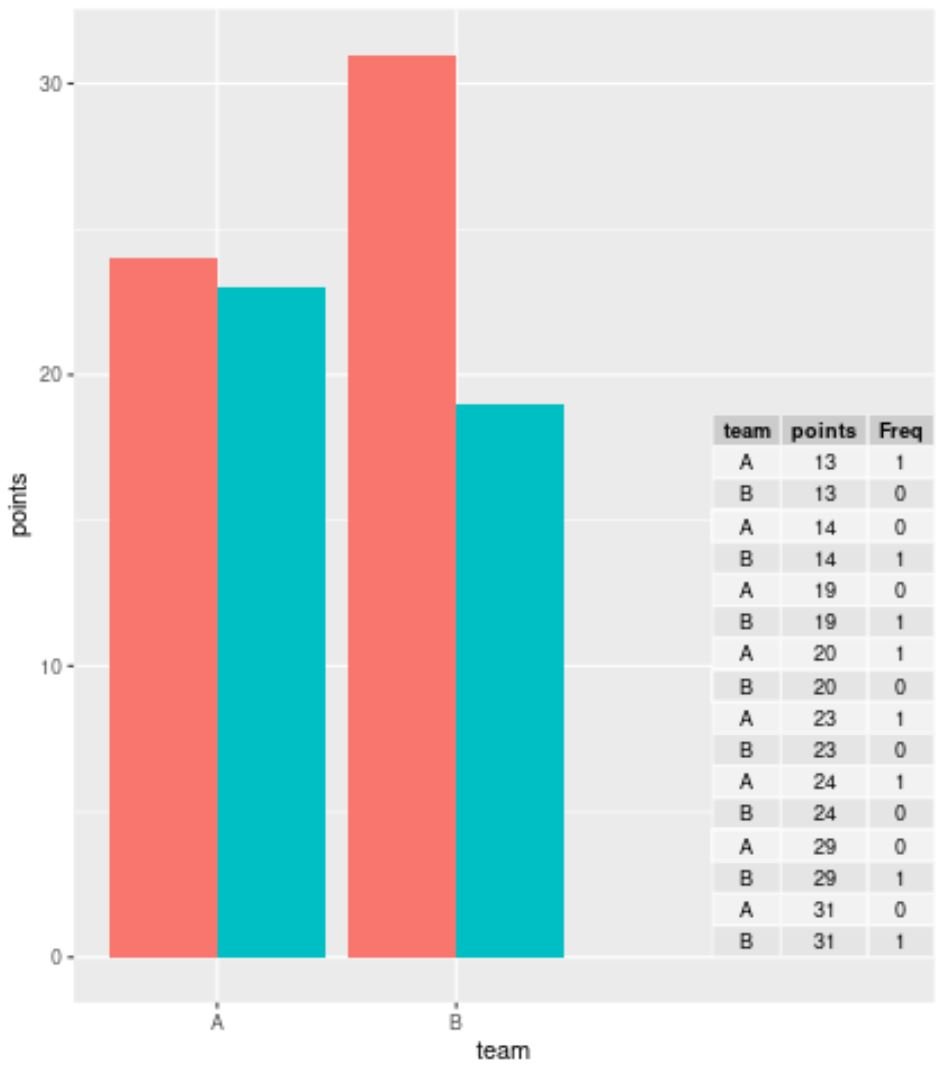
If you’re working with a large dataset and you don’t want to display each individual row, you can use the table() function to summarize the data before creating the table in ggplot2:
library(ggplot2)
library(ggpmisc)

#summarize frequencies of team and points in table
my_table data.frame(table(df[ , c(1, 3)]))

#create barplot with table
ggplot(df, aes(x=team, y=points, fill=position)) +
    geom_bar(position='dodge', stat='identity') +
    annotate(geom = 'table',
           x=4,
           y=0,
           label=list(my_table))
Example 2: Add Table to Scatterplot in ggplot2
We can use the following code to created a scatterplot in ggplot2 and add a table to the bottom right corner of the plot to shows the actual values from the data frame:
library(ggplo2)
library(ggpmisc)

#create scatterplot with table
ggplot(df, aes(x=team, y=points)) +
    geom_point(aes(color=position)) +
    annotate(geom='table',
           x=4,
           y=0,
           label=list(df))

Note: Feel free to play around with the x and y values within the annotate() function to place the table in the exact location that you’d like.
Additional Resources
The following tutorials explain how to perform other common tasks in ggplot2:
How to Add Text to ggplot2 Plots
How to Change Title Position in ggplot2
How to Change Order of Items in ggplot2 Legend