You can use the following basic syntax to order the items on the x-axis of a plot in ggplot2:
ggplot(df, aes(x=factor(x_var, level=c('value1', 'value2', 'value3')), y=y_var)) +
  geom_col()
The following examples show how to use this syntax in practice.
Example: Order Items on x-axis in ggplot2
Suppose we have the following data frame in R that shows the points scored by various basketball teams:
#create data frame
df frame(team=c('Mavs', 'Heat', 'Nets', 'Lakers'),
                 points=c(100, 122, 104, 109))

#view data frame
df

    team points
1   Mavs    100
2   Heat    122
3   Nets    104
4 Lakers    109
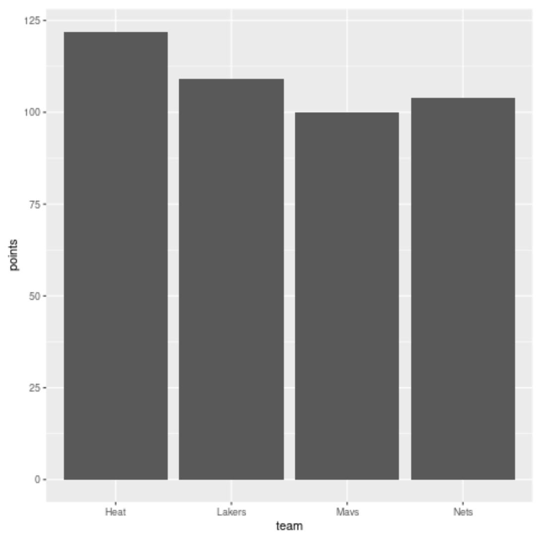
If we create a bar plot to visualize the points scored by each team, ggplot2 will automatically order the bars in alphabetical order:
library(ggplot2)

#create bar plot
ggplot(df, aes(x=team, y=points)) +
  geom_col()
To specify an order for the bars on the x-axis, we can use the level argument as follows:
library(ggplot2)

#create bar plot with specific axis order
ggplot(df, aes(x=factor(team, level=c('Mavs', 'Heat', 'Nets', 'Lakers')), y=points)) +
  geom_col()
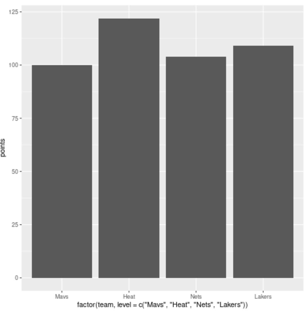
The bars are now in the exact order that we specified inside the level argument.
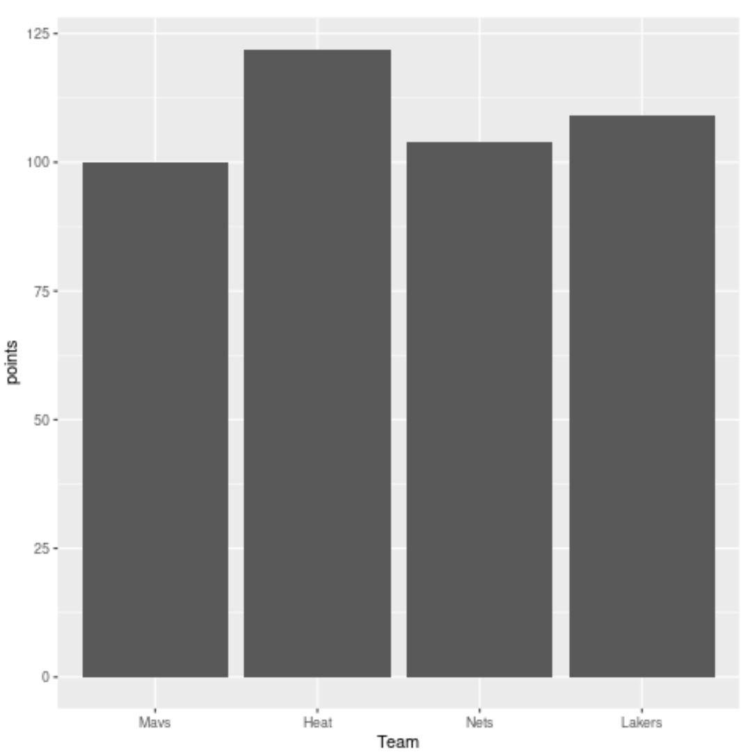
You may also want to use xlab() to rename the x-axis to something that is easier to read:
library(ggplot2)

#create bar plot with specific axis order
ggplot(df, aes(x=factor(team, level=c('Mavs', 'Heat', 'Nets', 'Lakers')), y=points)) +
  geom_col() +
  xlab('Team')
Additional Resources
The following tutorials explain how to perform other common tasks in ggplot2:
How to Rotate Axis Labels in ggplot2
How to Set Axis Breaks in ggplot2
How to Set Axis Limits in ggplot2
How to Change Legend Labels in ggplot2