You can use the scale_x_discrete() function to change the x-axis labels on a plot in ggplot2:
p + scale_x_discrete(labels=c('label1', 'label2', 'label3', ...))
The following example shows how to use this syntax in practice.
Example: Change X-Axis Labels in ggplot2
Suppose we have the following data frame in R that shows the points scored by various basketball teams:
#create data frame
df frame(team=c('Mavs', 'Heat', 'Nets', 'Lakers'),
                 points=c(100, 122, 104, 109))

#view data frame
df

    team points
1   Mavs    100
2   Heat    122
3   Nets    104
4 Lakers    109
If we create a bar plot to visualize the points scored by each team, ggplot2 will automatically create labels to place on the x-axis:
library(ggplot2)

#create bar plot
ggplot(df, aes(x=team, y=points)) +
  geom_col()

To change the x-axis labels to something different, we can use the scale_x_discrete() function:
library(ggplot2)

#create bar plot with specific axis order
ggplot(df, aes(x=team, y=points)) +
  geom_col() +
  scale_x_discrete(labels=c('label1', 'label2', 'label3', 'label4'))
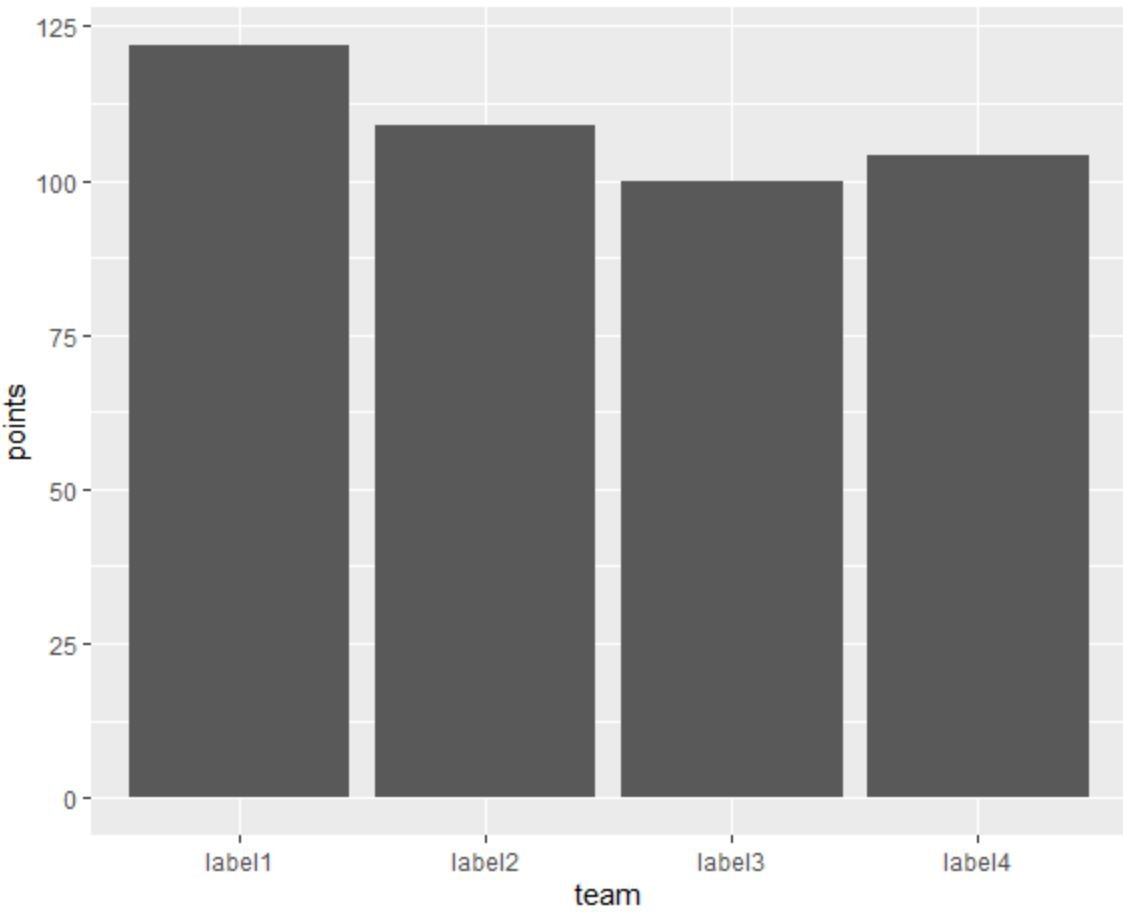
The x-axis labels now match the labels that we specified using the scale_x_discrete() function.
You can also specify the labels in a vector outside of the scale_discrete() function if you’d like:
library(ggplot2)

#specify labels for plot
my_labels label1', 'label2', 'label3', 'label4')

#create bar plot with specific axis order
ggplot(df, aes(x=team, y=points)) +
  geom_col() +
  scale_x_discrete(labels=my_labels)
This matches the previous plot.
Additional Resources
The following tutorials explain how to perform other common tasks in ggplot2:
How to Rotate Axis Labels in ggplot2
How to Set Axis Breaks in ggplot2
How to Set Axis Limits in ggplot2
How to Change Legend Labels in ggplot2