One of the first steps of any data analysis project is exploratory data analysis.
This involves exploring a dataset in three ways:
1. Summarizing a dataset using descriptive statistics.
2. Visualizing a dataset using charts.
3. Identifying missing values.
By performing these three actions, you can gain an understanding of how the values in a dataset are distributed and detect any problematic values before proceeding to perform a hypothesis test or perform statistical modeling.
The easiest way to perform exploratory data analysis in R is by using functions from the tidyverse packages.
The following step-by-step example shows how to use functions from these packages to perform exploratory data analysis on the diamonds dataset that comes built-in with the tidyverse packages.
Step 1: Load & View the Data
First, let’s use the data() function to load the diamonds dataset:
library(tidyverse)

#load diamonds dataset
data(diamonds)
We can take a look at the first six rows of the dataset by using the head() function:
#view first six rows of diamonds dataset
head(diamonds)

  carat cut       color clarity depth table price     x     y     z
1 0.23  Ideal     E     SI2      61.5    55   326  3.95  3.98  2.43
2 0.21  Premium   E     SI1      59.8    61   326  3.89  3.84  2.31
3 0.23  Good      E     VS1      56.9    65   327  4.05  4.07  2.31
4 0.290 Premium   I     VS2      62.4    58   334  4.2   4.23  2.63
5 0.31  Good      J     SI2      63.3    58   335  4.34  4.35  2.75
6 0.24  Very Good J     VVS2     62.8    57   336  3.94  3.96  2.48
Step 2: Summarize the Data
We can use the summary() function to quickly summarize each variable in the dataset:
#summarize diamonds dataset
summary(diamonds)

     carat               cut        color        clarity          depth
 Min.   :0.2000   Fair     : 1610   D: 6775   SI1    :13065   Min.   :43.00
 1st Qu.:0.4000   Good     : 4906   E: 9797   VS2    :12258   1st Qu.:61.00
 Median :0.7000   Very Good:12082   F: 9542   SI2    : 9194   Median :61.80
 Mean   :0.7979   Premium  :13791   G:11292   VS1    : 8171   Mean   :61.75
 3rd Qu.:1.0400   Ideal    :21551   H: 8304   VVS2   : 5066   3rd Qu.:62.50
 Max.   :5.0100                     I: 5422   VVS1   : 3655   Max.   :79.00
                                    J: 2808   (Other): 2531
     table           price             x                y                z
 Min.   :43.00   Min.   :  326   Min.   : 0.000   Min.   : 0.000   Min.   : 0.000
 1st Qu.:56.00   1st Qu.:  950   1st Qu.: 4.710   1st Qu.: 4.720   1st Qu.: 2.910
 Median :57.00   Median : 2401   Median : 5.700   Median : 5.710   Median : 3.530
 Mean   :57.46   Mean   : 3933   Mean   : 5.731   Mean   : 5.735   Mean   : 3.539
 3rd Qu.:59.00   3rd Qu.: 5324   3rd Qu.: 6.540   3rd Qu.: 6.540   3rd Qu.: 4.040
 Max.   :95.00   Max.   :18823   Max.   :10.740   Max.   :58.900   Max.   :31.800
For each of the numeric variables we can see the following information:
- Min: The minimum value.
- 1st Qu: The value of the first quartile (25th percentile).
- Median: The median value.
- Mean: The mean value.
- 3rd Qu: The value of the third quartile (75th percentile).
- Max: The maximum value.
For the categorical variables in the dataset (cut, color, and clarity) we see a frequency count of each value.
For example, for the cut variable:
- Fair: This value occurs 1,610 times.
- Good: This value occurs 4,906 times.
- Very Good: This value occurs 12,082 times.
- Premium: This value occurs 13,791 times.
- Ideal: This value occurs 21,551 times.
We can use the dim() function to get the dimensions of the dataset in terms of number of rows and number of columns:
#display rows and columns
dim(diamonds)

[1] 53940 10
We can see that the dataset has 53,940 rows and 10 columns.
Step 3: Visualize the Data
We can also create charts to visualize the values in the dataset.
For example, we can use the geom_histogram() function to create a histogram of the values for a certain variable:
#create histogram of values for price
ggplot(data=diamonds, aes(x=price)) +
  geom_histogram(fill="steelblue", color="black") +
  ggtitle("Histogram of Price Values")

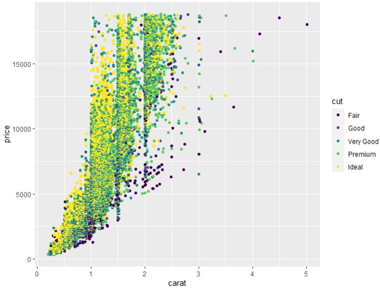
We can also use the geom_point() function to create a scatterplot of any pairwise combination of variables:
#create scatterplot of carat vs. price, using cut as color variable
ggplot(data=diamonds, aes(x=carat, y=price, color=cut)) +
  geom_point()

We can also use the geom_boxplot() function to create a boxplot of one variable grouped by another variable:
#create scatterplot of price, grouped by cut
ggplot(data=diamonds, aes(x=cut, y=price)) +
  geom_boxplot(fill="steelblue")

We can also use the cor() function to create a correlation matrix to view the correlation coefficient between each pairwise combination of numeric variables in the dataset:
#create correlation matrix of (rounded to 2 decimal places)
round(cor(diamonds[c('carat', 'depth', 'table', 'price', 'x', 'y', 'z')]), 2)

      carat depth table price     x     y    z
carat  1.00  0.03  0.18  0.92  0.98  0.95 0.95
depth  0.03  1.00 -0.30 -0.01 -0.03 -0.03 0.09
table  0.18 -0.30  1.00  0.13  0.20  0.18 0.15
price  0.92 -0.01  0.13  1.00  0.88  0.87 0.86
x      0.98 -0.03  0.20  0.88  1.00  0.97 0.97
y      0.95 -0.03  0.18  0.87  0.97  1.00 0.95
z      0.95  0.09  0.15  0.86  0.97  0.95 1.00
Related: What is Considered to Be a “Strong” Correlation?
Step 4: Identify Missing Values
We can use the following code to count the total number of missing values in each column of the dataset:
#count total missing values in each column
sapply(diamonds, function(x) sum(is.na(x)))

  carat     cut   color clarity   depth   table   price       x       y       z
      0       0       0       0       0       0       0       0       0       0
From the output we can see that there are zero missing values in each column.
In practice, you’ll likely encounter several missing values throughout your dataset.
This function will be useful for counting the total number of missing values.
Related: How to Impute Missing Values in R
Additional Resources
The following tutorials explain how to perform other common operations in R:
How to Use length() Function in R
How to Use cat() Function in R
How to Use substring() Function in R