Occasionally you may want to add a total value at the top of each bar in a stacked bar chart in Excel.
This tutorial provides a step-by-step example of how to create the following stacked bar chart with a total value at the top of each bar:
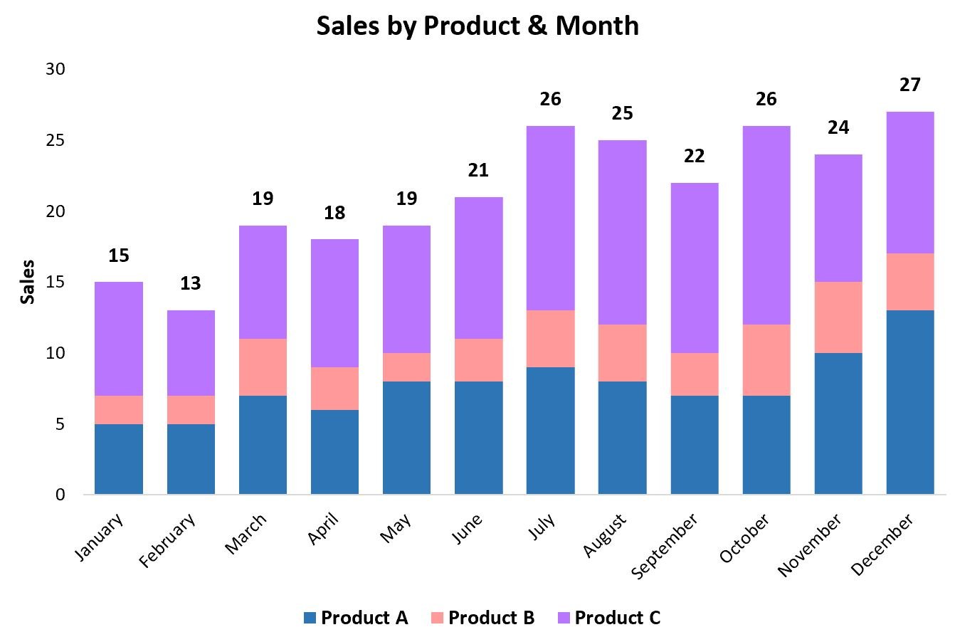
Let’s jump in!
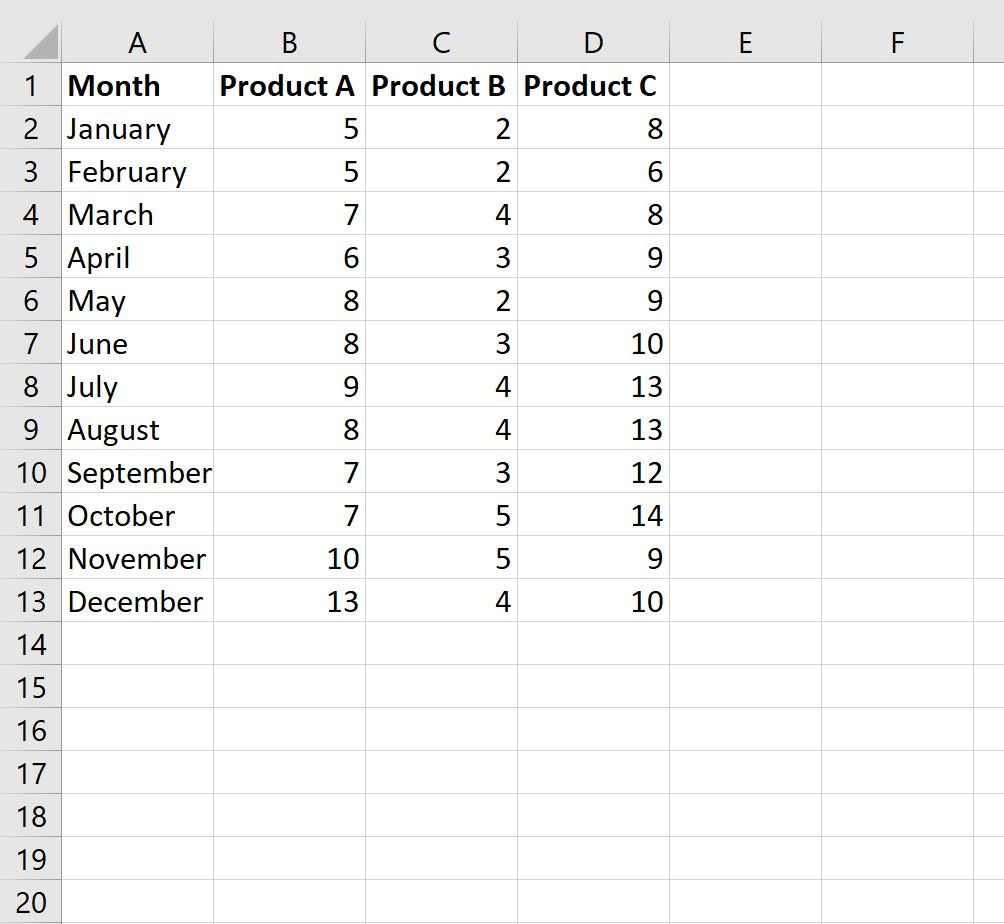
Step 1: Enter the Data
First, let’s create the following dataset that shows the total sales of three different products during each month in a year:
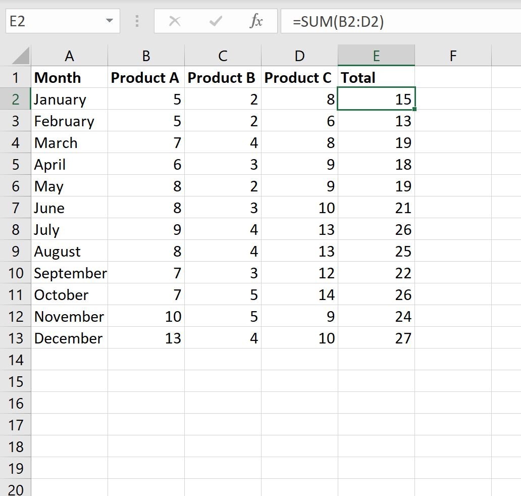
Step 2: Calculate the Total Values
Next, we’ll use the following formula to calculate the total sales per month:
=SUM(B2:E2)
We can type this formula into cell E2 and then copy and paste it to every remaining cell in column E:
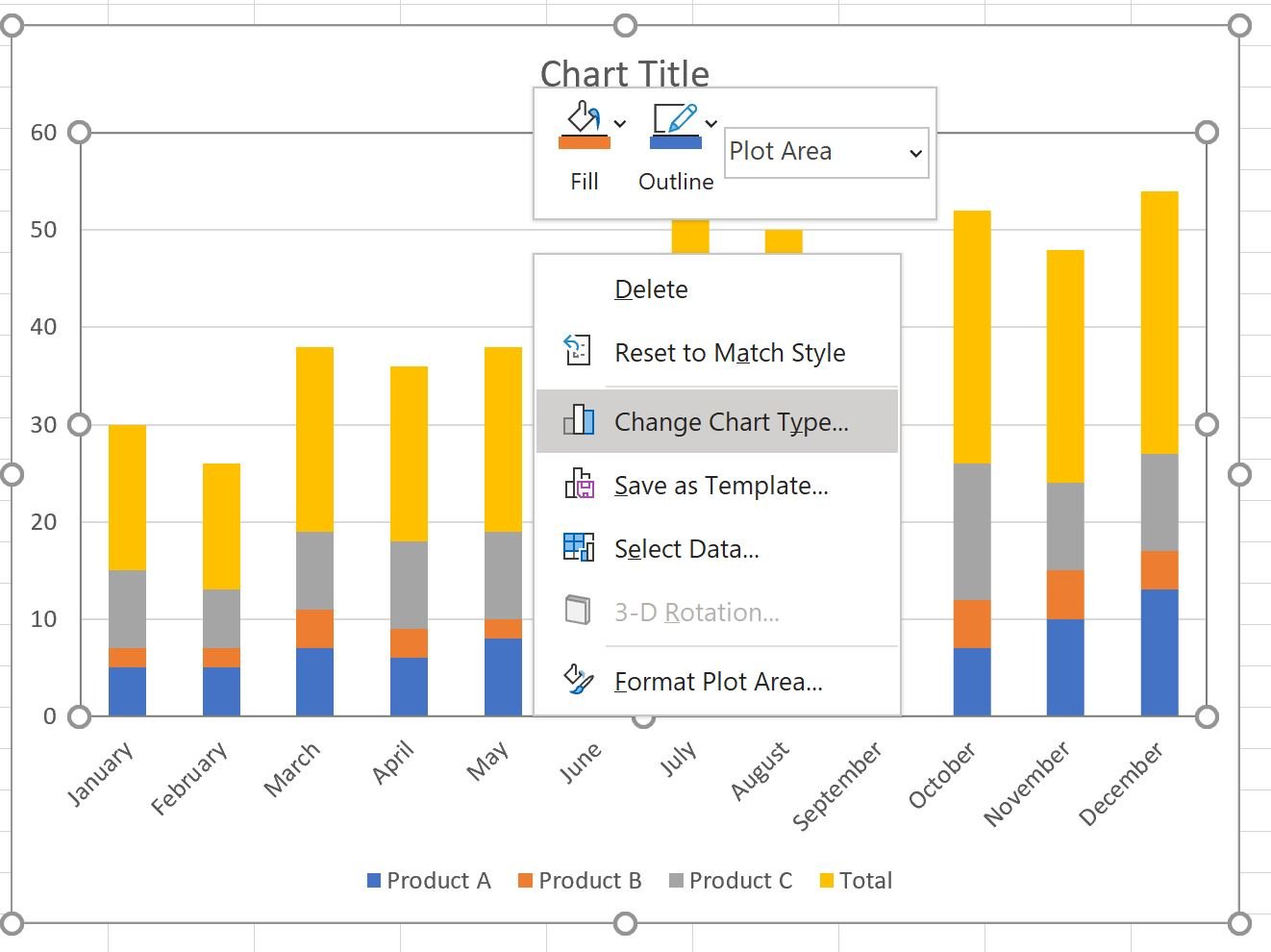
Step 3: Create Stacked Bar Chart
Next, highlight the cell range A1:E13, then click the Insert tab along the top ribbon, then click Stacked Column within the Charts group.
The following chart will be created:

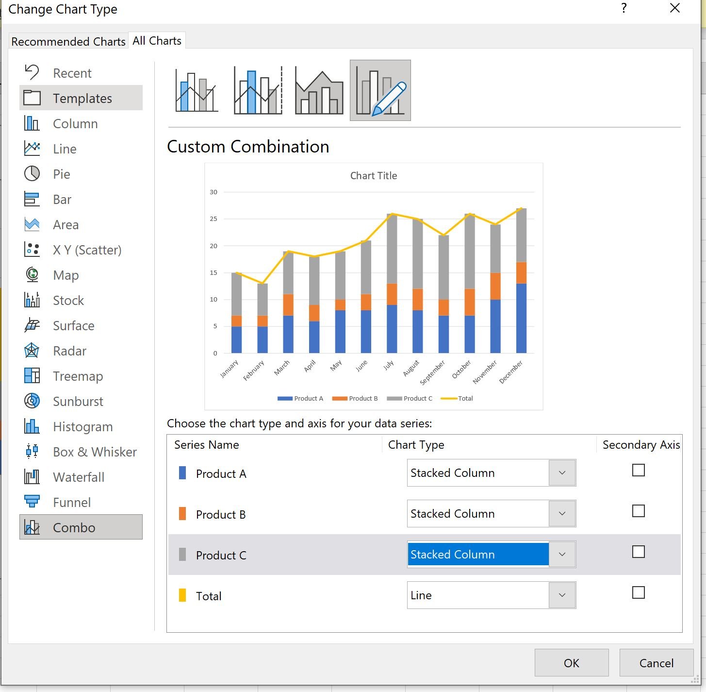
Next, right click anywhere on the chart and then click Change Chart Type:
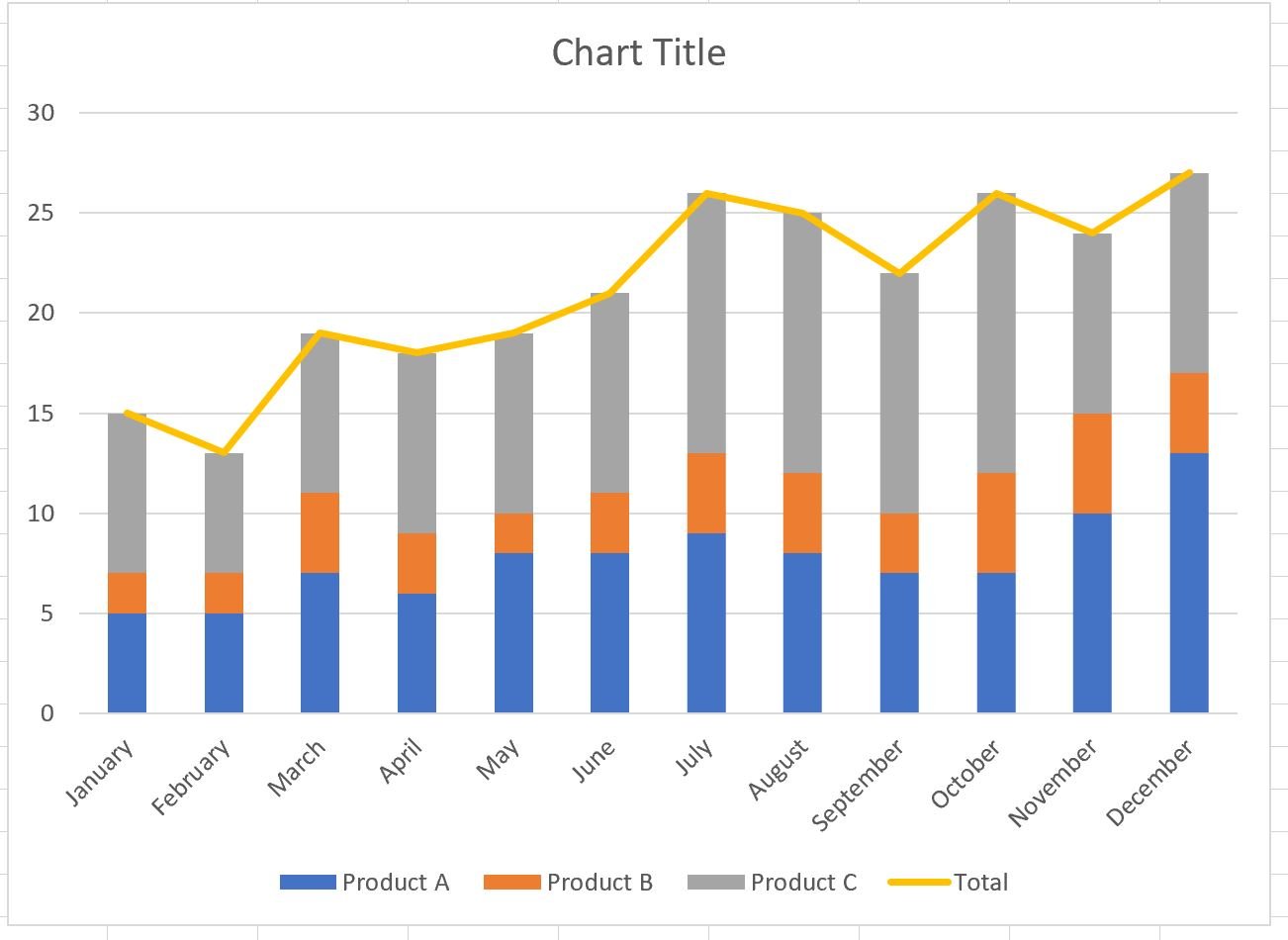
In the new window that appears, click Combo and then choose Stacked Column for each of the products and choose Line for the Total, then click OK:
The following chart will be created:
Step 4: Add Total Values
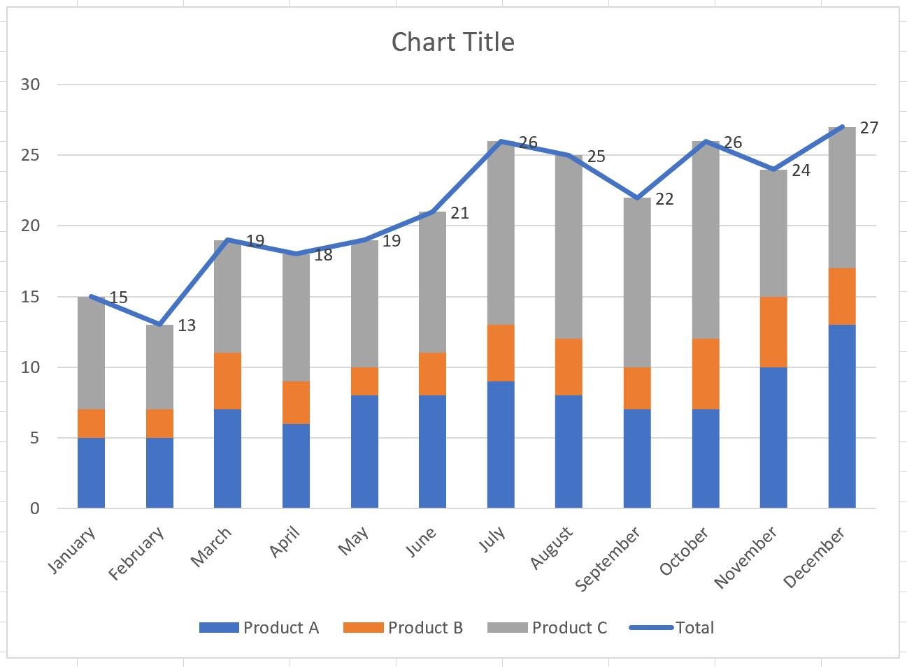
Next, right click on the yellow line and click Add Data Labels.
The following labels will appear:
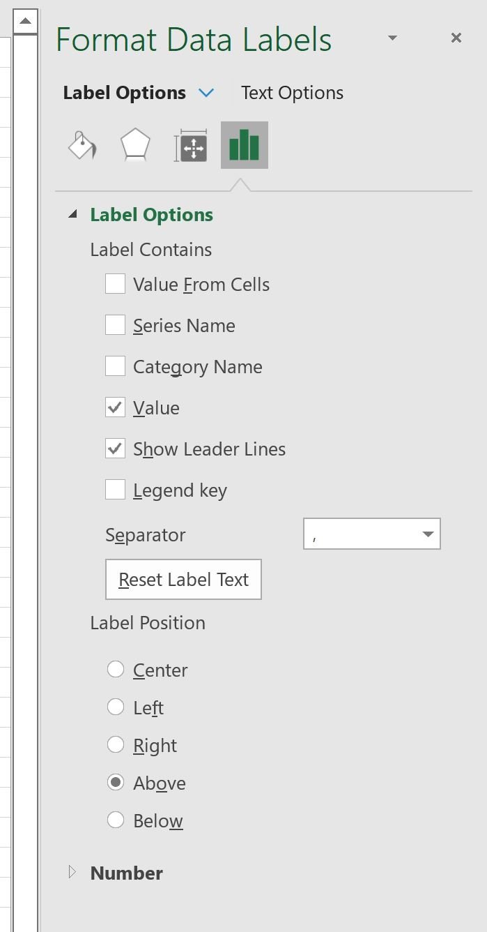
Next, double click on any of the labels.
In the new panel that appears, check the button next to Above for the Label Position:
Next, double click on the yellow line in the chart.
In the new panel that appears, check the button next to No line:
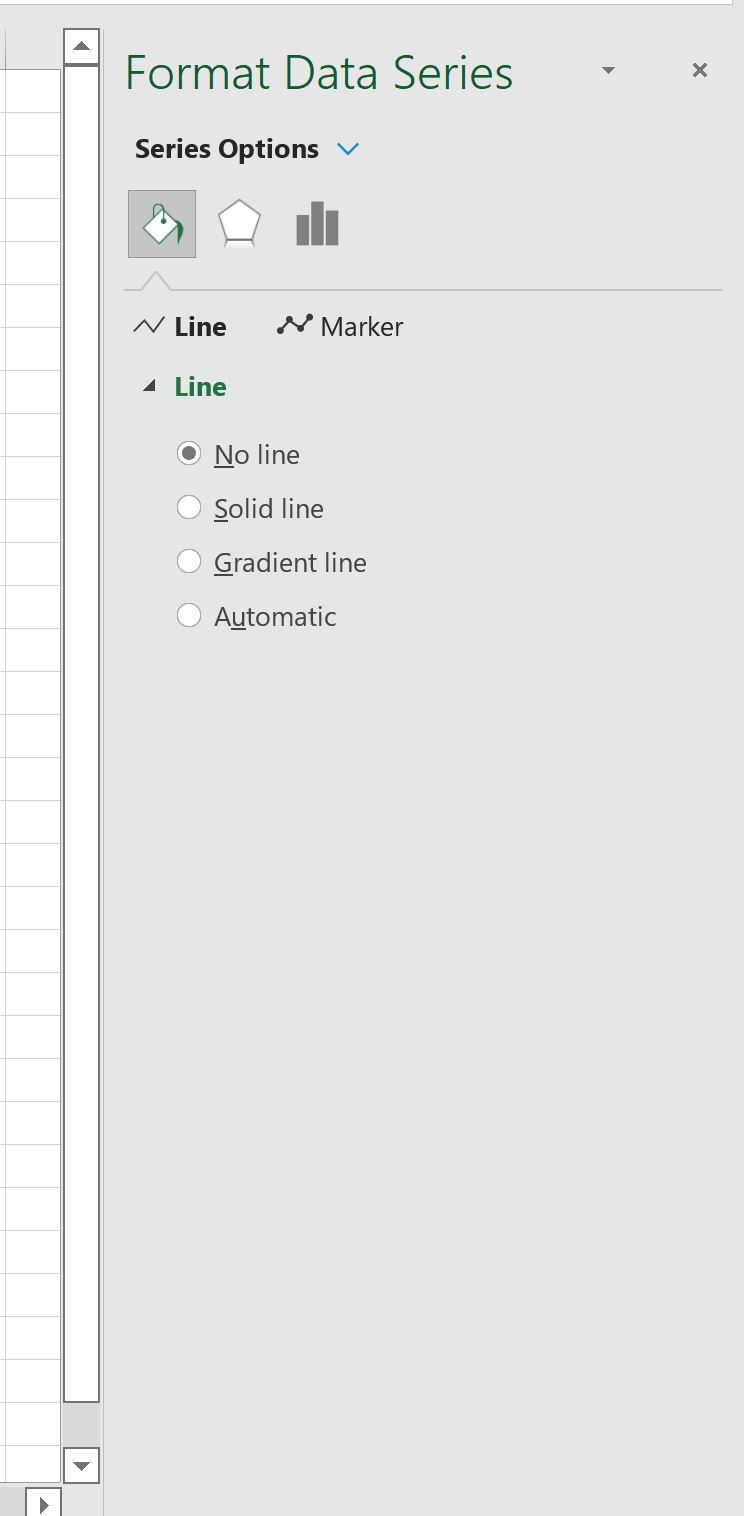
The line will be removed from the chart, but the total values will remain:

Step 5: Customize the Chart (Optional)
Feel free to add a title, customize the colors, and adjust the width of the bars to make the plot more aesthetically pleasing:
Additional Resources
The following tutorials explain how to perform other common tasks in Excel:
How to Fit a Curve in Excel
How to Make a Frequency Polygon in Excel
How to Add a Horizontal Line to Scatterplot in Excel