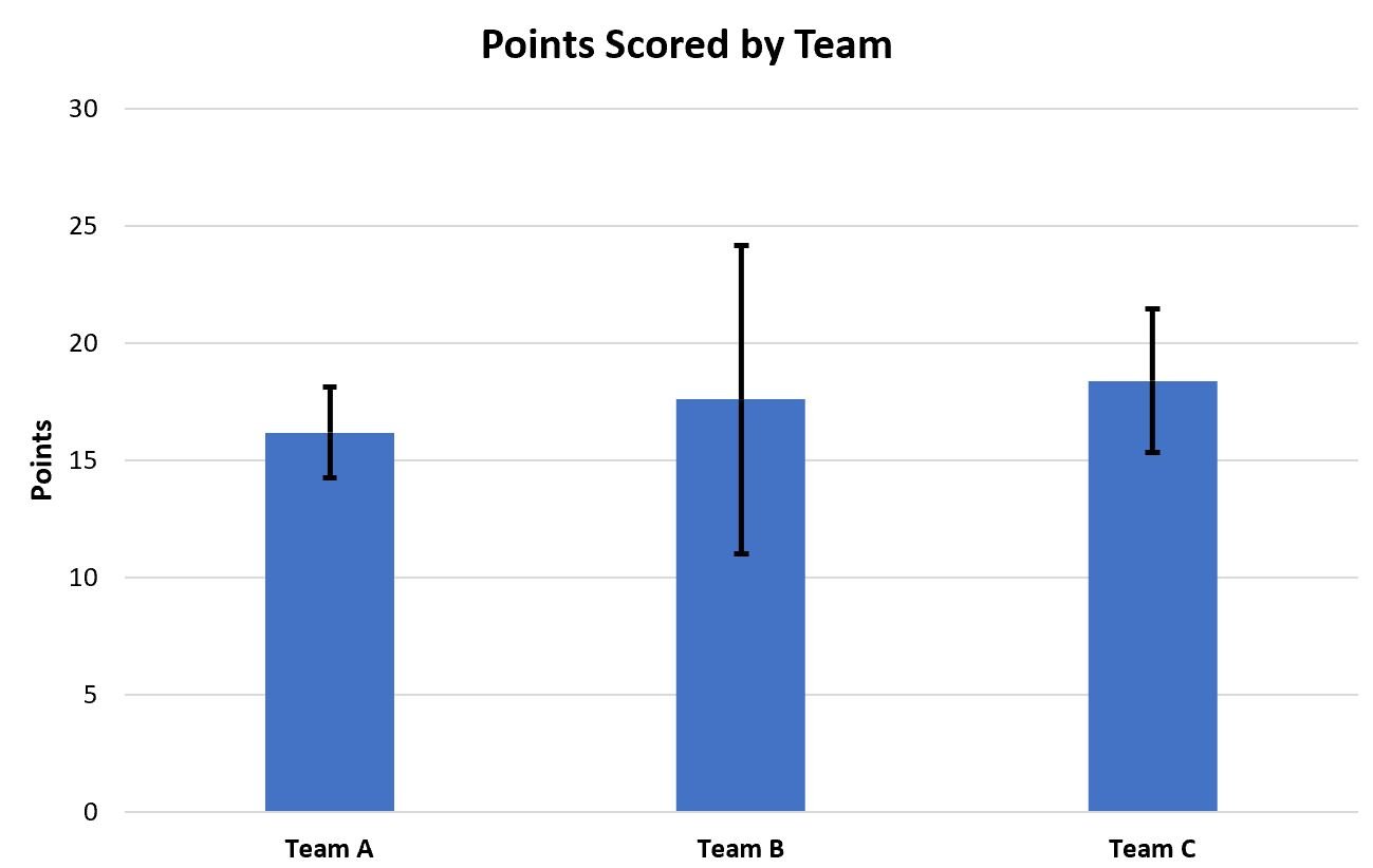
Often you may want to plot the mean and standard deviation for various groups of data in Excel, similar to the chart below:
The following step-by-step example shows exactly how to do so.
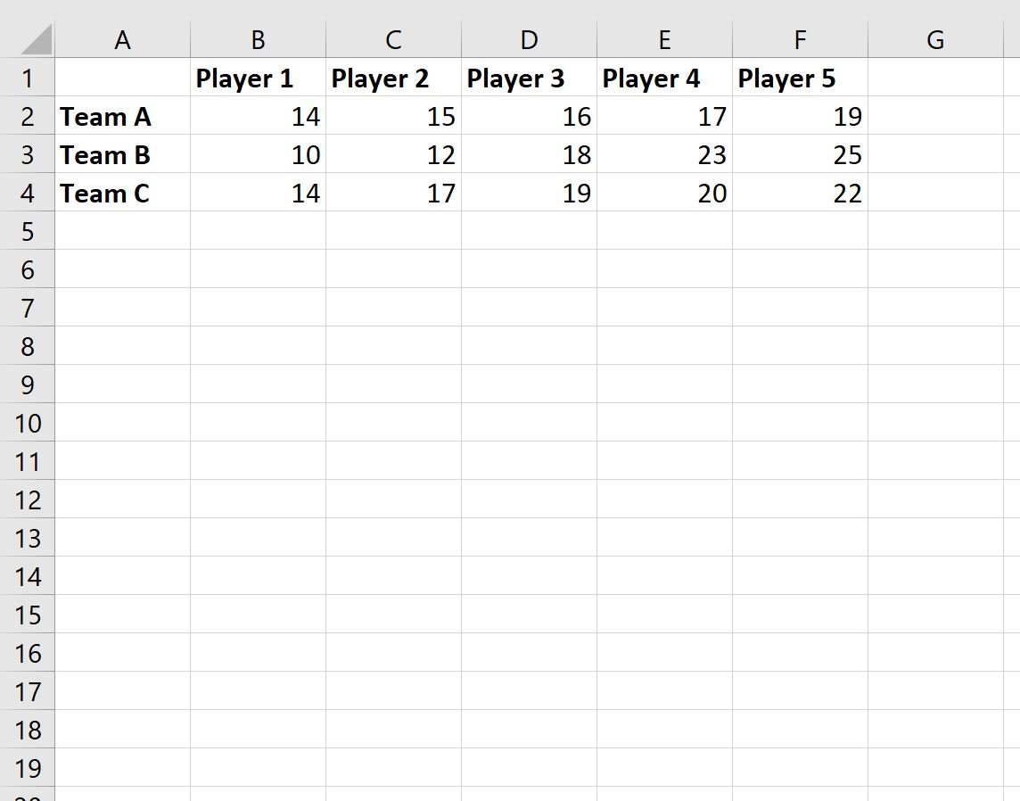
Step 1: Enter the Data
First, let’s enter the following data that shows the points scored by various basketball players on three different teams:
Step 2: Calculate the Mean and Standard Deviation for Each Group
Next, we will calculate the mean and standard deviation for each team:
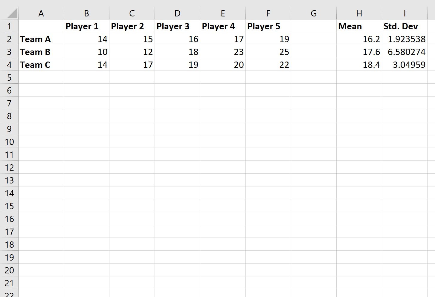
Here are the formulas that we used to calculate the mean and standard deviation in each row:
- Cell H2: =AVERAGE(B2:F2)
- Cell I2: =STDEV(B2:F2)
We then copy and pasted this formula down to each cell in column H and column I to calculate the mean and standard deviation for each team.
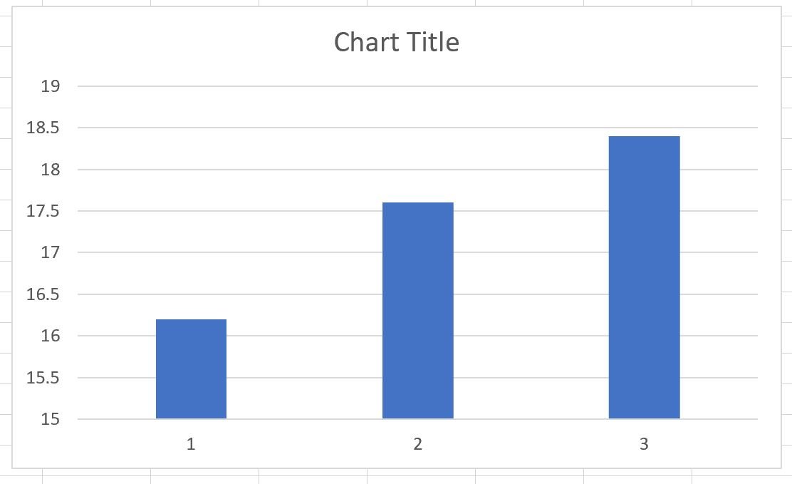
Step 3: Plot the Mean and Standard Deviation for Each Group
Next, highlight the cell range H2:H4, then click the Insert tab, then click the icon called Clustered Column within the Charts group:

The following bar chart will appear that shows the mean number of points scored by each team:
To add the standard deviation values to each bar, click anywhere on the chart, then click the green plus (+) sign in the top right corner, then click Error Bars, then click More Options:

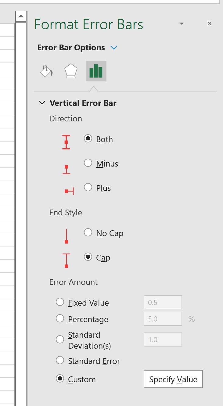
In the new panel that appears on the right side of the screen, click the icon called Error Bar Options, then click the Custom button under Error Amount, then click the Specify Value button:
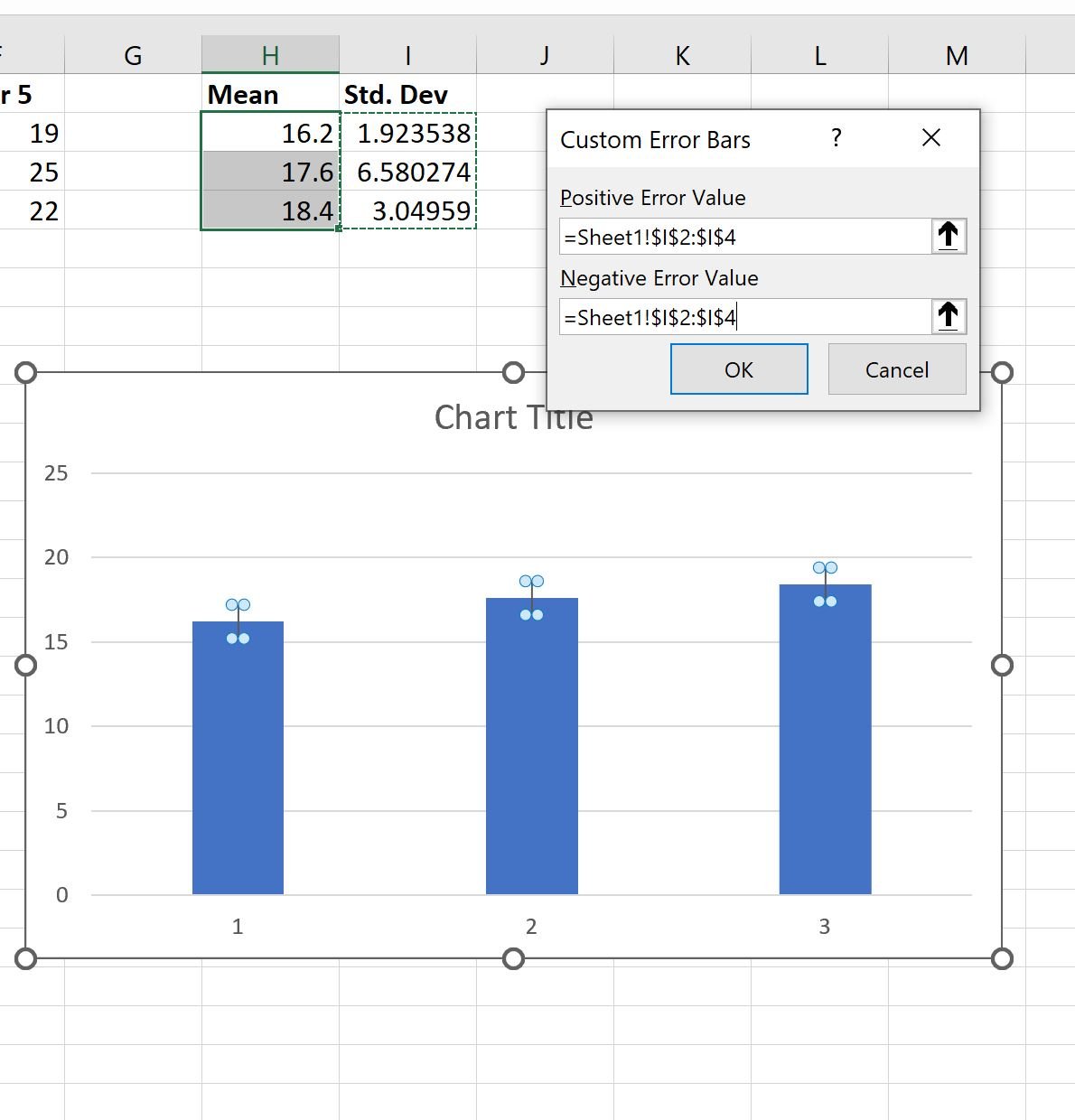
In the new window that appears, choose the cell range I2:I4 for both the Positive Error Value and Negative Error Value:
Once you click OK, the standard deviation lines will automatically be added to each individual bar:
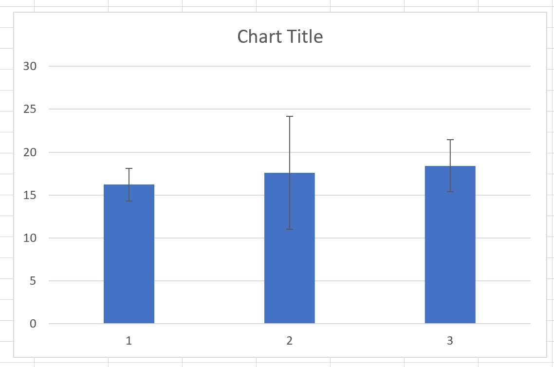
The top of each blue bar represents the mean points scored by each team and the black lines represent the standard deviation of points scored by each team.
Step 4: Customize the Chart (Optional)
Lastly, feel free to add a title, customize the colors, and add axis labels to make the chart easier to read:
Additional Resources
The following tutorials explain how to perform other common tasks in Excel:
How to Plot Multiple Lines in Excel
How to Create a Clustered Stacked Bar Chart in Excel
How to Create a Scatterplot with Multiple Series in Excel