Often you may want to filter a chart in Excel to only display a subset of the original data.
Fortunately this is easy to do using the Chart Filters function in Excel.
The following example shows how to use this function in practice.
Example: Filter a Chart in Excel
Suppose we have the following dataset in Excel that shows the sales of three different products during various years:

We can use the following steps to plot each of the product sales as a bar on the same graph:
- Highlight the cells in the range B1:D8.
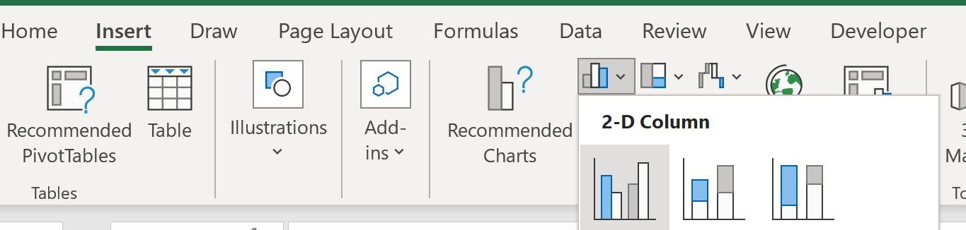
- Click the Insert Tab along the top ribbon.
- In the Charts group, click the first chart option in the section titled Insert Column or Bar Chart.
The following chart will appear:
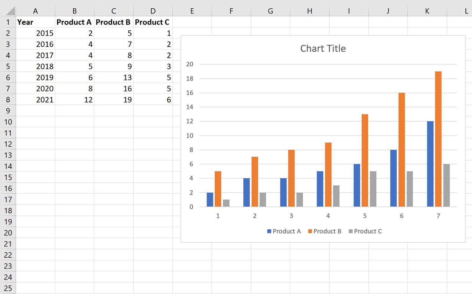
Each bar represents the sales of one of the three products during each year.
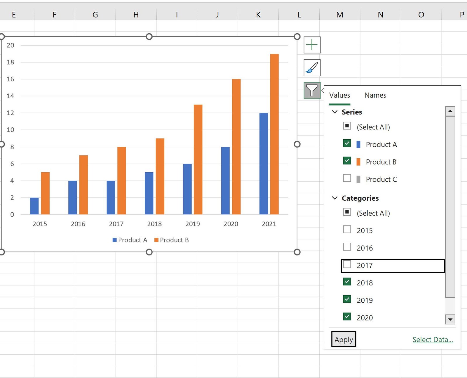
Now suppose we’d like to filter the chart to only show the sales of products A and B.
To do so, we can click anywhere on the chart, then click the filter icon that appears in the top right corner, then uncheck the box next to Product C, then click Apply:
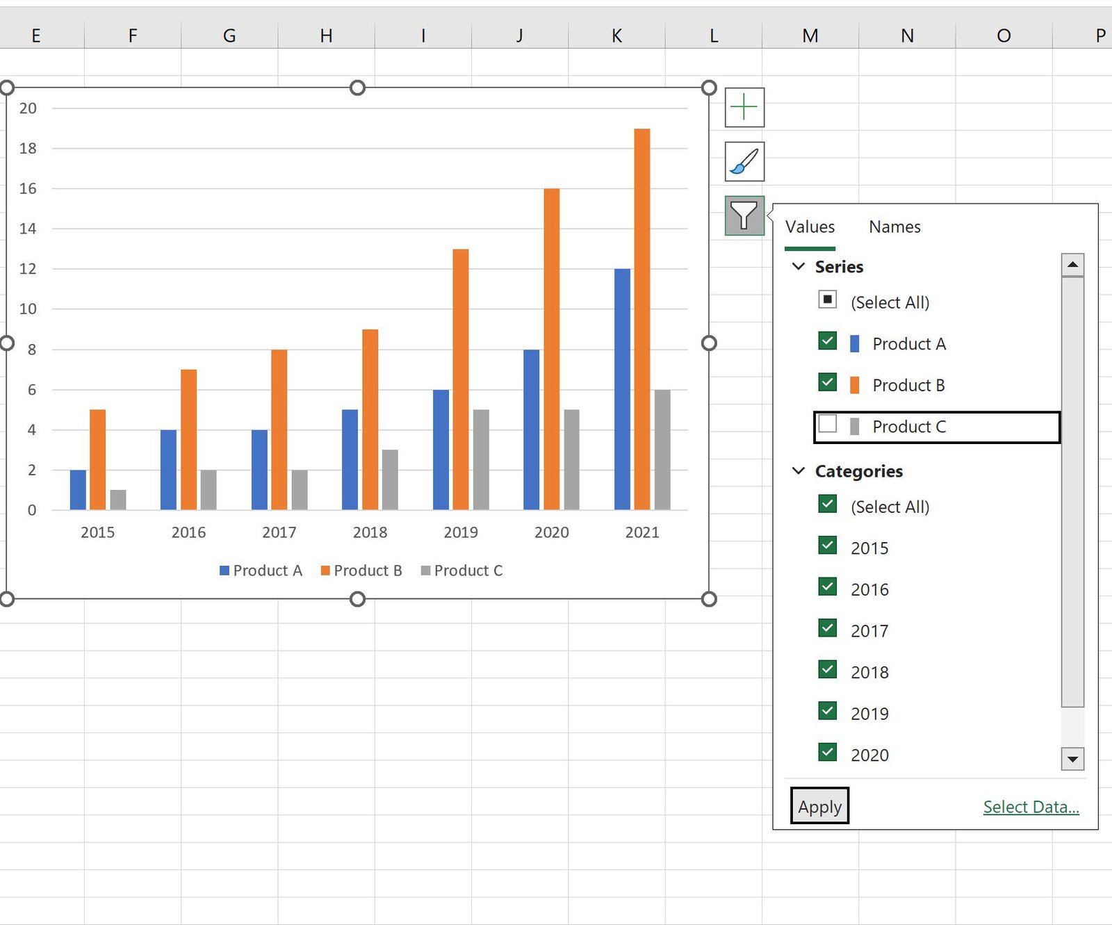
Note: It’s important that you click the Apply button, otherwise no filter will be applied.
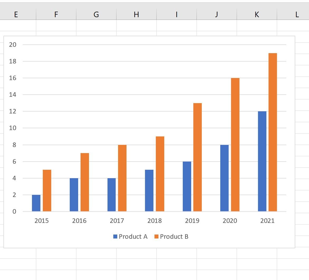
The chart will automatically update to only show the sales for products A and B:
You can also apply more than one filter.
For example, you could also uncheck the boxes next to the years 2015, 2016, and 2017 to filter by year as well:
Once you click Apply, the chart will automatically update to only show the sales for years 2018 through 2021:
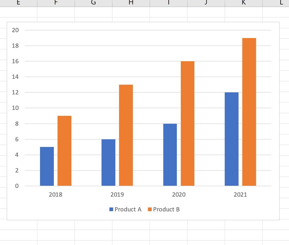
Feel free to apply as many filters as you’d like to gain different insights into your dataset.
Additional Resources
The following tutorials explain how to create other common graphs in Excel:
How to Create a Stem-and-Leaf Plot in Excel
How to Create a Dot Plot in Excel
How to Create Side-by-Side Boxplots in Excel
How to Create an Ogive Graph in Excel