Often you may be interested in adding error bars to charts in Google Sheets to capture uncertainty around measurements or calculated values.
Fortunately this is easy to do using built-in Google Sheets graphing functions.
The following step-by-step example shows how to add error bars to a column chart in Google Sheets.
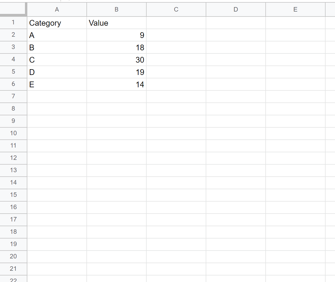
Step 1: Enter the Data
First, let’s enter the values for some data in Google Sheets:
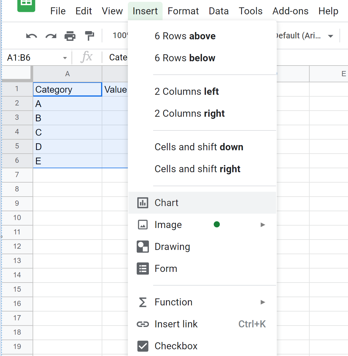
Step 2: Create a Column Chart
Next, let’s insert a column chart. Highlight cells A1:B6, then click the Insert tab and click Chart:
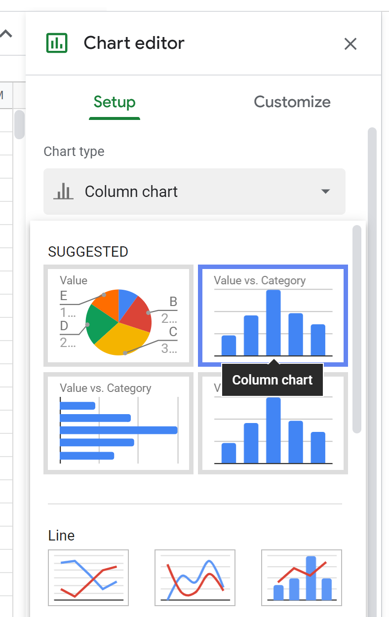
In the Chart editor window on the right side of the screen, click Chart type and then click Column chart:
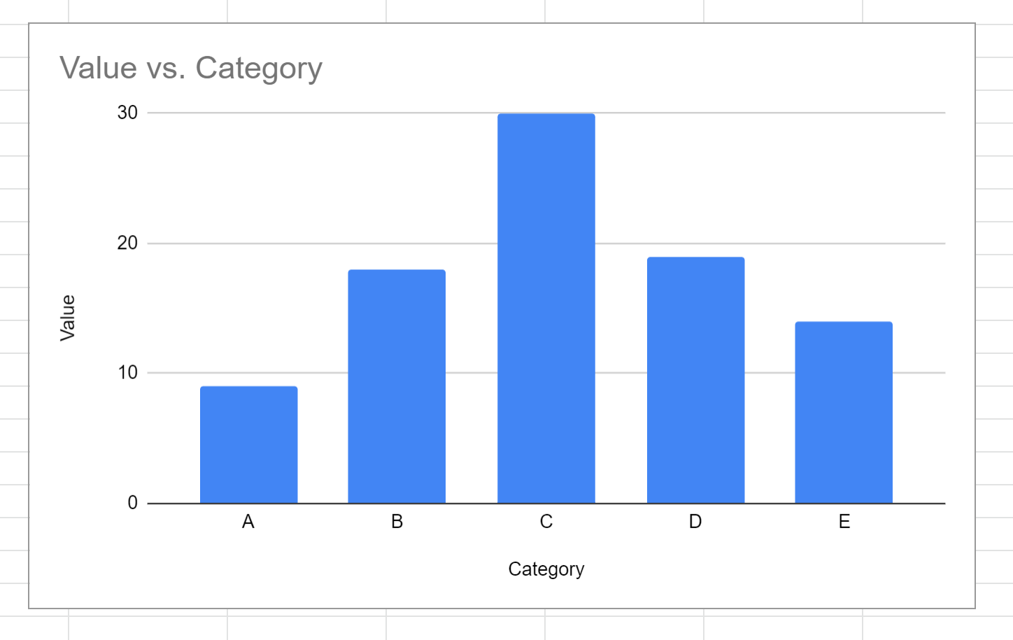
The following column chart will appear:
Step 3: Insert Error Bars
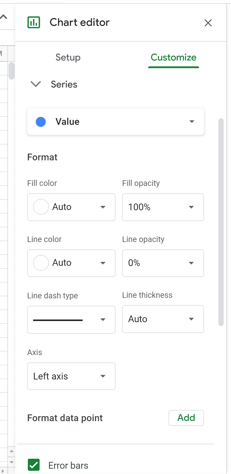
To insert error bars, click the Customize tab on the Chart editor window. Scroll down and click Series, then check the box next to Error bars:
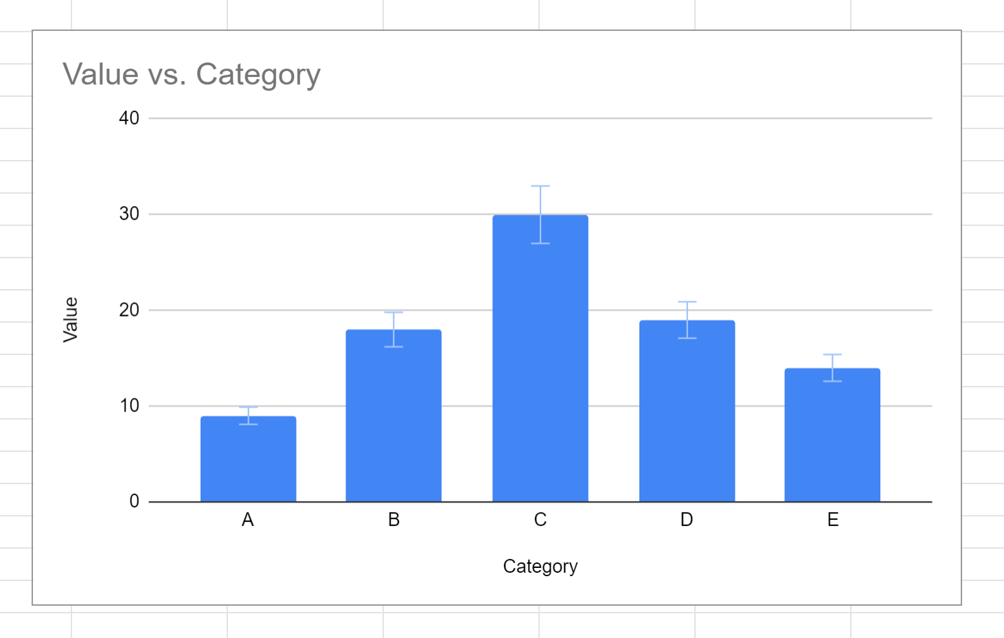
By default, error bars that are 10% of the size of each column will be shown in the chart:
Step 4: Customize Error Bars
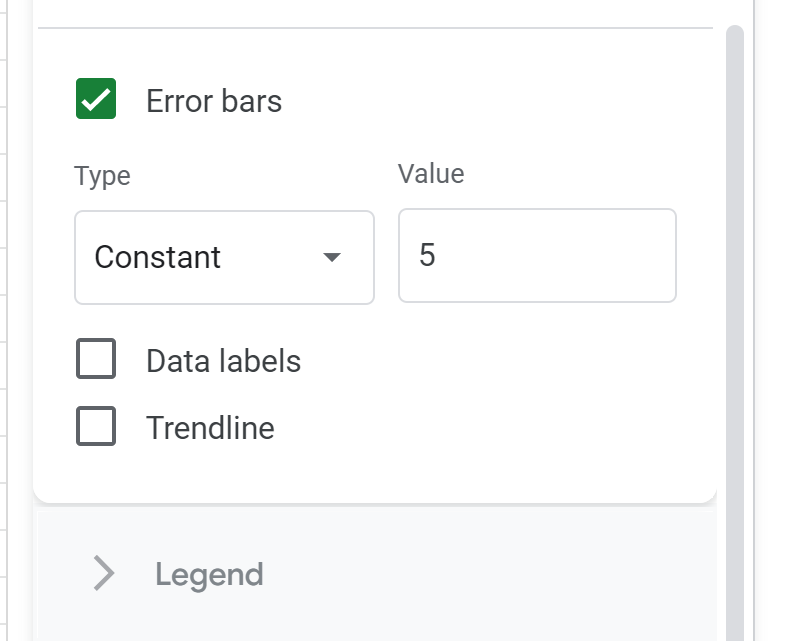
There are three types of error bars you can use in column charts in Google Sheets:
- Percent (default)
- Constant
- Standard Deviation
For example, we may choose to display a constant error bar with a length of 5 for each column:
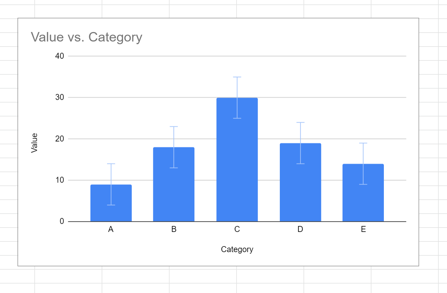
An error bar with a length of 5 would be added to each column in the chart:
Feel free to choose one of the three types of error bars to display, depending on how you would like the chart to appear.
Additional Resources
The following tutorials explain how to create other common visualizations in Google Sheets:
How to Make a Box Plot in Google Sheets
How to Create a Pareto Chart in Google Sheets
How to Create a Bubble Chart in Google Sheets