A doughnut chart is a circular chart that uses “slices” to display the relative sizes of data. It’s similar to a pie chart except it has a hole in the center, which makes it look more like a doughnut.

A double doughnut chart is exactly what it sounds like: a doughnut chart with two layers, instead of one.

This tutorial explains how to create a double doughnut chart in Excel.
Example: Double Doughnut Chart in Excel
Perform the following steps to create a double doughnut chart in Excel.
Step 1: Enter the data.
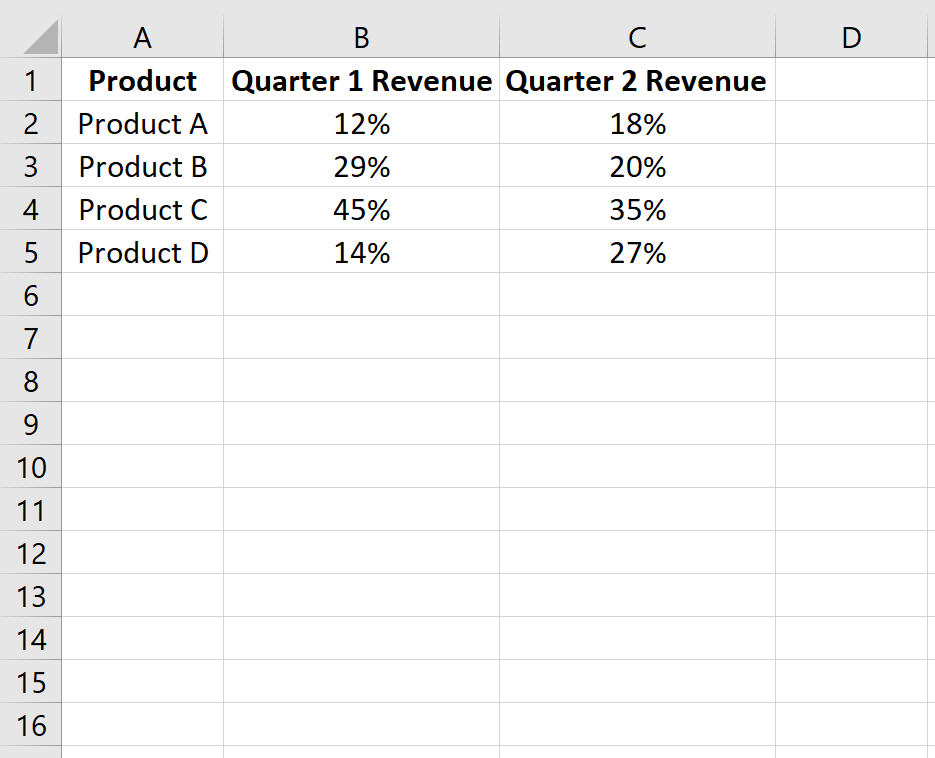
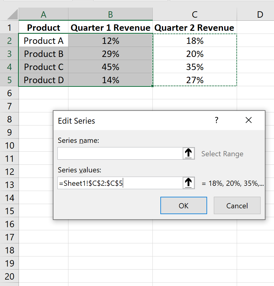
Enter the following data into Excel, which displays the percentage of a company’s revenue that comes from four different products during two sales quarters:
Step 2: Create a doughnut chart.
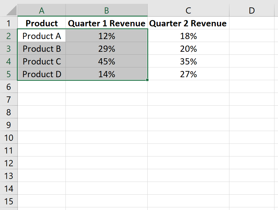
Highlight the first two columns of data.
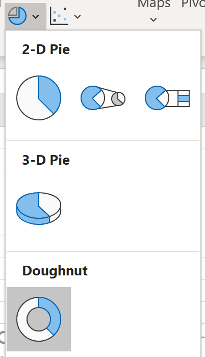
On the Data tab, in the Charts group, click the icon that says Insert Pie or Doughnut Chart.

Click on the icon that says Doughnut.
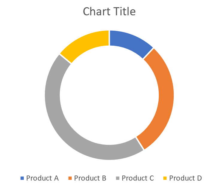
The following doughnut chart will automatically appear:
Step 3: Add a layer to create a double doughnut chart.
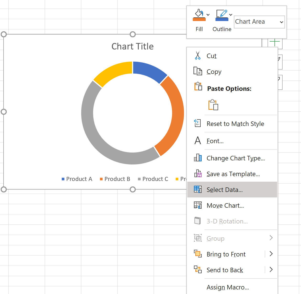
Right click on the doughnut chart and click Select Data.
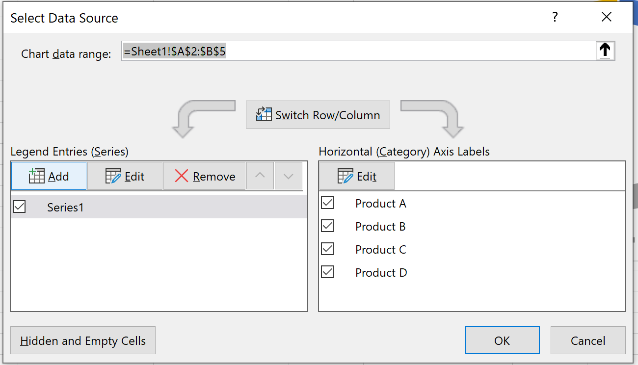
In the new window that pops up, click Add to add a new data series.
For Series values, type in the range of values fpr Quarter 2 revenue:
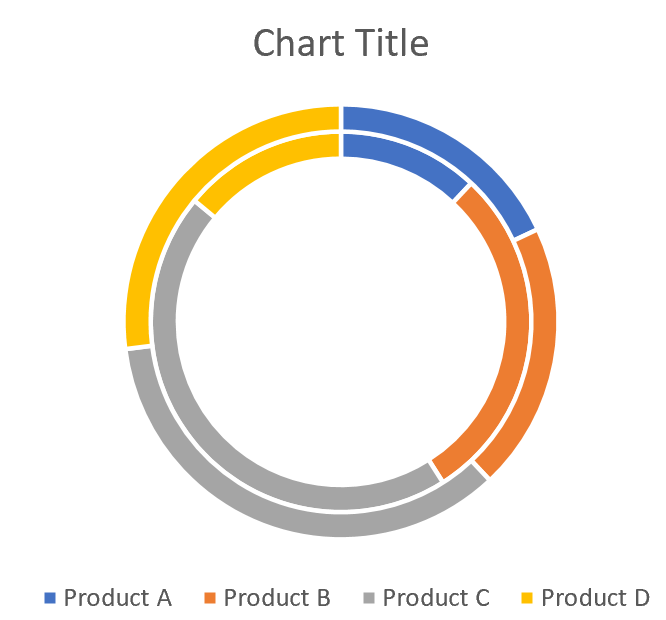
Click OK. The doughnut chart will automatically update with a second outer layer:
Step 4: Modify the appearance (optional).
Once you create the double doughnut chart, you may decide to add a title and labels, and decrease the size of the hole in the middle slightly to make the chart easier to read:

Additional Resources
The following tutorials explain how to create other common visualizations in Excel:
How to Create a Quadrant Chart in Excel
How to Create Progress Bars in Excel
How to Plot Multiple Lines in Excel
How to Create an Ogive Graph in Excel