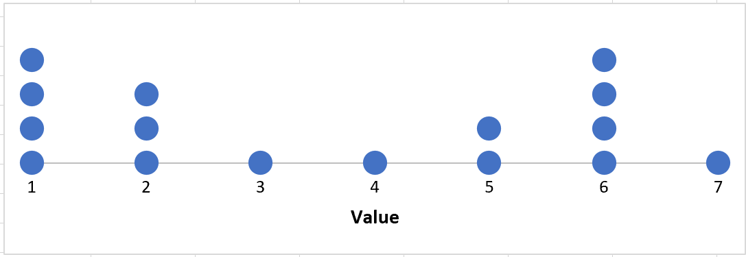
A dot plot is a type of plot that displays frequencies using dots.
This tutorial explains how to create the following dot plot in Excel:

Example: Dot Plot in Excel
Suppose we have the following frequency table in Excel:

Use the following steps to create a dot plot for this frequency table.
Step 1: Reorganize the data.
First, we need to reorganize the data into a “long” format:

Step 2: Create a dot plot using the “scatterplot” option.
Highlight cells D2:E17. Along the top ribbon, click Insert. Within the Charts group, select the first chart within the Scatter group:

The following plot will appear:

Step 3: Customize the chart.
Lastly, we can customize the chart to make it a bit more visually appealing. Namely:
- Delete the gridlines.
- Delete the title.
- Increase the size of the individual dots.
- Change the x-axis to only span from 1 to 7.
This will leave us with a dot plot that looks like this:

The individual values are shown along the x-axis and the frequencies of those values are represented by the number of dots.