This tutorial provides a step-by-step example of how to create the following cumulative sum chart in Google Sheets:

Let’s jump in!
Step 1: Enter the Data
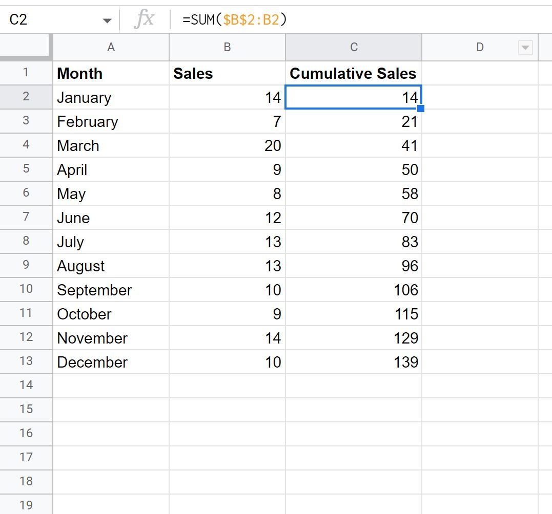
First, let’s create the following dataset that shows the total sales of some item during each month in a year:

Step 2: Calculate the Cumulative Sum
Next, we’ll use the following formula to calculate the cumulative sum of sales:
=SUM($B$2:B2)
We can type this formula into cell C2 and then drag and fill it to every remaining cell in column C:

Step 3: Create Cumulative Sum Chart
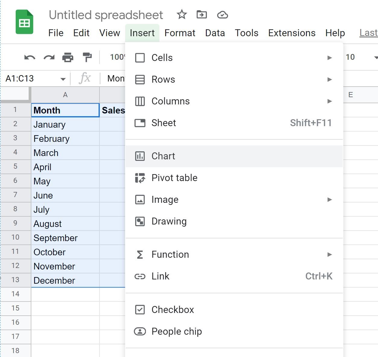
Next, highlight the cell range A1:C13, then click the Insert tab along the top ribbon, then click Chart.

In the Chart editor panel, click the Setup tab, then choose the chart titled Combo chart:

The following chart will appear:

The blue bars represent the sales each month and the red line represents the cumulative sales.
Feel free to customize the title, customize the colors, customize the line style, and adjust the width of the bars to make the plot look however you’d like.
Additional Resources
The following tutorials explain how to perform other common tasks in Google Sheets:
How to Add Average Line to Chart in Google Sheets
How to Add Trendline to Chart in Google Sheets
How to Plot Multiple Lines in Google Sheets