You can use the following methods to draw a boxplot with a mean value in R:
Method 1: Use Base R
#create boxplots
boxplot(df$values~df$group)

#calculate mean value by group
means #add means as circles to each boxplot
points(means, pch=20)
Method 2: Use ggplot2
library(ggplot2)

#create boxplots with mean values shown as circles
ggplot(df, aes(x=group, y=values, fill=group)) +
  geom_boxplot() +
  stat_summary(fun=mean, geom='point', shape=20)
The following examples show how to use each method in practice with the following data frame in R:
#create data frame
df frame(team=rep(c('A', 'B', 'C'), each=5),
                 points=c(4, 4, 5, 6, 8, 7, 6, 8, 9, 12,
                          11, 12, 13, 16, 18))

#view first six rows of data frame
head(df)

  team points
1    A      4
2    A      4
3    A      5
4    A      6
5    A      8
6    B      7
Example 1: Create Boxplots with Mean Values in Base R
The following code shows how to create boxplots with mean values in base R:
#create boxplots
boxplot(df$points~df$team)

#calculate mean value by group
means #add means as circles to each boxplot
points(means, pch=20, cex=1.5)
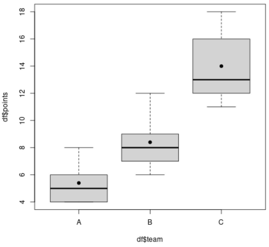
The black lines inside each boxplot represent the median value and the black circles inside each boxplot represent the mean value.
Note: Change the value for the cex argument to change the circle size.
Example 2: Create Boxplots with Mean Values in ggplot2
The following code shows how to create boxplots with mean values in ggplot2:
library(ggplot2)

#create boxplots with mean values
ggplot(df, aes(x=team, y=points, fill=team)) +
  geom_boxplot() +
  stat_summary(fun=mean, geom='point', shape=20, size=8) +
  theme(legend.position='none')

The black lines inside each boxplot represent the median value and the black circles inside each boxplot represent the mean value.
Note: Change the value for the size argument within the stat_summary() function to change the circle size.
Additional Resources
The following tutorials offer additional information about boxplots:
When Should You Use a Box Plot? (3 Scenarios)
How to Identify Skewness in Box Plots
How to Compare Box Plots