A “bell curve” is the nickname given to the shape of a normal distribution, which has a distinct “bell” shape:
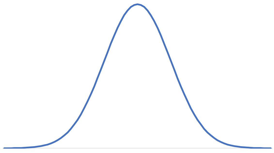
This tutorial explains how to make a bell curve in Excel for a given mean and standard deviation and even provides a free downloadable template that you can use to make your own bell curve in Excel.
Example: Bell Curve in Excel
Use the following steps to make a bell curve in Excel.
Step 1: Create cells for the mean and standard deviation.
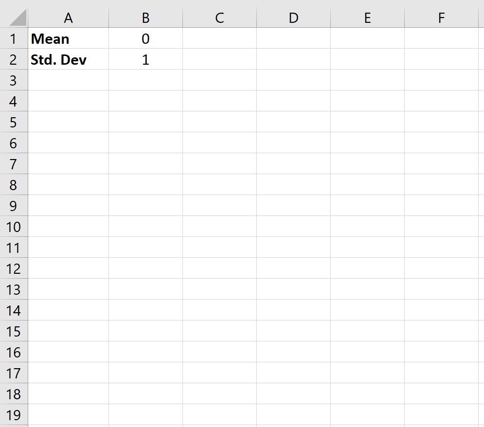
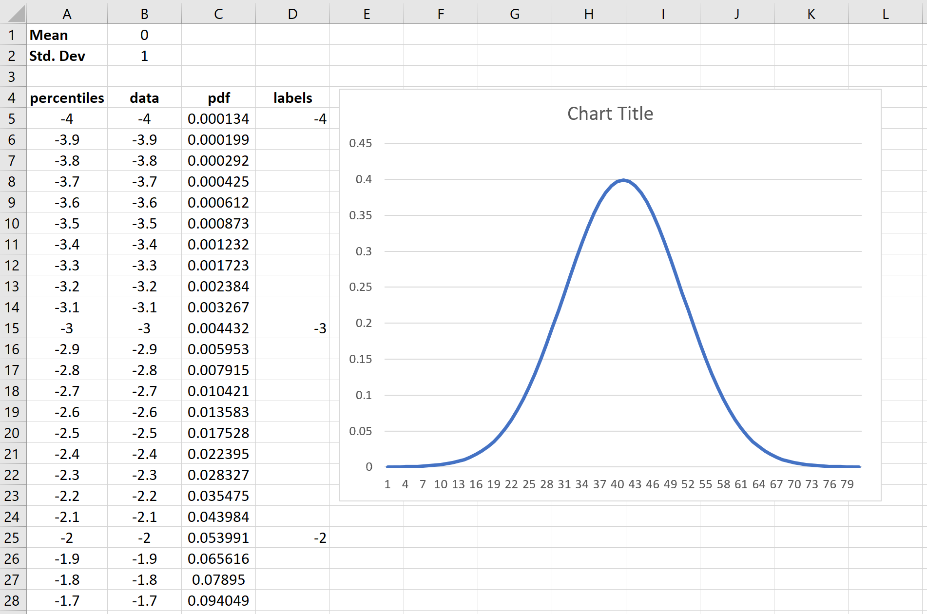
Step 2: Create cells for percentiles from -4 to 4, in increments of 0.1.
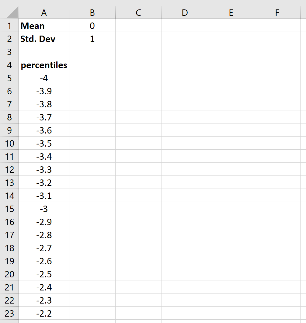
. . .
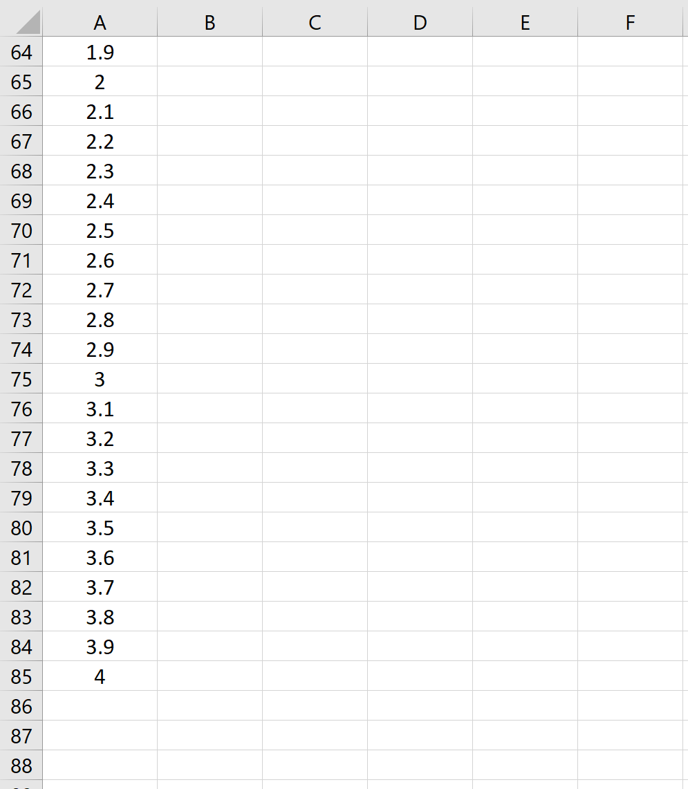
Step 3: Create a column of data values to be used in the graph.
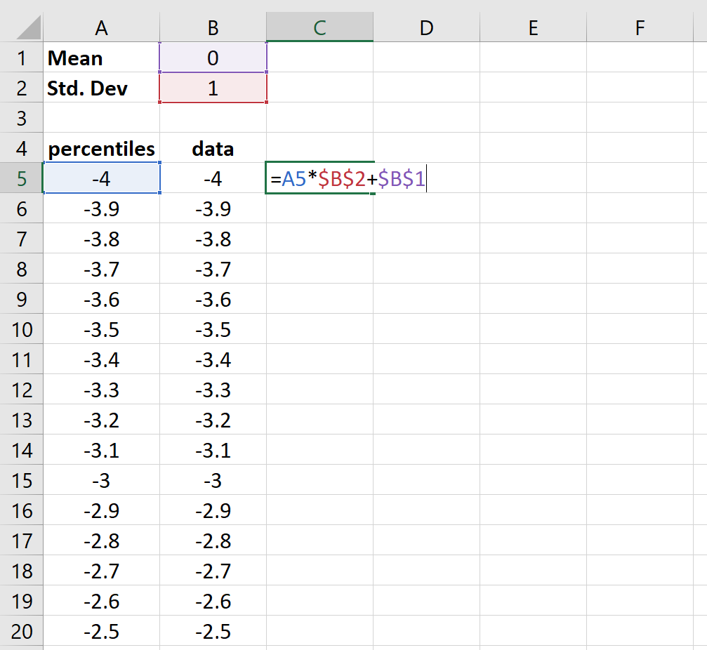
Step 4: Find the values for the normal distribution pdf.
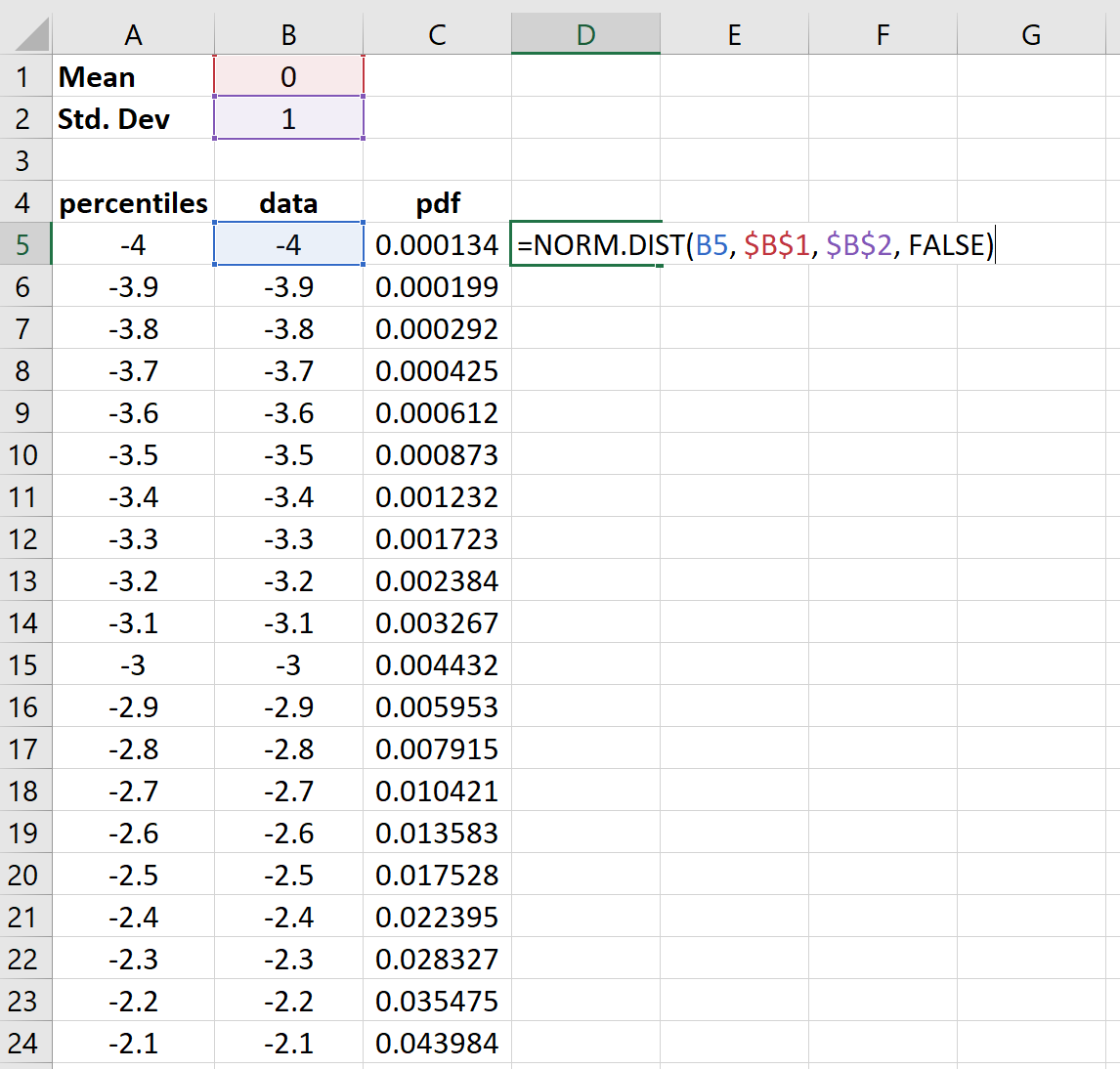
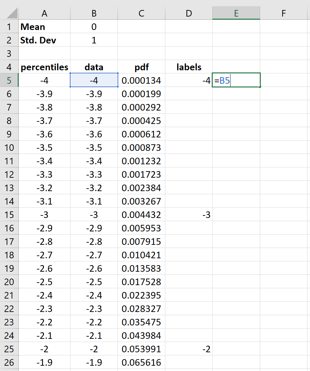
Step 5: Create x-axis plot labels for only the integer percentiles.
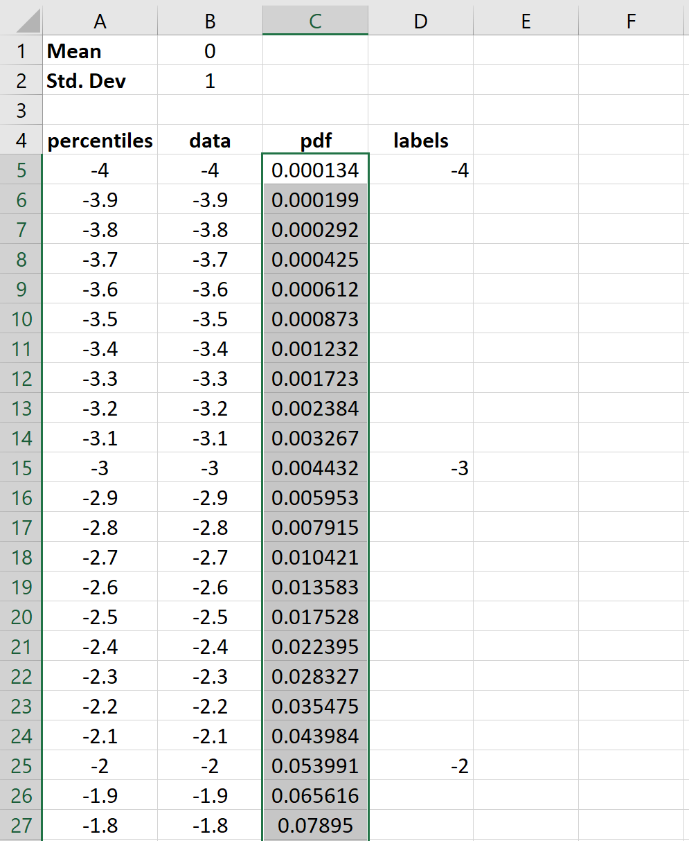
Step 6: Make the bell curve.
First, highlight all of the values in the pdf column:
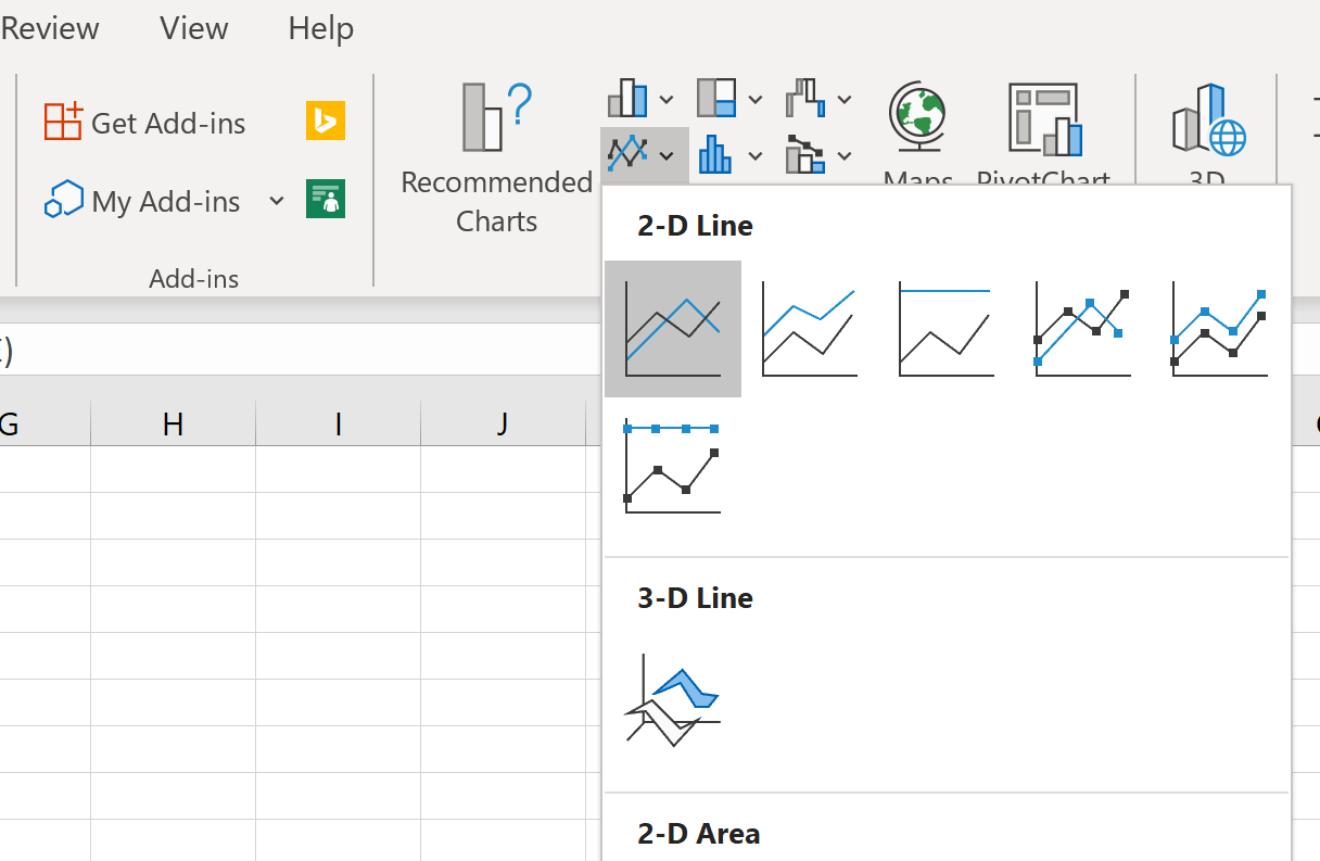
Then, in the Charts group on the Insert tab, click the first plot option in the Insert Line or Area Chart category:
A bell curve will automatically appear:
Step 7: Modify the x-axis labels.
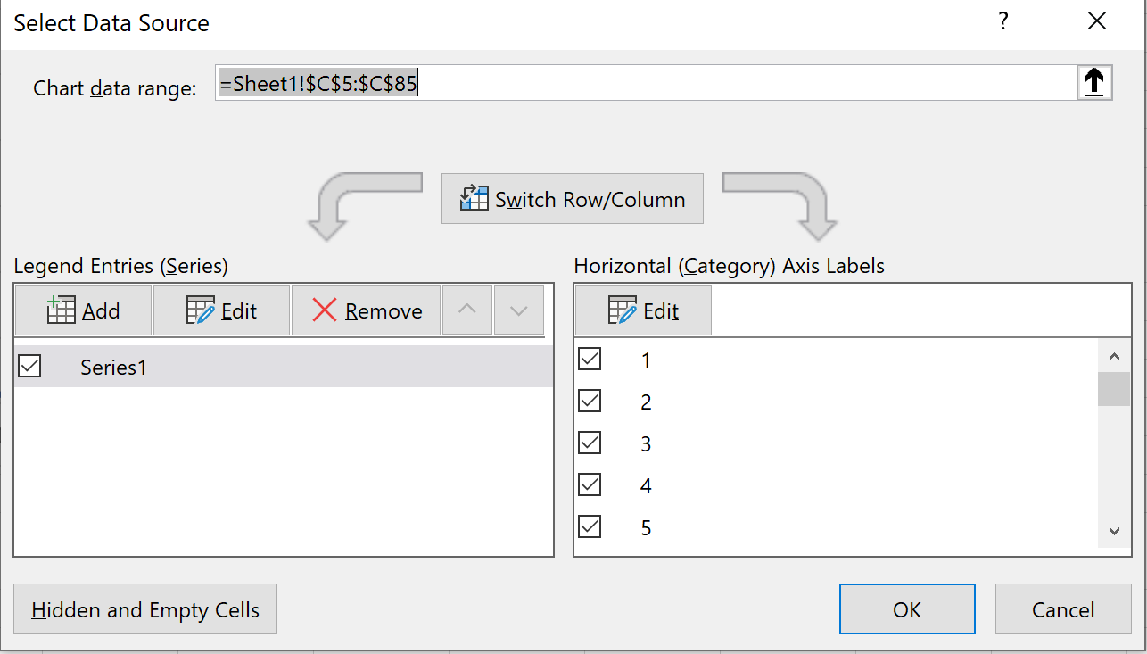
Right click anywhere on the chart and click Select Data. A new window will pop up. Click on the Edit button under Horizontal Axis Labels:
Select the range of cells where the x-axis labels are located. In our case, it’s cell range D5:D85. Then click OK.
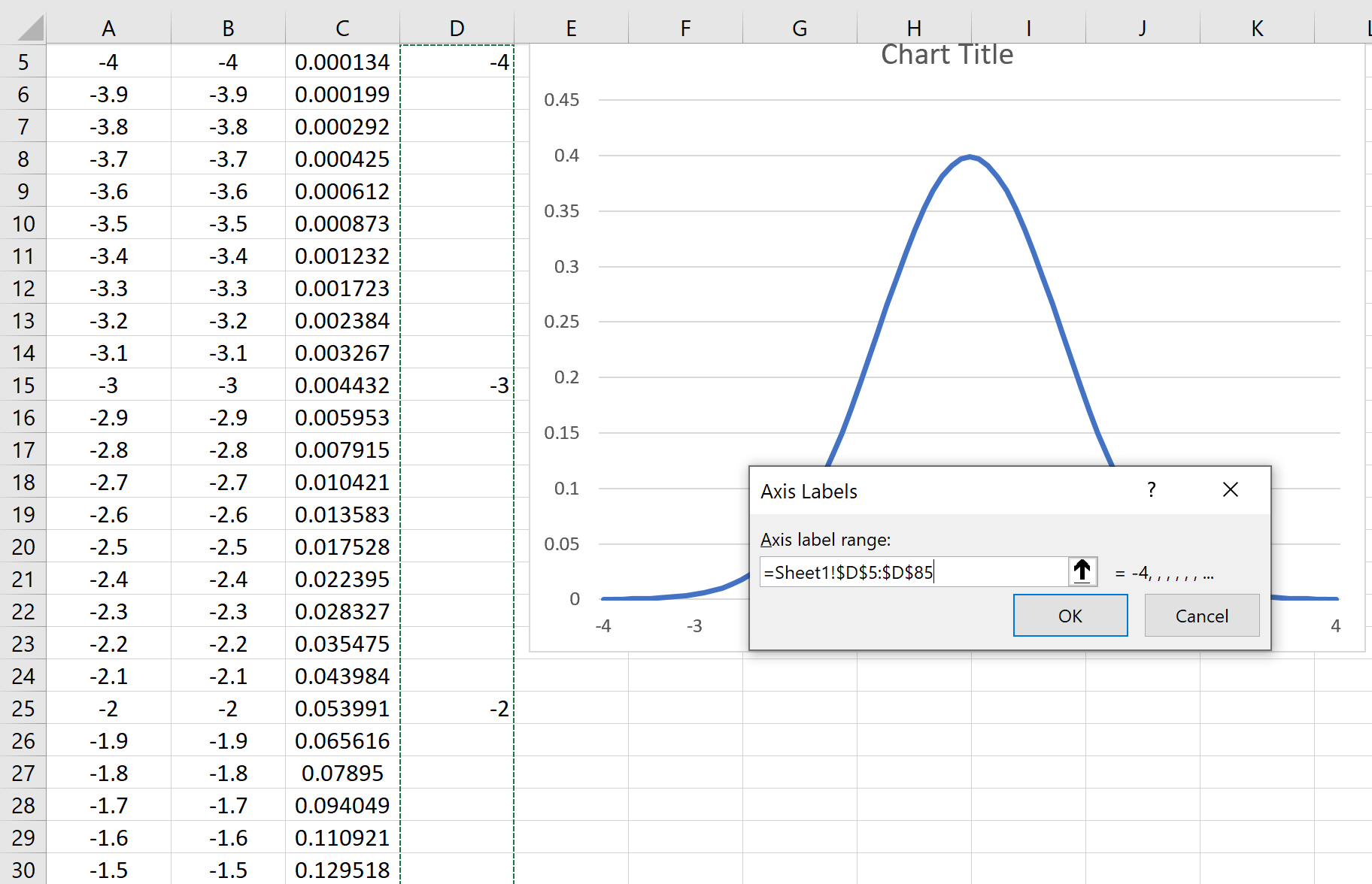
The x-axis labels will update automatically :
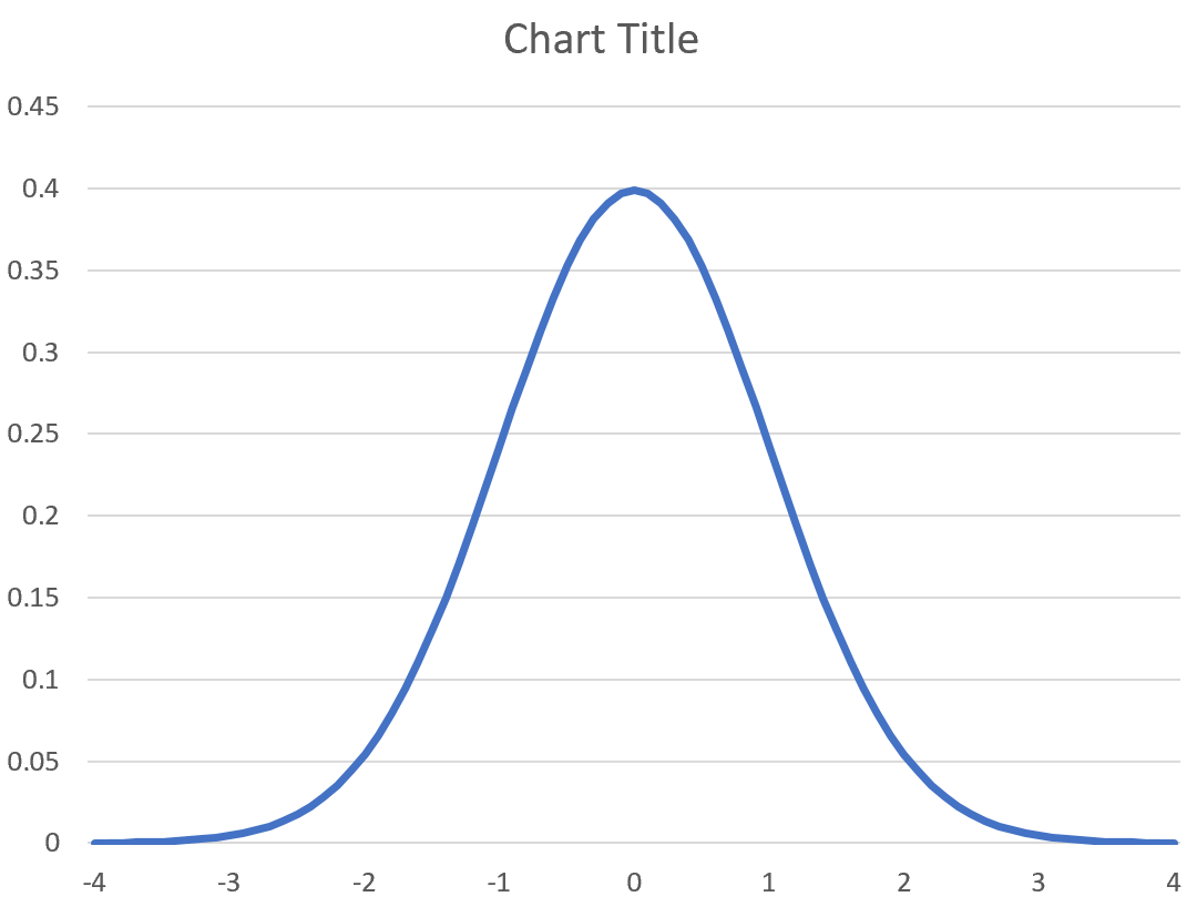
You’ll notice that if you change the mean and standard deviation, the bell curve will update automatically. For example, here’s what the bell curve turns into if we use mean = 10 and standard deviation = 2:
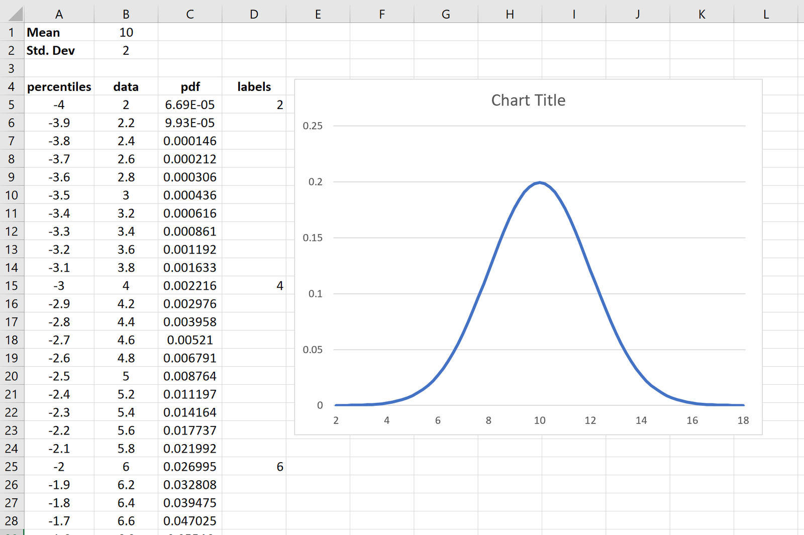
Feel free to modify the chart title, add axis labels, and change the color if you’d like to make the chart more aesthetically pleasing.
Free Template
Feel free to download this free template that was used to make the exact bell curve in this tutorial.
Additional Resources
An Introduction to the Normal Distribution
Normal CDF Calculator
How to Plot a Normal Distribution in R