Autocorrelation measures the degree of similarity between a time series and a lagged version of itself over successive time intervals.
It’s also sometimes referred to as “serial correlation” or “lagged correlation” since it measures the relationship between a variable’s current values and its historical values.
When the autocorrelation in a time series is high, it becomes easy to predict future values by simply referring to past values.
How to Calculate Autocorrelation in Python
Suppose we have the following time series in Python that shows the value of a certain variable during 15 different time periods:
#define data
x = [22, 24, 25, 25, 28, 29, 34, 37, 40, 44, 51, 48, 47, 50, 51]
We can calculate the autocorrelation for every lag in the time series by using the acf() function from the statsmodels library:
import statsmodels.api as sm

#calculate autocorrelations
sm.tsa.acf(x)

array([ 1.        ,  0.83174224,  0.65632458,  0.49105012,  0.27863962,
        0.03102625, -0.16527446, -0.30369928, -0.40095465, -0.45823389,
       -0.45047733])
The way to interpret the output is as follows:
- The autocorrelation at lag 0 is 1.
- The autocorrelation at lag 1 is 0.8317.
- The autocorrelation at lag 2 is 0.6563.
- The autocorrelation at lag 3 is 0.4910.
And so on.
We can also specify the number of lags to use with the nlags argument:
sm.tsa.acf(x, nlags=5)

array([1.0, 0.83174224, 0.65632458, 0.49105012, 0.27863962, 0.03102625])
How to Plot the Autocorrelation Function in Python
We can plot the autocorrelation function for a time series in Python by using the tsaplots.plot_acf() function from the statsmodels library:
from statsmodels.graphics import tsaplots
import matplotlib.pyplot as plt

#plot autocorrelation function
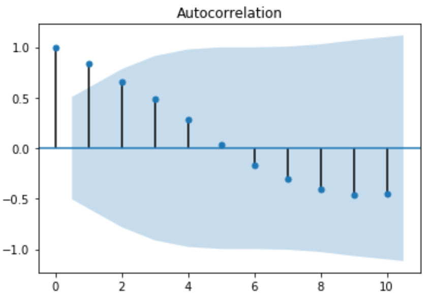
fig = tsaplots.plot_acf(x, lags=10)
plt.show()

The x-axis displays the number of lags and the y-axis displays the autocorrelation at that number of lags. By default, the plot starts at lag = 0 and the autocorrelation will always be 1 at lag = 0.
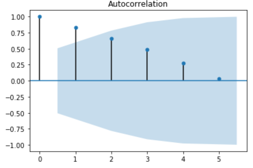
We can also zoom in on the first few lags by choosing to use fewer lags with the lags argument:
from statsmodels.graphics import tsaplots
import matplotlib.pyplot as plt

#plot autocorrelation function
fig = tsaplots.plot_acf(x, lags=5)
plt.show()

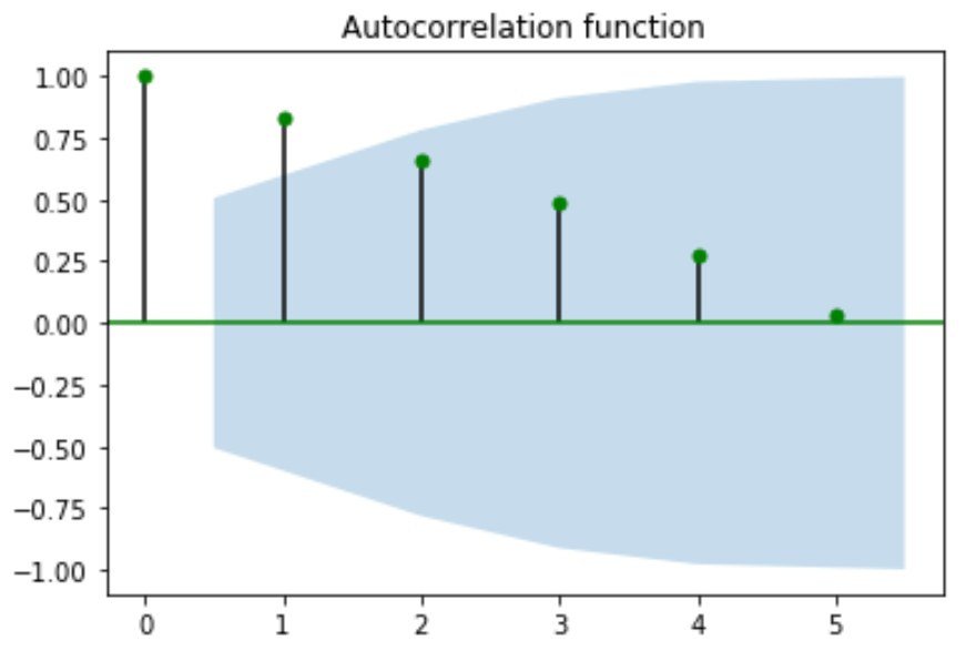
We can also change the title and the color of the circles used in the plot with the title and color arguments:
from statsmodels.graphics import tsaplots
import matplotlib.pyplot as plt

#plot autocorrelation function
fig = tsaplots.plot_acf(x, lags=5, color='g', title='Autocorrelation function')
plt.show()

You can find more Python tutorials on this page.