Often you may want to add a regression equation to a plot in R as follows:

Fortunately this is fairly easy to do using functions from the ggplot2 and ggpubr packages.
This tutorial provides a step-by-step example of how to use functions from these packages to add a regression equation to a plot in R.
Step 1: Create the Data
First, let’s create some fake data to work with:
#make this example reproducible
set.seed(1)

#create data frame
df frame(x = c(1:100))
df$y #view head of data frame
head(df)

  x         y
1 1 -8.529076
2 2 11.672866
3 3 -4.712572
4 4 47.905616
5 5 26.590155
6 6  7.590632
Step 2: Create the Plot with Regression Equation
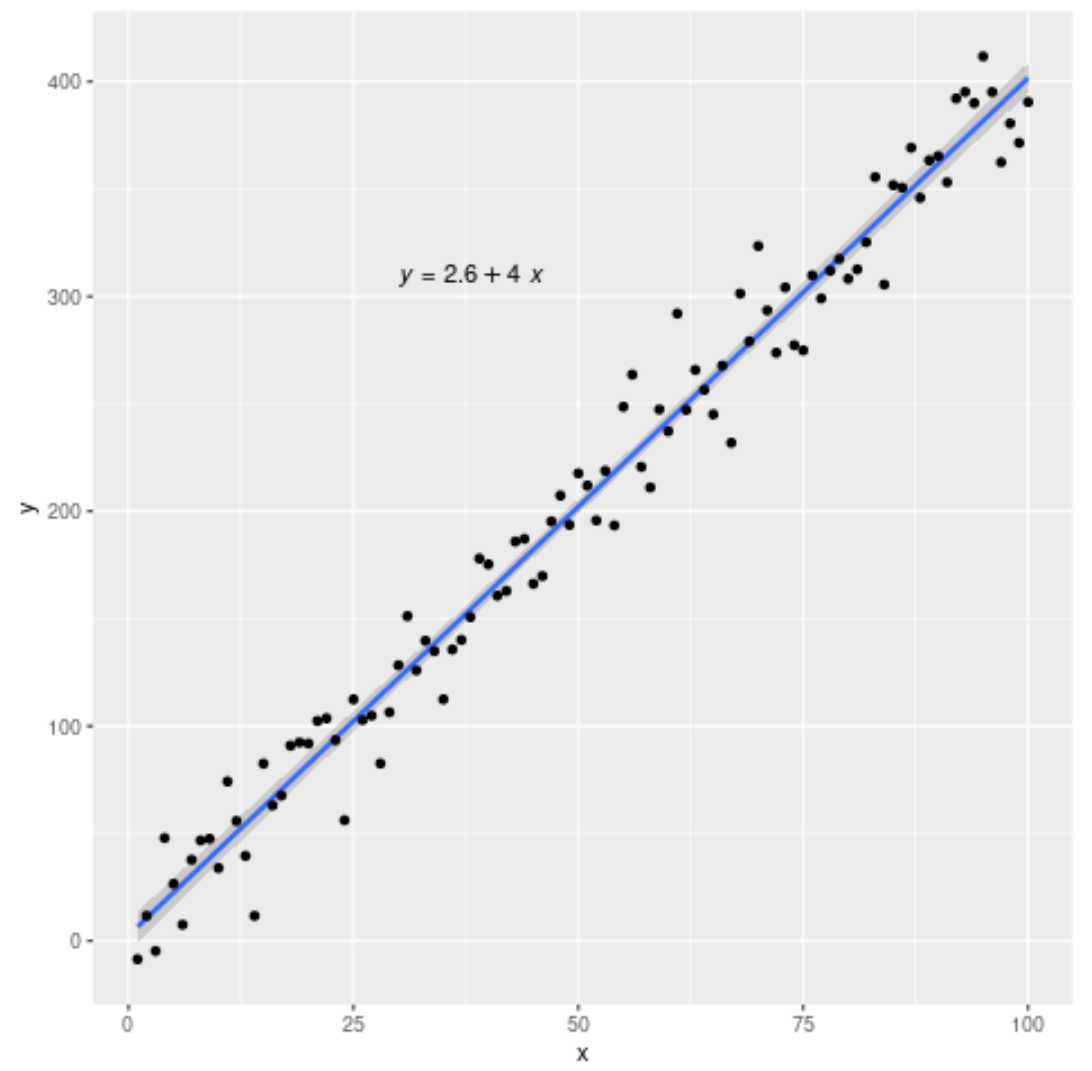
Next, we’ll use the following syntax to create a scatterplot with a fitted regression line and equation:
#load necessary libraries
library(ggplot2)
library(ggpubr)

#create plot with regression line and regression equation
ggplot(data=df, aes(x=x, y=y)) +
        geom_smooth(method="lm") +
        geom_point() +
        stat_regline_equation(label.x=30, label.y=310)

This tells us that the fitted regression equation is:
y = 2.6 + 4*(x)
Note that label.x and label.y specify the (x,y) coordinates for the regression equation to be displayed.
Step 3: Add R-Squared to the Plot (Optional)
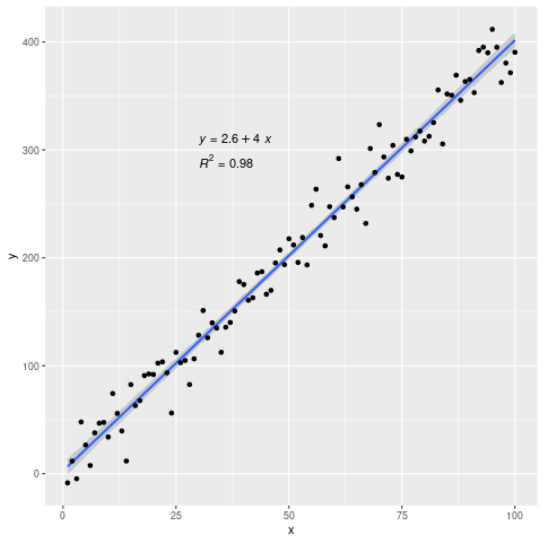
You can also add the R-squared value of the regression model if you’d like using the following syntax:
#load necessary libraries
library(ggplot2)
library(ggpubr)

#create plot with regression line, regression equation, and R-squared
ggplot(data=df, aes(x=x, y=y)) +
        geom_smooth(method="lm") +
        geom_point() +
        stat_regline_equation(label.x=30, label.y=310) +
        stat_cor(aes(label=..rr.label..), label.x=30, label.y=290)

The R-squared for this model turns out to be 0.98.
You can find more R tutorials on this page.