A bar of pie chart is a pie chart that combines the smallest slices in the chart into one slice and then explodes that slice into a bar chart.
The benefit of this type of chart is that it provides an easier way to visualize the smallest slices of the pie chart.
This tutorial provides a step-by-step example of how to create the following bar of pie chart in Excel:
Step 1: Enter the Data
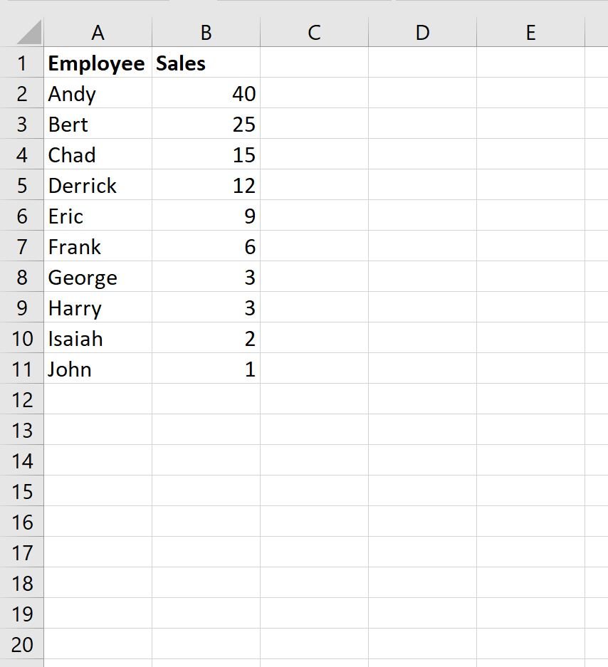
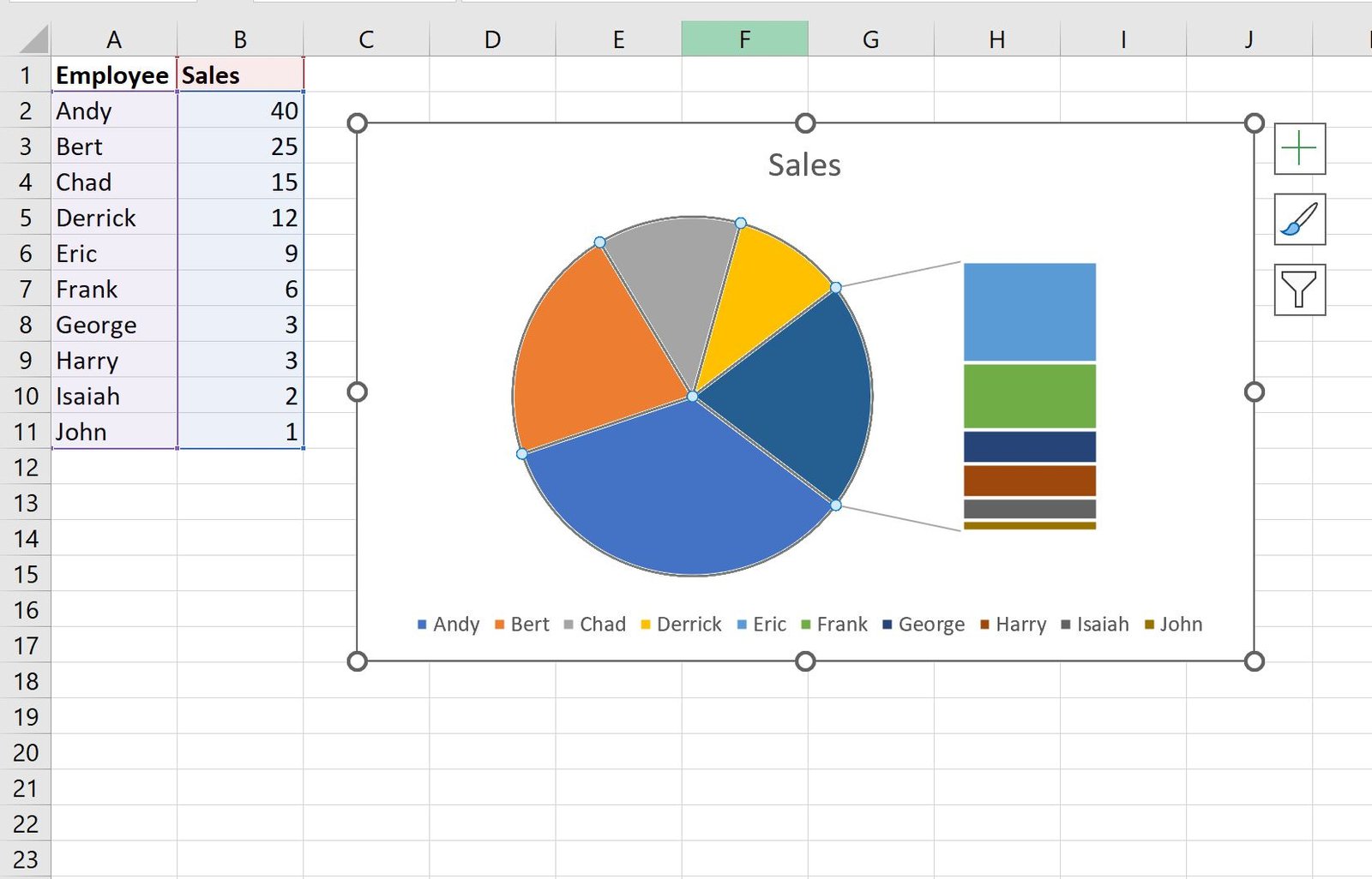
First, let’s enter the following dataset that shows the total sales made by 10 different employees at a company:
Step 2: Create a Bar of Pie Chart
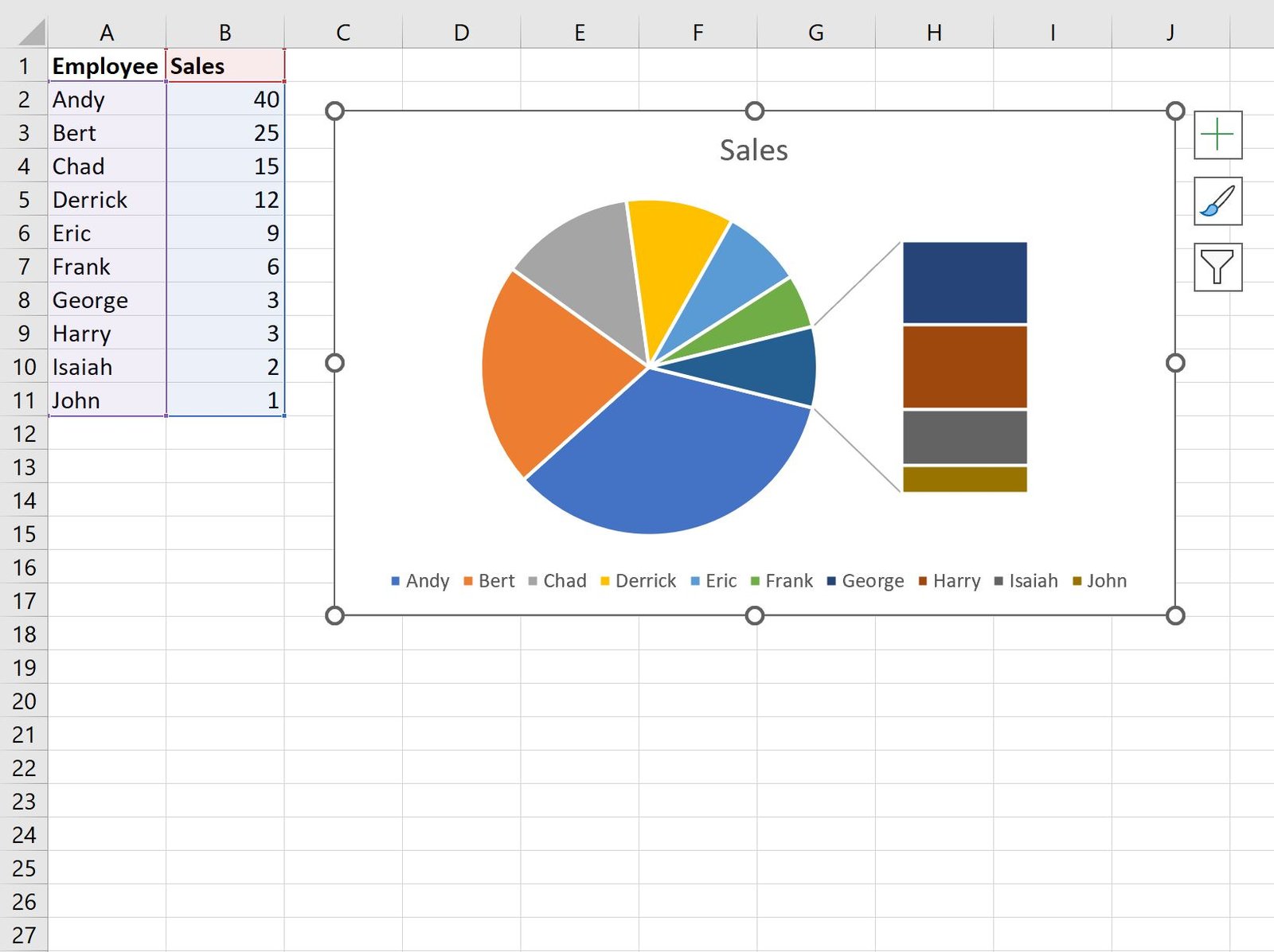
To create a pie of bar chart to visualize this dataset, highlight the cell range A1:B11, then click the Insert tab along the top ribbon, then click the Pie icon and then click Bar of Pie:

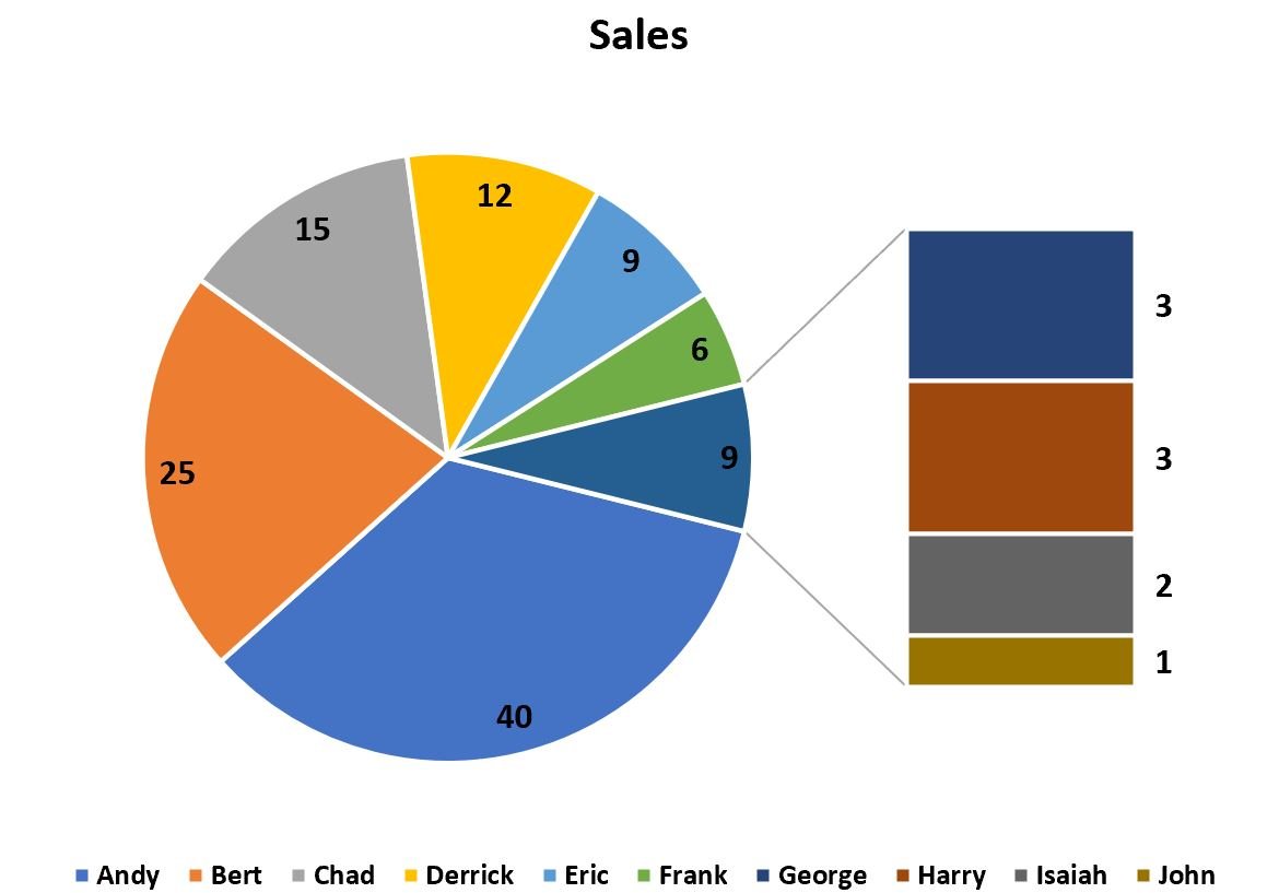
Excel will automatically insert the following bar of pie chart:
Step 3: Customize the Bar of Pie Chart
By default, Excel has chosen to group the four smallest slices in the pie into one slice and then explode that slice into a bar chart.
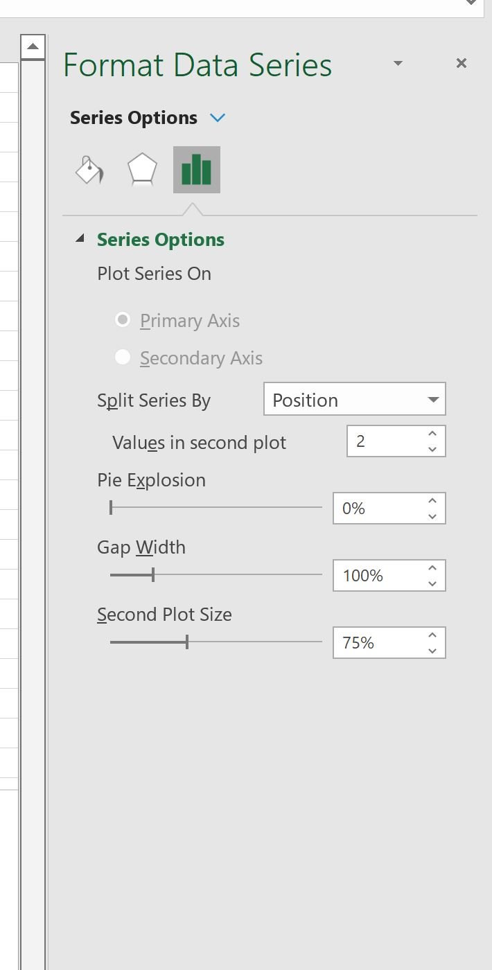
To group together a different number of slices, simply double click any element in the bar chart.
This will bring up a panel called Format Data Series.
Suppose we change the number for Values in second plot to 2:
The number of values shown in the bar chart will change to 2:

We can also choose to group together all slices in the pie that are less than a certain percentage of the total pie.
For example, we could group together all slices that make up less than 10% of the total pie:
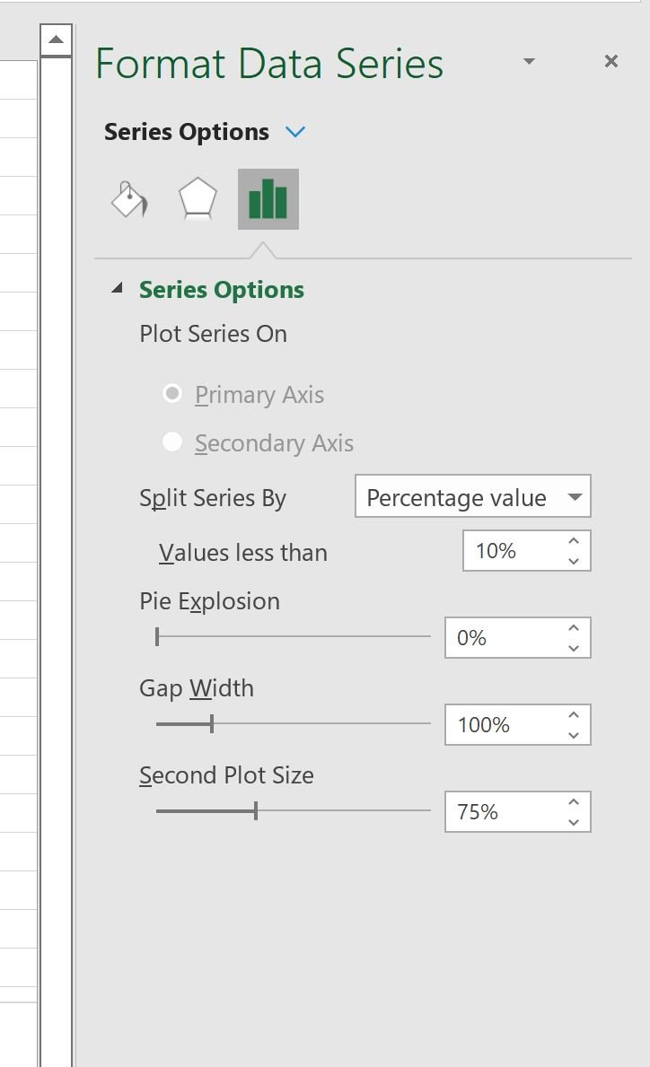
Excel will automatically calculate the number of slices to include in the bar chart:
In this dataset, the total Sales values sum to 116. Thus, 10% of 116 is 11.6
This means that any employee with less than 11.6 sales is automatically included in the bar chart.
Once you’ve decided how many slices to include in the bar chart, click anywhere on the chart to bring up the tiny plus “+” sign in the top right corner and check the box next to Data Labels to add labels to the chart:

The bar of pie chart is now complete.
Additional Resources
The following tutorials explain how to create other common visualizations in Excel:
How to Create a Quadrant Chart in Excel
How to Create a Bubble Chart in Excel
How to Create a Double Doughnut Chart in Excel