You can easily rotate the axis labels on a chart in Excel by modifying the Text direction value within the Format Axis panel.
The following step-by-step example shows how to do so in practice.
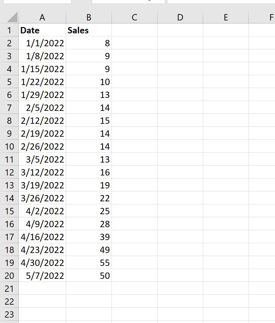
Step 1: Enter the Data
First, let’s enter the following dataset into Excel:
Step 2: Create the Plot
Next, highlight the values in the range A2:B20.
Then click the Insert tab along the top ribbon, then click the icon called Scatter with Smooth Lines and Markers within the Charts group.
The following chart will automatically appear:
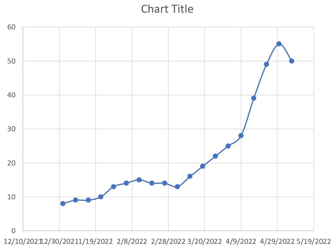
By default, Excel makes each label on the x-axis horizontal.
However, this causes the labels to overlap in some areas and makes it difficult to read.
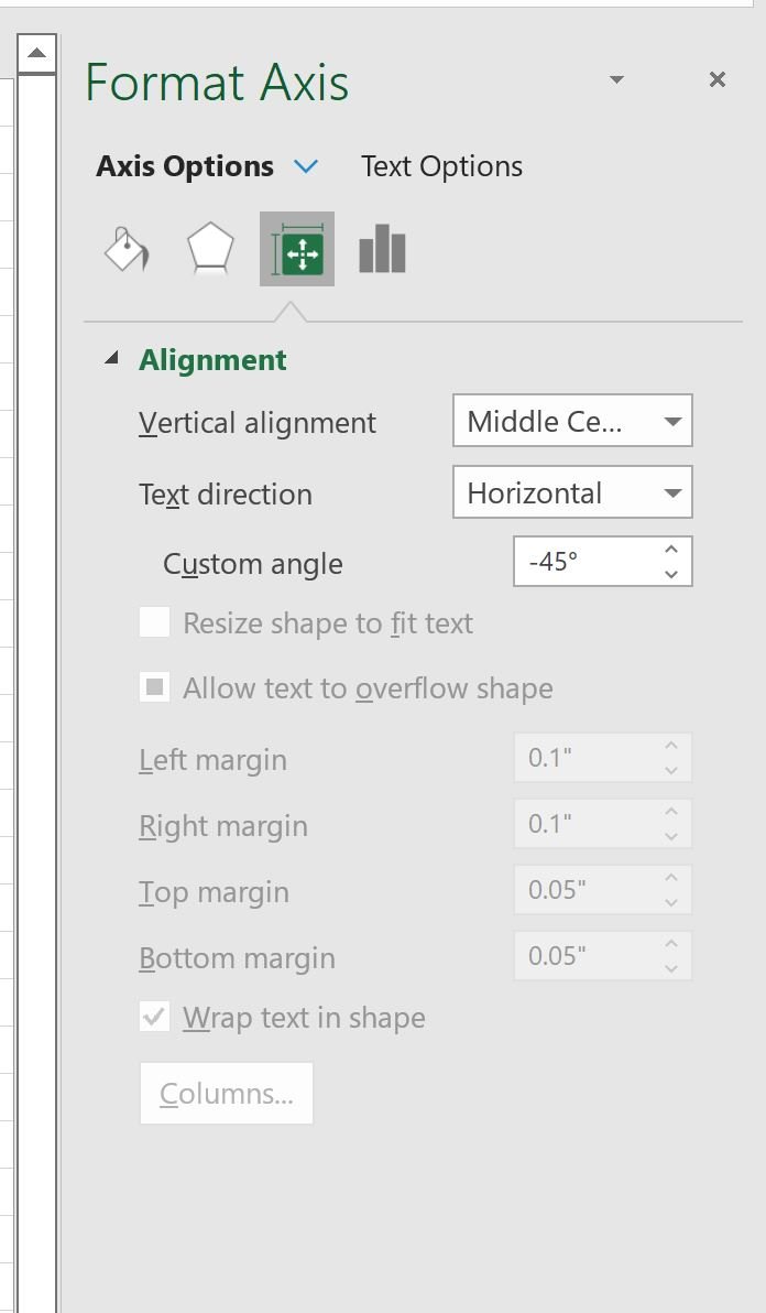
Step 3: Rotate Axis Labels
In this step, we will rotate the axis labels to make them easier to read.
To do so, double click any of the values on the x-axis.
In the Format Axis panel that appears, click the icon called Size & Properties and type -45 in the box titled Custom angle:
The x-axis labels will be rotated at a 45 degree angle to make them easier to read:
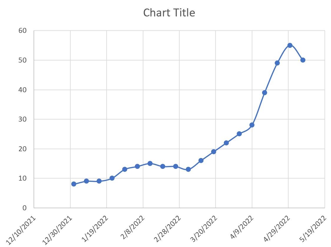
Notice that the labels are much easier to read now.
Feel free to play around with the value in the Custom angle box to rotate the labels exactly how you’d like.
Additional Resources
The following tutorials explain how to perform other common tasks in Excel:
How to Add Labels to Scatterplot Points in Excel
How to Change Axis Scales in Excel Plots
How to Add a Vertical Line to Charts in Excel