Often you may want to plot multiple data sets on the same chart in Excel, similar to the chart below:

The following step-by-step example shows exactly how to do so.
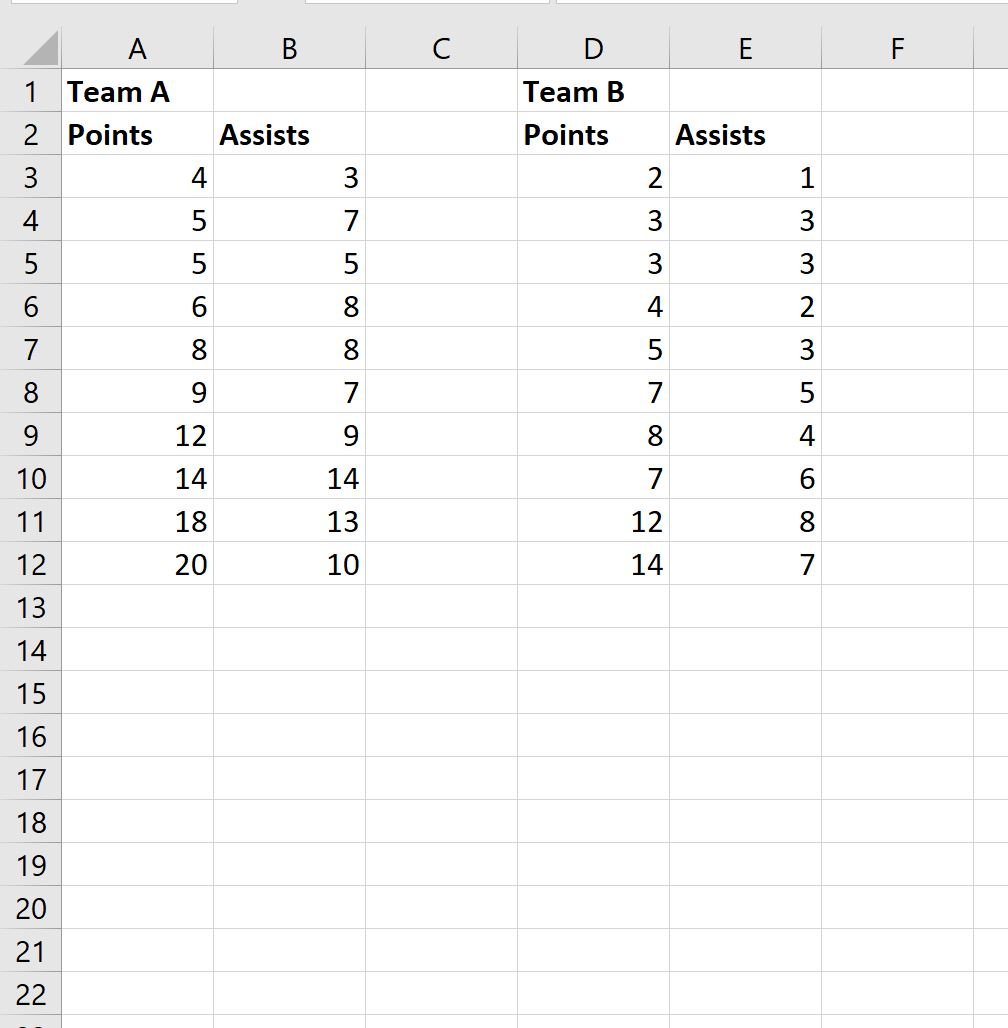
Step 1: Enter the Data Sets
First, let’s enter the following two datasets into Excel:
Step 2: Plot the First Data Set
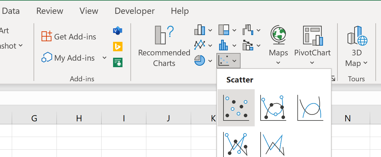
To create a scatter plot for Team A, highlight the cell range A2:B12, then click the Insert tab, then click the Scatter option within the Charts group:
The following scatter plot will be created:

Step 3: Add the Second Data Set
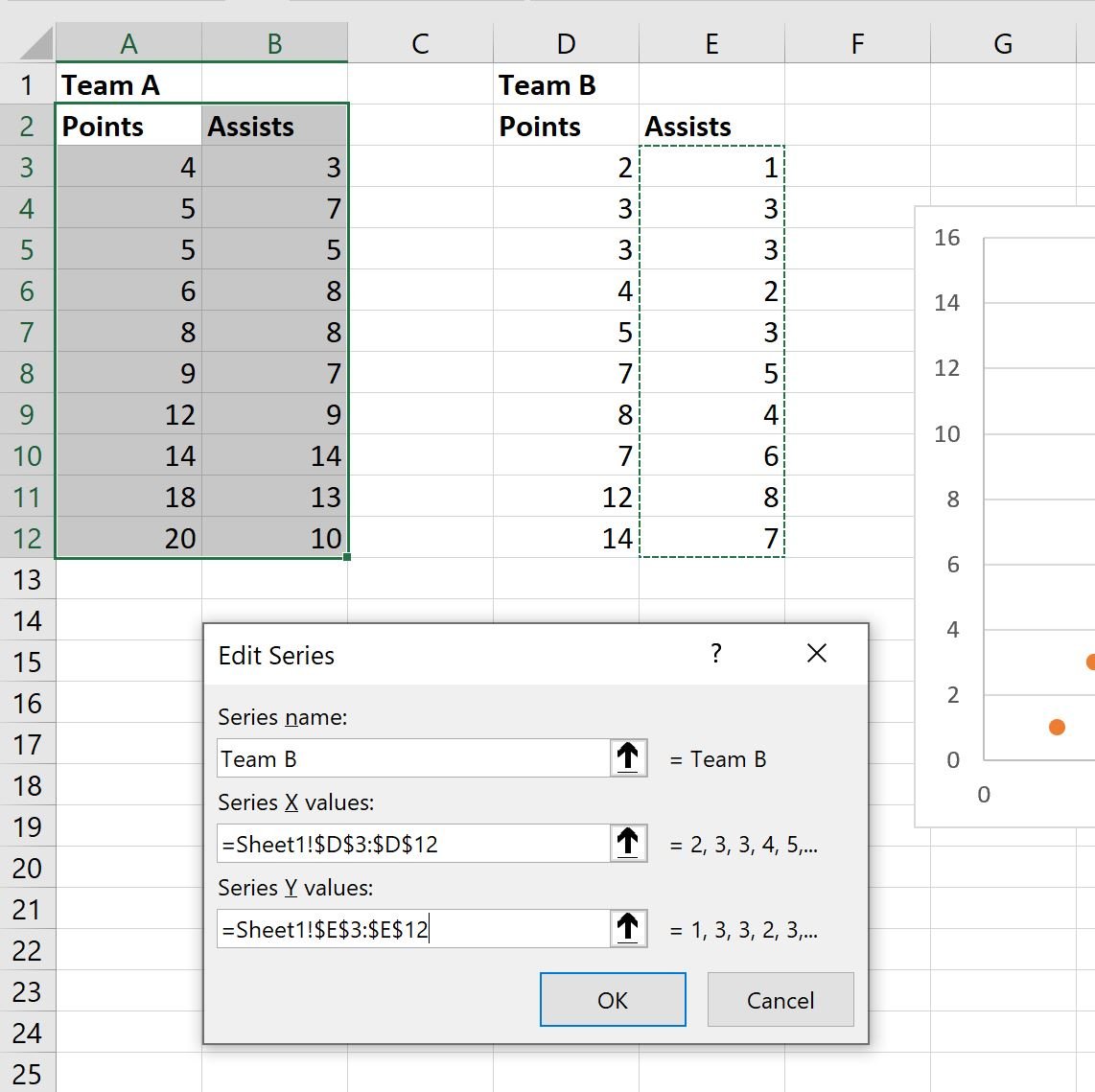
Next, right click anywhere on the scatter plot. Then click Select Data from the dropdown menu:

In the new window that appears, click Add under the Legend Entries box.
Then type “Team B” for the Series Name, then choose D3:D12 for the Series X Values and E3:E12 for the Series Y Values:
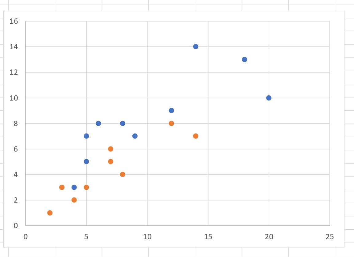
Once you click OK, the values for the second data set will automatically be added to the scatter plot:
Step 4: Customize the Chart (Optional)
Lastly, feel free to modify the colors, add a chart title, add axis titles, and add a legend to make the chart easier to interpret:
Additional Resources
The following tutorials explain how to perform other common tasks in Excel:
How to Plot Multiple Lines in Excel
How to Create a Clustered Stacked Bar Chart in Excel
How to Create a Scatterplot with Multiple Series in Excel