Often you may want to create a graph in Excel that allows you to visualize the correlation between two variables.
This tutorial provides a step-by-step example of how to create this type of correlation graph in Excel.
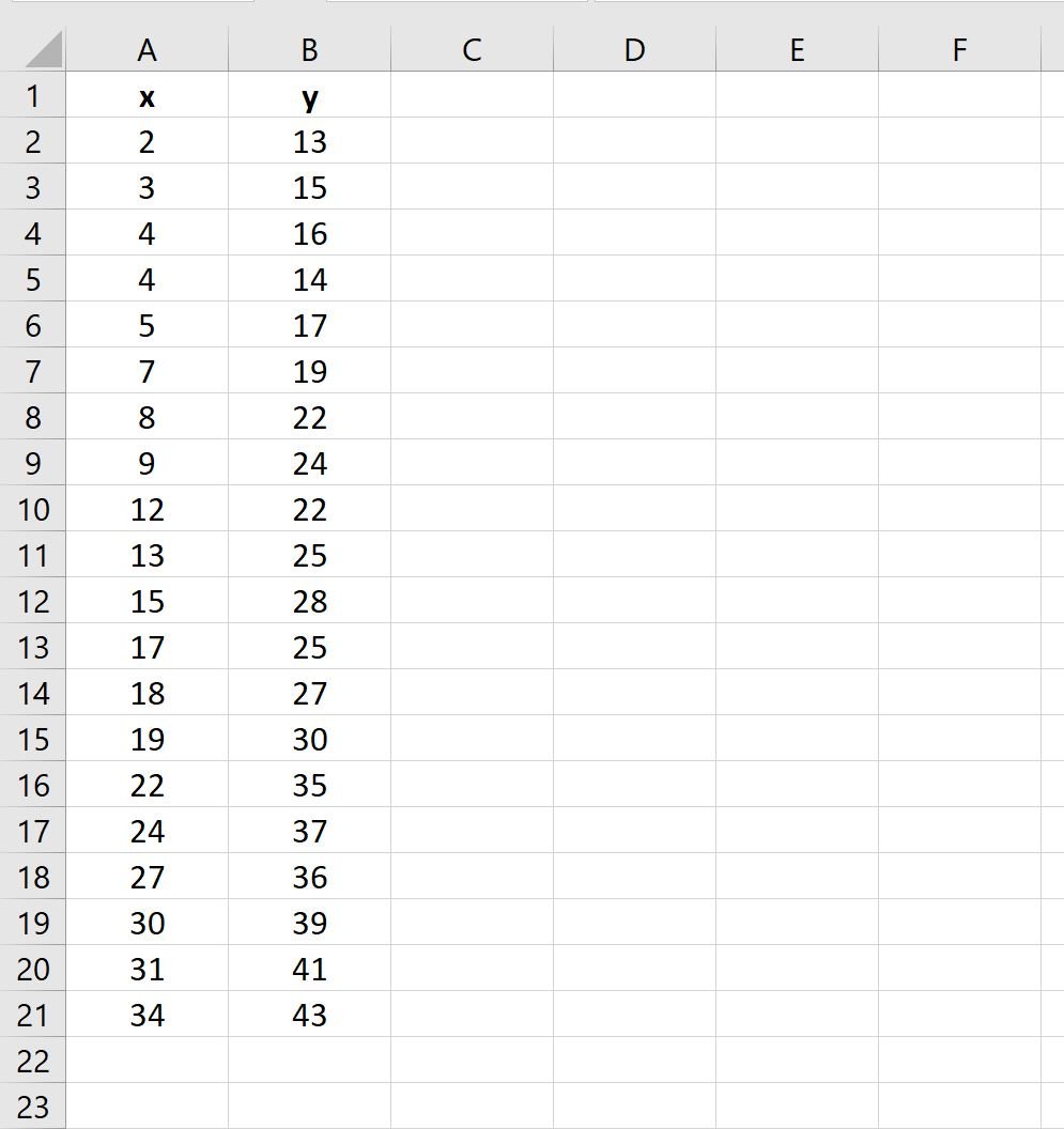
Step 1: Create the Data
First, let’s create a dataset with two variables in Excel:
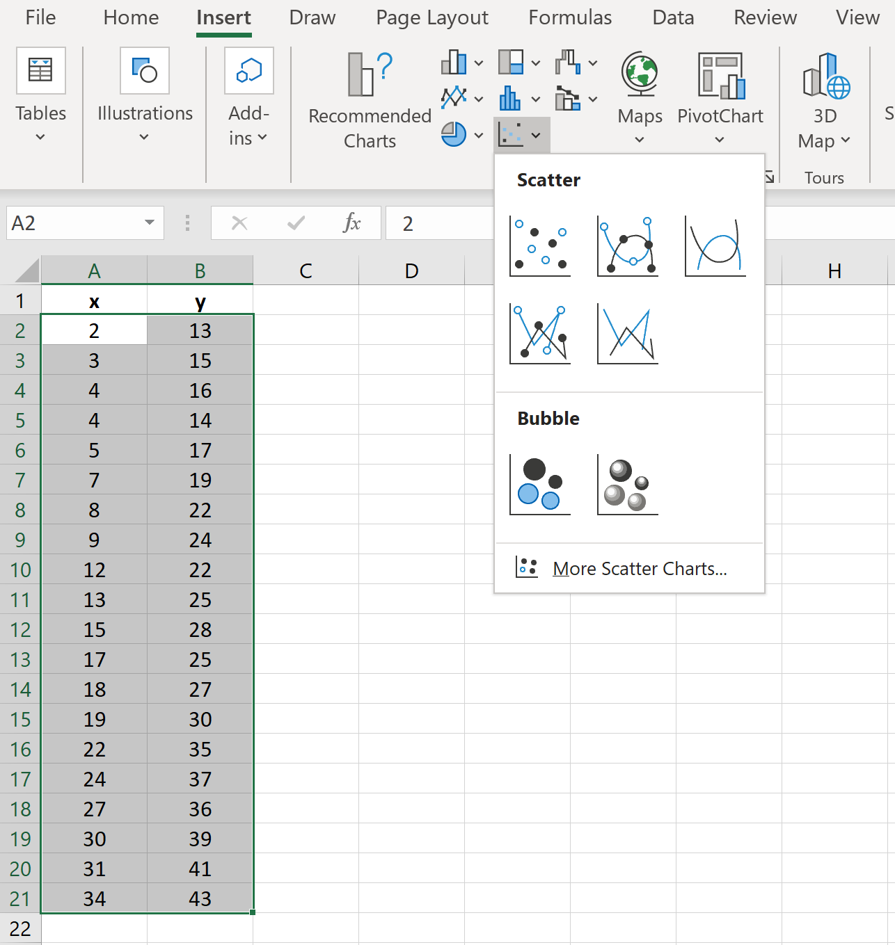
Step 2: Create a Scatterplot
Next, highlight the cell range A2:B21.
On the top ribbon, click the Insert tab, then click Insert Scatter (X, Y) in the Charts group and click the first option to create a scatterplot:
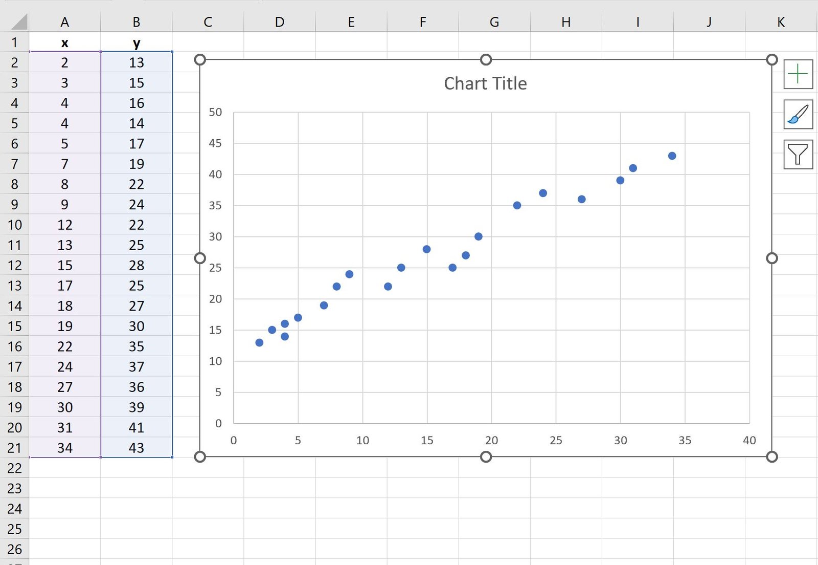
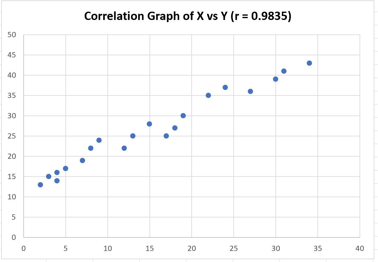
The following scatterplot will appear:
Step 3: Add Correlation Coefficient
To calculate the correlation coefficient between the two variables, type the following formula into cell A23:
=CORREL(A2:A21, B2:B21)
The following screenshot shows how to use this formula in practice:
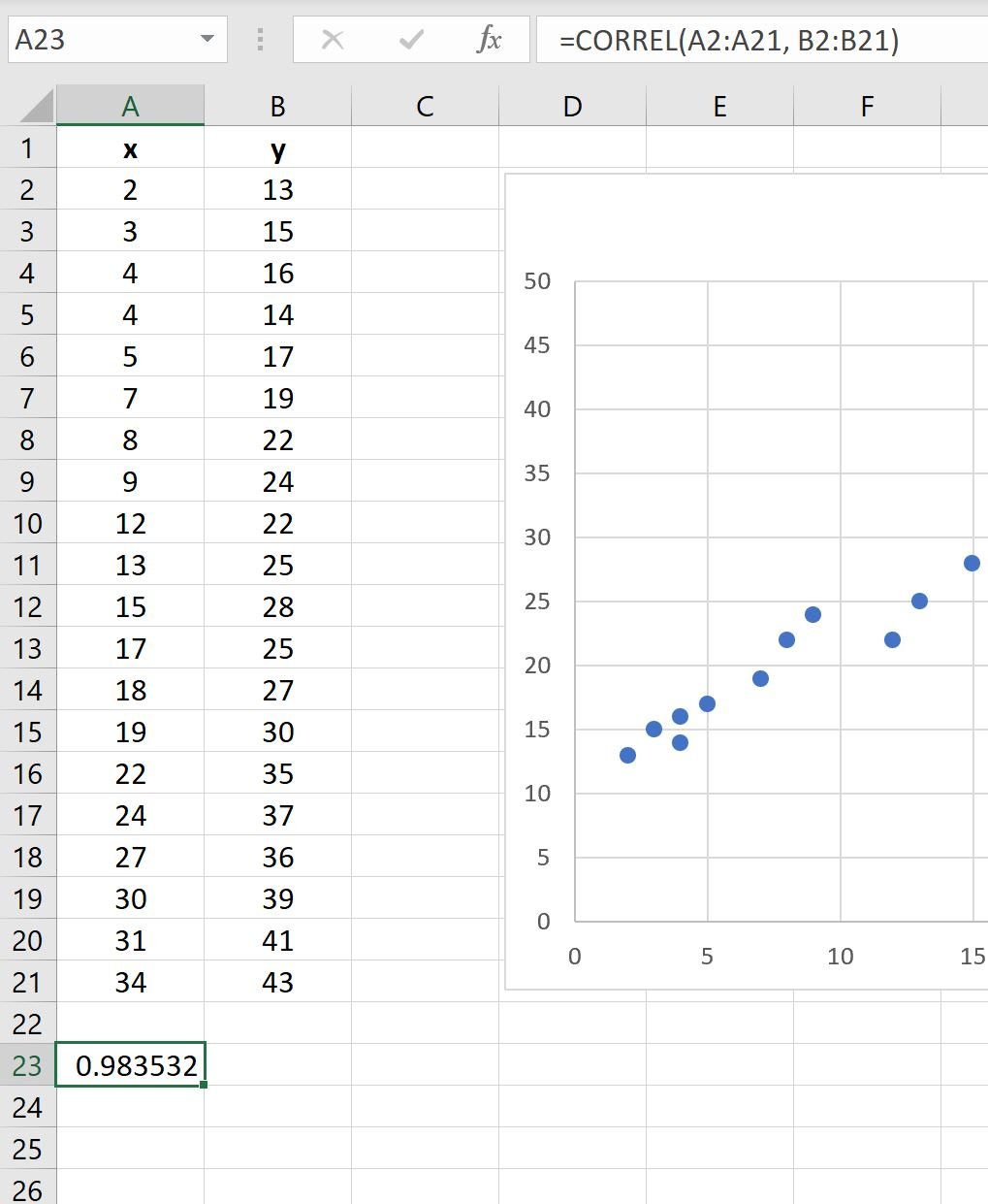
The correlation coefficient between these two variables is 0.9835.
Feel free to add this value in the title of the scatterplot if you’d like:
Note that the correlation between two variables can range between -1 and 1 where:
- -1 indicates a perfect negative linear correlation
- 0 indicates no linear correlation
- 1 indicates a perfect positive linear correlation
In our example, a correlation of 0.9835 represents a strong positive correlation between the two variables.
This matches the pattern that we see in the scatterplot: As the value for x increases, the value for y also increases in a highly predictable manner.
Related: What is Considered to Be a “Strong” Correlation?
Additional Resources
The following tutorials explain how to perform other common tasks in Excel:
How to Create a Scatterplot Matrix in Excel
How to Add Labels to Scatterplot Points in Excel
How to Add a Horizontal Line to a Scatterplot in Excel
How to Create a Scatterplot with Multiple Series in Excel