A burndown chart is a chart that shows the ideal “burndown” (i.e. completion) of tasks vs. the actual burndown of tasks at some company.
This type of chart can help teams and project managers determine if they’re working at a planned pace or not.
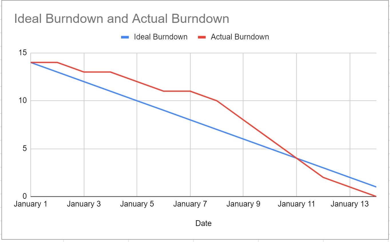
This tutorial provides a step-by-step example of how to create the following burndown chart in Google Sheets:
Let’s jump in!
Step 1: Enter the Data
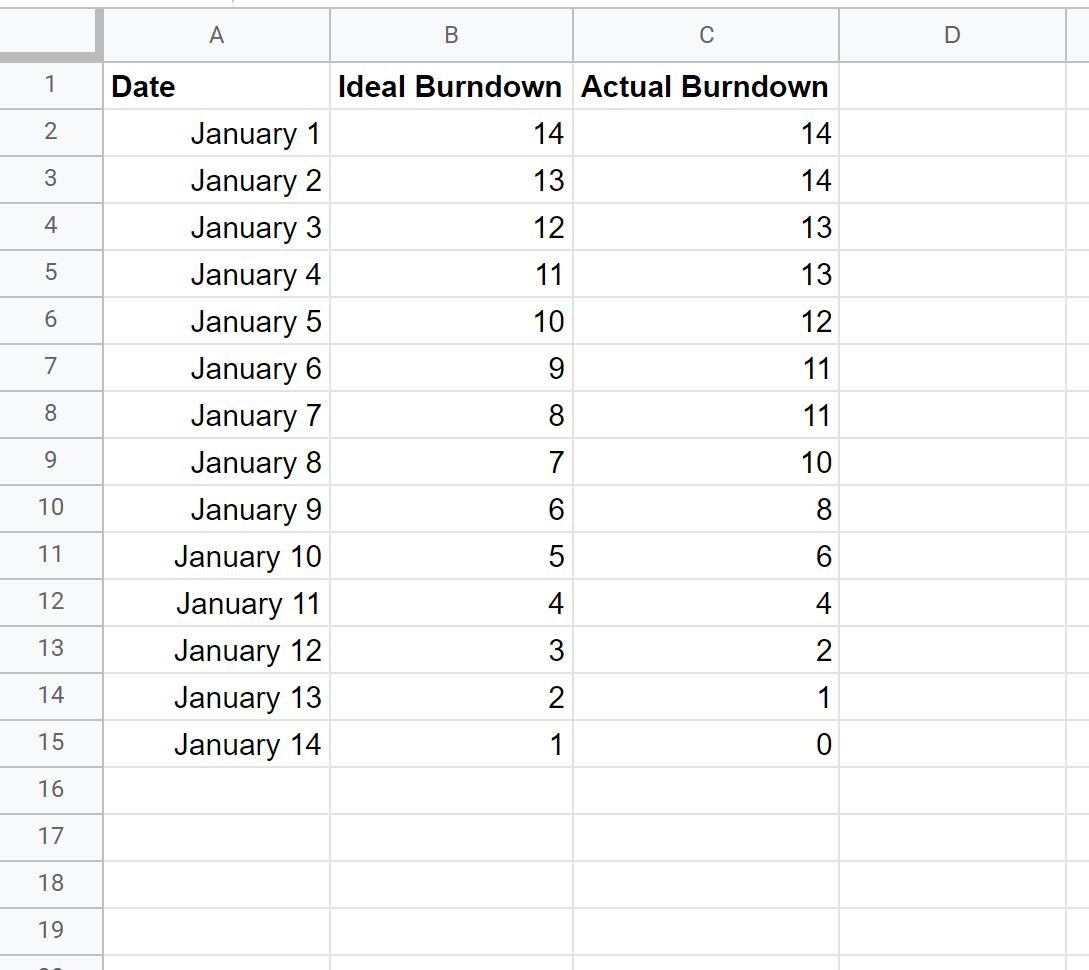
First, let’s enter the following dataset that shows the ideal burndown of tasks vs. the actual burndown of tasks by date:
Step 2: Insert the Burndown Chart
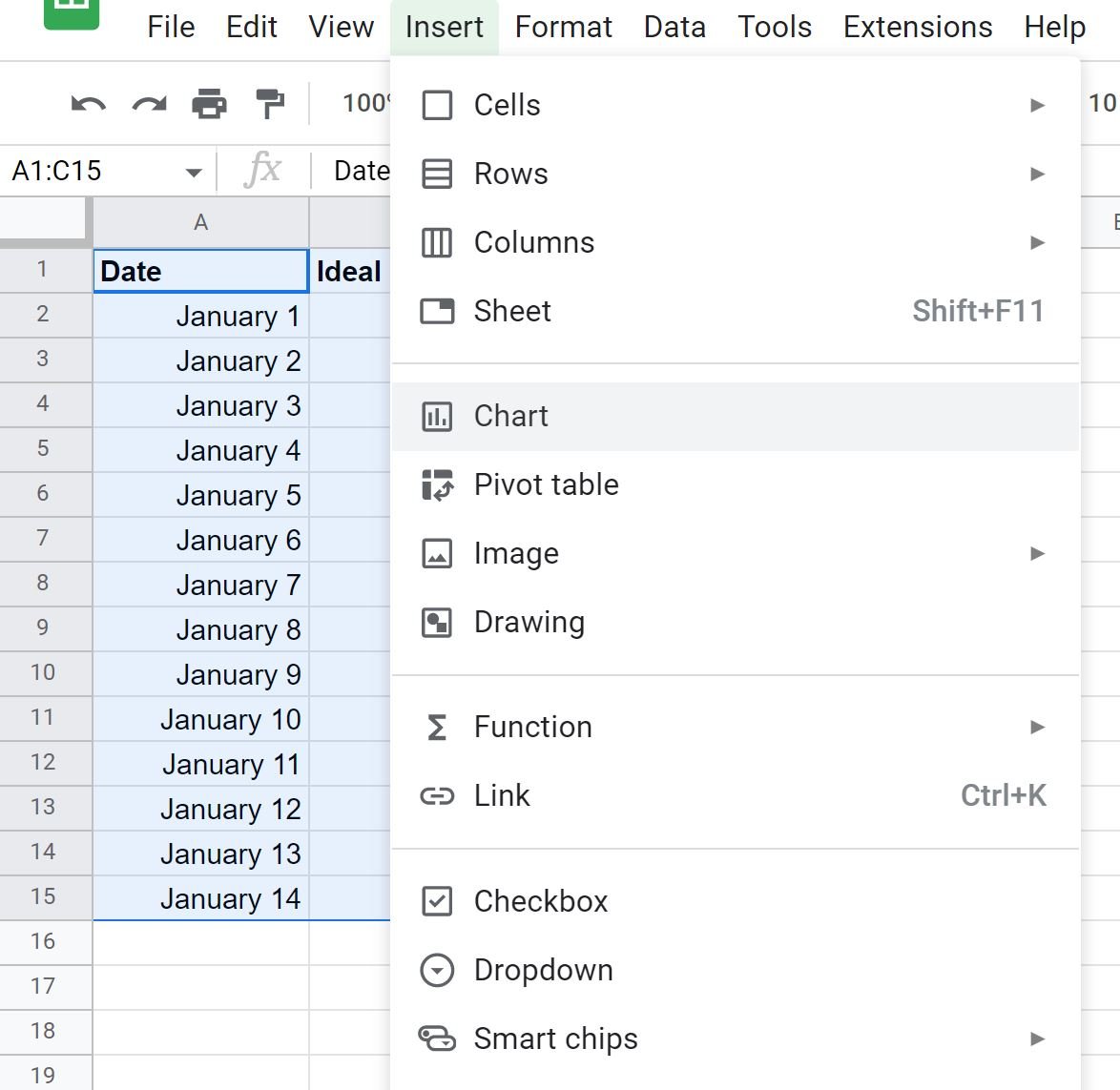
Next, highlight the cells in the range A1:C15, then click the Insert tab, then click Chart:
In the Chart editor panel that appears on the right side of the screen, choose Line chart as the Chart type:
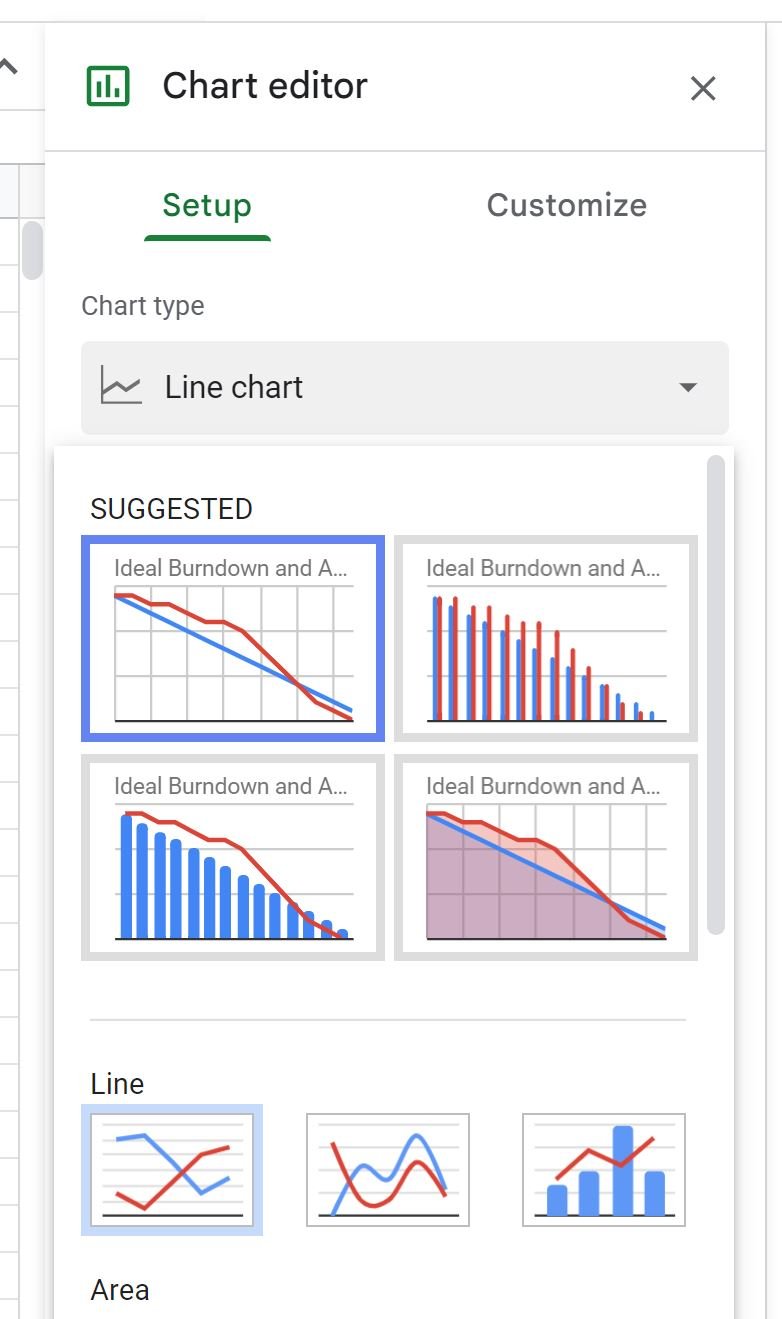
The following chart will appear:

Feel free to customize the title, the colors, the line style, and the axis labels to make the plot look however you’d like.
Step 3: Interpret the Burndown Chart
The blue line in the burndown chart represents the “ideal” burndown or the “planned” burndown of tasks.
The red line represents the “actual” burndown of tasks.
When the red line is above the blue line, the team is burning through tasks slower than planned and when the red line is below the blue line, the team is burning through tasks faster than planned.
From the burndown chart above we can see that the team is burning through tasks slower than the planned pace up until January 11.
After this point, the red line is below the blue line which means the team burns through the tasks quicker than the planned pace.
Note: In this example we used individual days for the x-axis but you could also use weekly intervals, bi-weekly intervals, or any other interval that is standard for your particular team or company.
Additional Resources
The following tutorials explain how to perform other common tasks in Google Sheets:
How to Add Average Line to Chart in Google Sheets
How to Add Trendline to Chart in Google Sheets
How to Plot Multiple Lines in Google Sheets