Principal components analysis, often abbreviated PCA, is an unsupervised machine learning technique that seeks to find principal components – linear combinations of the original predictors – that explain a large portion of the variation in a dataset.
The goal of PCA is to explain most of the variability in a dataset with fewer variables than the original dataset.
For a given dataset with p variables, we could examine the scatterplots of each pairwise combination of variables, but the sheer number of scatterplots can become large very quickly.
For p predictors, there are p(p-1)/2 scatterplots.
So, for a dataset with p = 15 predictors, there would be 105 different scatterplots!
Fortunately, PCA offers a way to find a low-dimensional representation of a dataset that captures as much of the variation in the data as possible.
If we’re able to capture most of the variation in just two dimensions, we could project all of the observations in the original dataset onto a simple scatterplot.
The way we find the principal components is as follows:
Given a dataset with p predictors: X1, X2, … , Xp,, calculate Z1, … , ZM to be the M linear combinations of the original p predictors where:
- Zm = ΣΦjmXj for some constants Φ1m, Φ2m, Φpm, m = 1, …, M.
- Z1 is the linear combination of the predictors that captures the most variance possible.
- Z2 is the next linear combination of the predictors that captures the most variance while being orthogonal (i.e. uncorrelated) to Z1.
- Z3 is then the next linear combination of the predictors that captures the most variance while being orthogonal to Z2.
- And so on.
In practice, we use the following steps to calculate the linear combinations of the original predictors:
1. Scale each of the variables to have a mean of 0 and a standard deviation of 1.
2. Calculate the covariance matrix for the scaled variables.
3. Calculate the eigenvalues of the covariance matrix.
Using linear algebra, it can be shown that the eigenvector that corresponds to the largest eigenvalue is the first principal component. In other words, this particular combination of the predictors explains the most variance in the data.
The eigenvector corresponding to the second largest eigenvalue is the second principal component, and so on.
This tutorial provides a step-by-step example of how to perform this process in R.
Step 1: Load the Data
First we’ll load the tidyverse package, which contains several useful functions for visualizing and manipulating data:
library(tidyverse)
For this example we’ll use the USArrests dataset built into R, which contains the number of arrests per 100,000 residents in each U.S. state in 1973 for Murder, Assault, and Rape.
It also includes the percentage of the population in each state living in urban areas, UrbanPop.
The following code show how to load and view the first few rows of the dataset:
#load data
data("USArrests")

#view first six rows of data
head(USArrests)

           Murder Assault UrbanPop Rape
Alabama      13.2     236       58 21.2
Alaska       10.0     263       48 44.5
Arizona       8.1     294       80 31.0
Arkansas      8.8     190       50 19.5
California    9.0     276       91 40.6
Colorado      7.9     204       78 38.7
Step 2: Calculate the Principal Components
After loading the data, we can use the R built-in function prcomp() to calculate the principal components of the dataset.
Be sure to specify scale = TRUE so that each of the variables in the dataset are scaled to have a mean of 0 and a standard deviation of 1 before calculating the principal components.
Also note that eigenvectors in R point in the negative direction by default, so we’ll multiply by -1 to reverse the signs.
#calculate principal components
results TRUE)

#reverse the signs
results$rotation #display principal components
results$rotation

               PC1        PC2        PC3         PC4
Murder   0.5358995 -0.4181809  0.3412327 -0.64922780
Assault  0.5831836 -0.1879856  0.2681484  0.74340748
UrbanPop 0.2781909  0.8728062  0.3780158 -0.13387773
Rape     0.5434321  0.1673186 -0.8177779 -0.08902432
We can see that the first principal component (PC1) has high values for Murder, Assault, and Rape which indicates that this principal component describes the most variation in these variables.
We can also see that the second principal component (PC2) has a high value for UrbanPop, which indicates that this principle component places most of its emphasis on urban population.
Note that the principal components scores for each state are stored in results$x. We will also multiply these scores by -1 to reverse the signs:
#reverse the signs of the scores
results$x #display the first six scores
head(results$x)

                  PC1        PC2         PC3          PC4
Alabama     0.9756604 -1.1220012  0.43980366 -0.154696581
Alaska      1.9305379 -1.0624269 -2.01950027  0.434175454
Arizona     1.7454429  0.7384595 -0.05423025  0.826264240
Arkansas   -0.1399989 -1.1085423 -0.11342217  0.180973554
California  2.4986128  1.5274267 -0.59254100  0.338559240
Colorado    1.4993407  0.9776297 -1.08400162 -0.001450164
Step 3: Visualize the Results with a Biplot
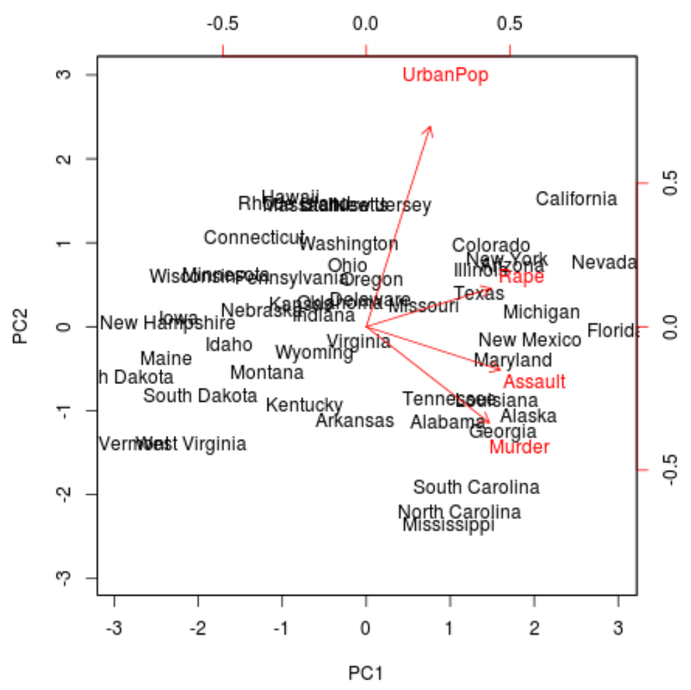
Next, we can create a biplot – a plot that projects each of the observations in the dataset onto a scatterplot that uses the first and second principal components as the axes:
Note that scale = 0 ensures that the arrows in the plot are scaled to represent the loadings.
biplot(results, scale = 0)

From the plot we can see each of the 50 states represented in a simple two-dimensional space.
The states that are close to each other on the plot have similar data patterns in regards to the variables in the original dataset.
We can also see that the certain states are more highly associated with certain crimes than others. For example, Georgia is the state closest to the variable Murder in the plot.
If we take a look at the states with the highest murder rates in the original dataset, we can see that Georgia is actually at the top of the list:
#display states with highest murder rates in original dataset
head(USArrests[order(-USArrests$Murder),])

               Murder Assault UrbanPop Rape
Georgia          17.4     211       60 25.8
Mississippi      16.1     259       44 17.1
Florida          15.4     335       80 31.9
Louisiana        15.4     249       66 22.2
South Carolina   14.4     279       48 22.5
Alabama          13.2     236       58 21.2
Step 4: Find Variance Explained by Each Principal Component
We can use the following code to calculate the total variance in the original dataset explained by each principal component:
#calculate total variance explained by each principal component
results$sdev^2 / sum(results$sdev^2)

[1] 0.62006039 0.24744129 0.08914080 0.04335752
From the results we can observe the following:
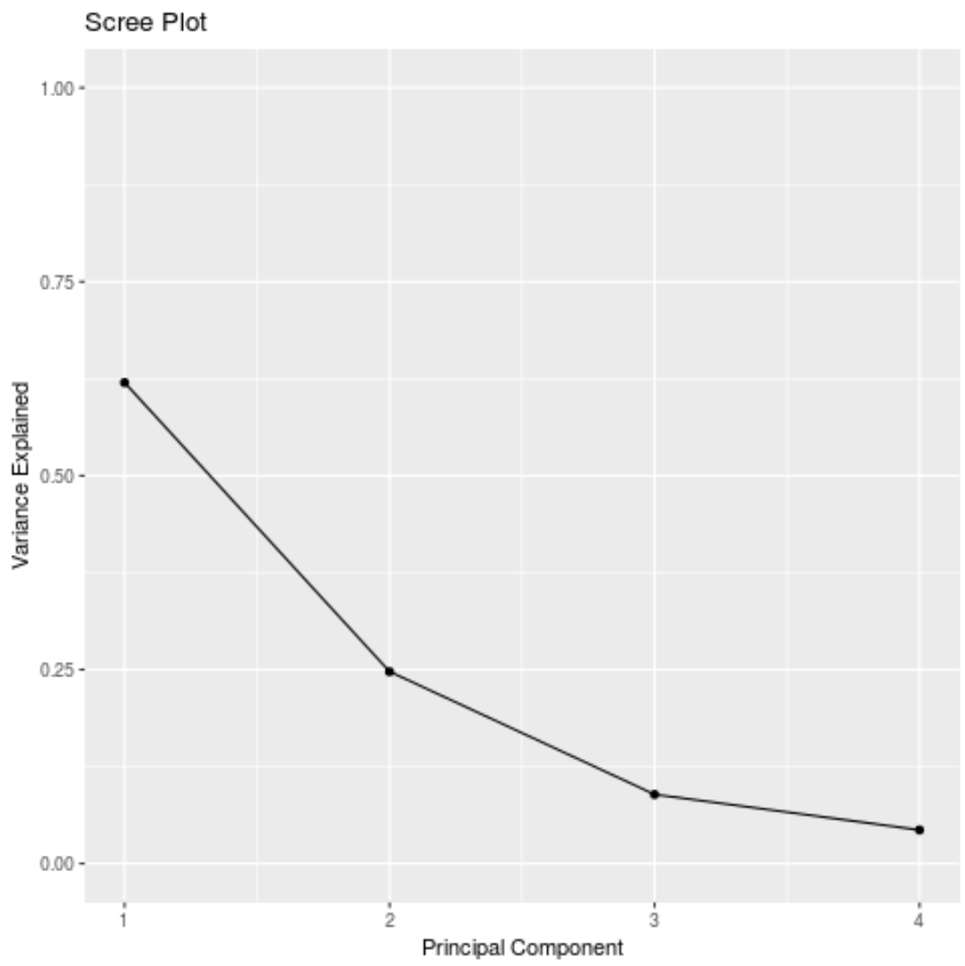
- The first principal component explains 62% of the total variance in the dataset.
- The second principal component explains 24.7% of the total variance in the dataset.
- The third principal component explains 8.9% of the total variance in the dataset.
- The fourth principal component explains 4.3% of the total variance in the dataset.
Thus, the first two principal components explain a majority of the total variance in the data.
This is a good sign because the previous biplot projected each of the observations from the original data onto a scatterplot that only took into account the first two principal components.
Thus, it’s valid to look at patterns in the biplot to identify states that are similar to each other.
We can also create a scree plot – a plot that displays the total variance explained by each principal component – to visualize the results of PCA:
#calculate total variance explained by each principal component
var_explained = results$sdev^2 / sum(results$sdev^2)

#create scree plot
qplot(c(1:4), var_explained) +
  geom_line() +
  xlab("Principal Component") +
  ylab("Variance Explained") +
  ggtitle("Scree Plot") +
  ylim(0, 1)

Principal Components Analysis in Practice
In practice, PCA is used most often for two reasons:
1. Exploratory Data Analysis – We use PCA when we’re first exploring a dataset and we want to understand which observations in the data are most similar to each other.
2. Principal Components Regression – We can also use PCA to calculate principal components that can then be used in principal components regression. This type of regression is often used when multicollinearity exists between predictors in a dataset.
The complete R code used in this tutorial can be found here.